Product Listing Page serve as the digital storefront within mobile commerce apps, where users browse and explore the available products or services. These page play a crucial role in guiding users through their shopping journey, facilitating product discovery, and ultimately driving conversions.
Table of Content
- The Significance of Grid View, List View, and Different Image View Types
- Comparing Grid View and List View: Balancing Visual Appeal and Information Density
- Image View Types in Product Listing Page
- Which View Type Is Most Suitable Under Which Scenarios For Different Products
- Product Listing Page Customization Options
- User Preferences And Behaviour
- Summing It Up – Optimize Product Listing Page To Enhance User Experience
The Significance of Grid View, List View, and Different Image View Types
- Grid View
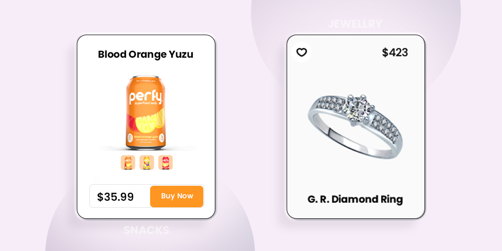
Grid view presents products in a visually appealing layout, usually in a grid pattern with thumbnail images and concise product details. This format allows users to quickly scan multiple products at once, making it ideal for browsing extensive product catalogs. Grid view enhances user experience by providing a visually engaging and efficient way to explore product options.
- List View
List view displays products in a linear format, often with more detailed information about each item. This format is preferred by users who prioritize information over visuals or when they want to compare products side by side. List view is particularly useful for users seeking specific features or specifications, as it offers a more structured presentation of product details.
- Different Image View Types
In addition to grid and list views, mobile commerce apps may offer various image view types to cater to different user preferences and browsing behaviors. These may include:
- Carousel View: Carousel view allows users to swipe through a series of product images, providing a dynamic and interactive browsing experience. It enables users to view products from different angles or see additional images, enhancing their understanding and appreciation of the product.
- Zoomable Images: Zoomable images enable users to zoom in on product photos for a closer look at details or textures. This feature is particularly beneficial for products where visual clarity is essential, such as apparel, home decor, or electronics.
- 360-Degree View: Some mobile commerce apps offer a 360-degree view feature, allowing users to rotate products virtually and examine them from all angles. This immersive experience simulates the in-store shopping experience and can significantly enhance user engagement and confidence in their purchasing decisions.
Overall, the strategic implementation of grid view, list view, and different image view types in product listing page contributes to a seamless and enjoyable user experience in mobile commerce apps. By catering to diverse user preferences and browsing styles, app developers can maximize user engagement, satisfaction, and ultimately, conversion rates.
Comparing Grid View and List View: Balancing Visual Appeal and Information Density
When it comes to displaying products on your online store, the layout you choose can make a big difference in how customers browse and engage with your offerings. Let’s take a closer look at these two popular options: grid view and list view.
Grid View
- Visual Appeal: Grid view offers a visually appealing layout with large product images, making it attractive and engaging for users.
- Quick Decision-Making: Users can quickly scan through products and make snap judgments based on visual appeal alone, enhancing the browsing experience.
- Ideal for Certain Products: This layout is particularly suitable for products that rely heavily on visual presentation, such as clothing, home decor, and electronics.
List View
- Comprehensive Information: List view provides additional product details such as descriptions, prices, and ratings, helping users make informed purchase decisions.
- Easy Comparison: Users can easily compare products as all relevant details are displayed in a structured format, facilitating comparison shopping.
- Structured Layout: The condensed format of list view offers a structured layout that is easier to navigate, particularly for users who prefer detailed information before making a purchase.
In conclusion, both grid view and list view have their strengths and weaknesses, and the best choice depends on your target audience and their preferences. By understanding the pros and cons of each layout, you can make an informed decision that enhances the browsing experience for your customers.
Learn More:Product Listing Pages In An eCommerce Mobile App: A Comprehensive Guide
Image View Types in Product Listing Page
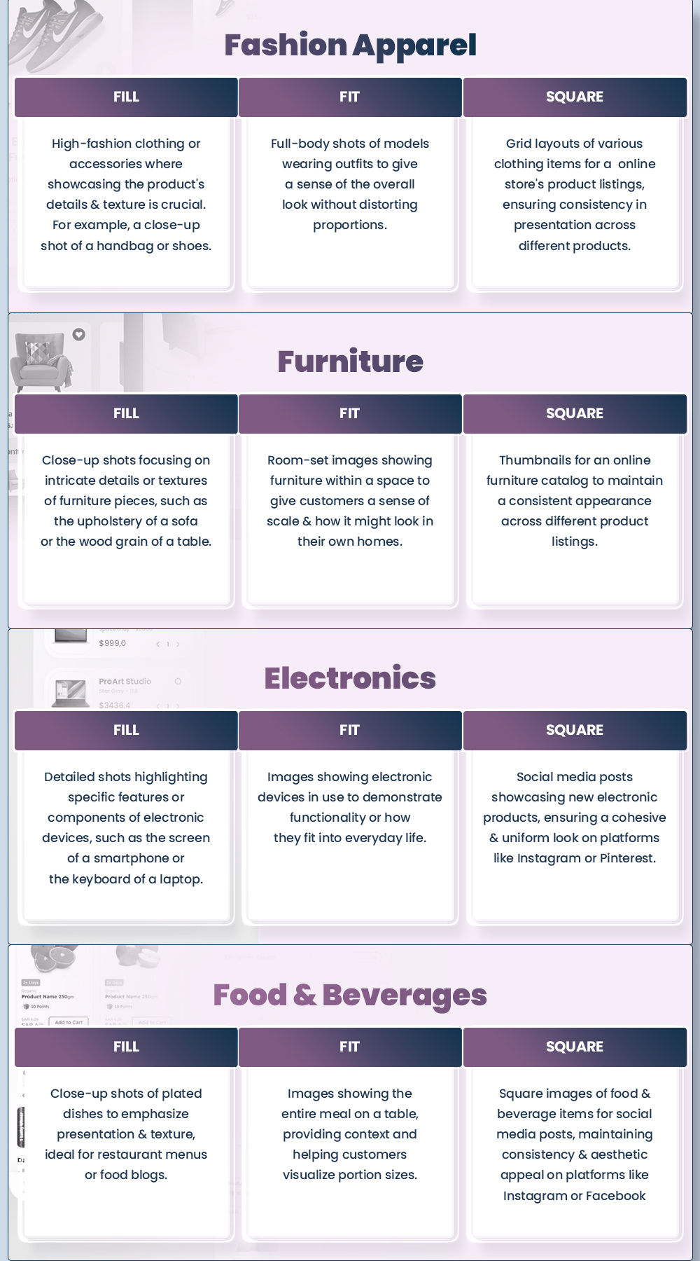
The differences between fill, fit, and square image view types have a significant impact on how products are presented visually.
Fill: When an image is set to fill, it’s expanded or shrunk to cover the entire designated area, regardless of its original shape. Fill is commonly chosen when the goal is to make the most of the space available, even if it means losing some details of the product. It’s visually striking, but the downside is potential loss of important information.
Fit: This view type ensures the entire image is displayed within the space, maintaining its original aspect ratio. While this preserves the integrity of the image, it might result in empty spaces around it if the container’s aspect ratio differs.
Square: Images are cropped to fit a square container in square image view types, regardless of their original aspect ratio. This uniformity is often preferred for consistency in presentations, especially in grid layouts or social media. However, it requires careful cropping to ensure essential details aren’t lost. While square presentations look clean and organized, there’s a risk of losing some product features in the process.
Which View Type Is Most Suitable Under Which Scenarios For Different Products

Product Listing Page Customization Options
Imagine you’re a merchant setting up your online store, and you’re not just limited to a one-size-fits-all product listing page (PLP). You have the power to customize every detail, from the subtle borders around your products to whether or not you reveal those discounted prices.
Here’s how these customization features let you craft a shopping experience that’s uniquely yours:
- Boost Sales: The ability to display discounted prices provides merchants with flexibility in implementing promotional strategies. Merchants can decide to show discounted prices to attract deal-hunters. Moreover, they can hide them for a more exclusive feel on select products or collections.
- Call-to-Action Optimization: Adding or removing the “Add to Bag” buttons based on user preferences or specific product characteristics can optimize the effectiveness of call-to-action (CTA) elements.
For example, for products that require customization or personalization before purchase, merchants may choose to hide the “Add to Bag” button until users have completed the necessary steps.
Conversely, for impulse-buy items, prominentlydisplaying the “Add to Bag” button can streamline the purchasing process and encourage conversions.

- Brand Consistency: Imagine you have an online store specializing in eco-friendly home goods. You could customize your PLPs by using earthy tones for product borders, reflecting your brand’s commitment to sustainability. Additionally, you might prominently display the names of eco-conscious vendors whose products you feature. It will reinforce your brand’s values and build trust with customers who share those values. It will keep your product listing page in line with your brand’s style. Therefore, you’re making sure customers recognize and trust your brand. As a result, everything looks and feels the same across your online store. It creates a shopping experience that’s easy to remember.
Tap Into a Broader Audience With Custom iOS and Android App For Your Shopify Store. No Code Needed!
Allow Customers to Explore More Products to Discover Relevant Items with Custom Landing Pages. Try Now!
Try Mobile App Builder For Free
User Preferences And Behaviour
Users engage with grid view and list view differently based on their preferences and the type of information they want to see. Let’s break down the differences and discuss user preferences regarding image view types and displayed elements with examples
- Grid View:
- Engagement: Grid view typically displays multiple products in a visually appealing grid layout, allowing users to quickly scan through a variety of options. Users often engage with grid view when they prioritize visual appeal and want to explore products based on images.
- Preferences
- Users who enjoy browsing visually and making decisions based on product images often prefer grid view.
- Grid view is popular for fashion, home decor, and other visually-driven products where the aesthetics of the item are important.
- List View:
- Engagement: List view presents products in a more structured format, often with additional details such as product names, prices, and descriptions. Users engage with list views when they prioritize information and want a more detailed overview of each product.
- Preferences:
- Users who prefer a more organized and information-rich browsing experience often opt for list view.
- List view is popular for electronics, appliances, and other products where specifications and details are crucial for decision-making.
A step by step video to help you have a comprehensive understanding on Product Listing Page feature required to enhance your mobile app shopping experience.
Summing It Up – Optimize Product Listing Page To Enhance User Experience
Product listing page plays a pivotal role in online shopping experiences, offering users a variety of ways to browse and compare products. The choice between grid view and list view provides users with distinct browsing experiences tailored to their preferences.
About The Author
I love navigating the world of SaaS with finesse. As an SEO enthusiast and seasoned Copy Writer, I'm here to transform tech-speak into compelling narratives that resonate with online merchants. With a penchant for alliteration and a touch of humor, I bring a unique flair to SaaS content.
Related Posts
Mobile App Engagement Strategy for Shopify Merchants: Turning User Engagement Metrics Into Action
In the previous blog of our “Mobile App User Engagement”…
Top Mobile App User Engagement Metrics Every Shopify Merchant Should Track
Every day, mobile apps collect and produce vast amounts of…
Why a Shopify Mobile App Is the Future of Your Store’s Growth
Mobile commerce is no longer just the future, it has…