
Majority of online merchants believe in the game of mobile apps, user experience is everything. Well, let me tell you, one major player in that user experience game is the mobile app menu design. Trust me, it’s a big deal.
Think about it like this: Have you ever used an app where finding what you need feels like navigating a maze blindfolded? Yeah, not fun. But with a well-designed menu, it’s like having a helpful guide showing you exactly where to go.
Table of Content
Let’s break it down a bit more:
1. Ease of Navigation: A logical and easy-to-follow menu layout ensures that users can find what they need quickly and efficiently, reducing frustration and enhancing the overall user experience.
2. Enhanced Discoverability: Ever wished you could find that one feature buried deep in the app without spending hours searching? A smart menu design puts the important stuff front and center, so you can get to it in no time.
3. Accessibility and Inclusivity: Everyone should be able to use an app, no matter what. That’s where accessibility comes in. A thoughtful menu design takes into account things like clear labels and easy-to-read text, making sure everyone can navigate with ease.
Therefore, the significance of mobile app menu design cannot be overstated. It revolves around simplifying user interactions, fostering engagement, and promoting inclusivity
Simplified menus are a cornerstone of effective mobile app menu design. Think of them as the guiding hand that effortlessly steers users through the app’s functionalities
How Simplified Mobile App Menu Design Contribute To Improved User Experience And Engagement
Simplified mobile app menu design is a catalyst for enhancing user experience and engagement in different ways
- Streamlined Navigation: Simplified menus declutter options, making it easy for users to find what they need quickly, reducing frustration and improving their journey through the app.
- Clear Visibility: Important features are prominently displayed in simplified menus, enhancing their discoverability and encouraging users to explore more of the app’s offerings.
- Consistent Experience: Uniform menu design across the app promotes consistency, allowing users to navigate familiar patterns regardless of their location within the application, building trust and confidence in its usability.
Optimizing top navigation, side navigation, and bottom navigation contributes to simplified navigation in a mobile app by addressing different user needs and preferences while ensuring easy access to essential features.
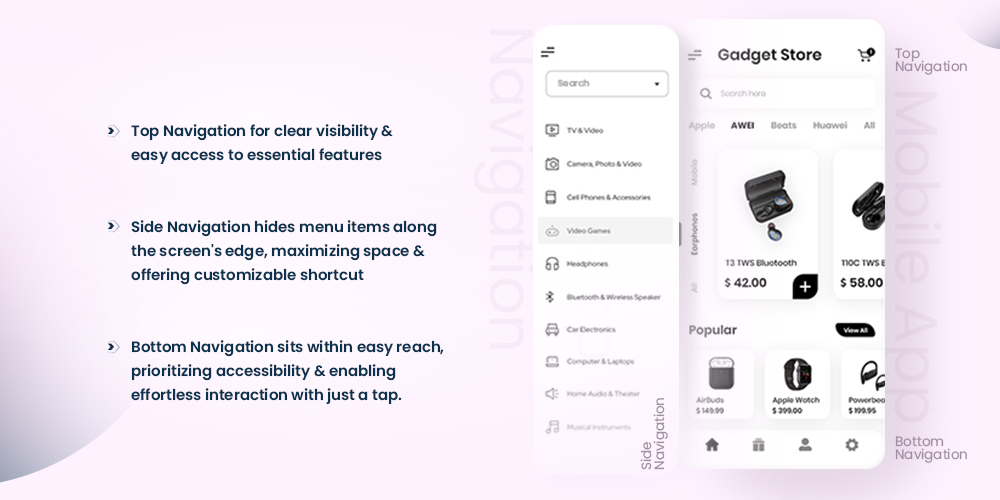
Each menu option brings its unique strengths: top for visibility, side for space-saving, and bottom for accessibility. Together, they form the backbone of simplified navigation, making it intuitive and user-friendly for all.
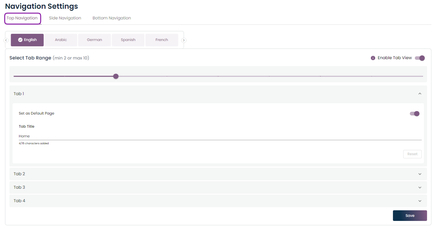
Top Navigation
As customers open your app, the top navigation bar is their gateway to everything it offers. It’s your opportunity to show users their needs matter.
Hence, optimized top navigation ensures a clear, intuitive interface, setting the tone for their experience. Because in this fast-paced world, there’s no second chance for a first impression.
Clear Visibility
Top navigation offers clear visibility by placing essential features prominently at the top of the screen, ensuring they’re immediately visible to users upon launching the app. As a result, users can easily locate and access key functionalities without the need for scrolling or searching.
Clear And Concise Labels For Top Navigation Items
- Be Accurate: Each navigation label should accurately describe the content or functionality it represents. Avoid using vague or ambiguous terms that might confuse users.
- Keep it Short: Aim for brevity in your labels to prevent overcrowding the navigation bar. Use concise wording that conveys the intended meaning without unnecessary complexity.
- Consider Visual Hierarchy: Use formatting techniques such as font size, weight, and color to establish a visual hierarchy within the navigation bar. This helps users quickly identify the most important or frequently used items.
- Use Familiar Language: Opt for words and phrases that are familiar to your target audience. Avoid jargon or technical terms that may be unfamiliar or confusing to users.
- Prioritize Clarity Over Creativity: While it’s tempting to get creative with your labels, prioritize clarity above all else. Users should be able to understand the purpose of each navigation item at a glance.
Overall, designing clear and concise labels for top navigation items and prioritizing them based on user needs are essential steps in creating a user-friendly and intuitive navigation experience
Side Navigation
Imagine your customers trying to navigate through your app, searching desperately for that one feature buried deep down. Side navigation acts as a friendly guide, neatly organizing everything into sections, making it easy for them to find what they need without the headache.
Say goodbye to endless scrolling or tapping around in frustration. Side menu helps you to hide away things you don’t need right now, keeping your screen clean and ready for action.
Side navigation is super accessible, making it easy for everyone to use the app, whether you’re navigating with one hand or using screen readers. It’s all about making sure everyone feels welcome and included in the app experience.
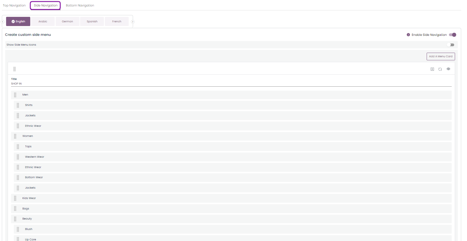
Customizing the side navigation menu enables online merchants to prioritize frequently visited sections such as “New Arrivals” or “Sale Items,” positioning them prominently at the top.
By doing so, merchants facilitate quicker access for shoppers to these key areas, reducing the time spent navigating through menus.
As a result, it streamlines the shopping experience, enhancing efficiency and ultimately increasing the likelihood of conversions.
Let’s Consider A Scenario Where Side Navigation Significantly Improves The Customer Experience
Imagine a customer using a fashion app to browse the latest trends and shop for new clothes.
With the side navigation feature incorporated in your mobile app, customers can effortlessly navigate through various sections and features with ease and efficiency.
- Effortlessly explore various app features like “New Arrivals,” “Categories,” “Favorites,” “Profile,” and “Settings” from the menu.
- Quickly discover the latest trends, filter by size, color, or style, and find exactly what you’re looking for.
- Seamlessly navigate between different clothing categories and discover a wide range of options to match your style preferences.
- Easily add favorite items for future reference with just a tap.
- Access profile section to update shipping address and payment information conveniently.
- Enjoy a seamless shopping experience with visible side navigation, providing quick access to all app features.
How Side Navigation Will Help Shoppers to Navigate and Explore Products Effortlessly
- Quick Access to Key Sections – Side navigation allows shoppers to quickly access essential sections such as product categories, new arrivals, sale items, and account settings without the need for endless scrolling or hunting through menus.
- Cross-Device Compatibility – Concerned about how your customers navigate your online store across different devices?
No need to worry! Side navigation ensures a seamless and consistent experience for shoppers, whether they’re browsing on a phone, tablet, or computer. Its responsive design approach ensures that the navigation menu remains visible and easy to use on all devices. - Streamlined Browsing Experience – With side navigation, shoppers can easily filter and sort products based on their preferences, such as price, size, color, or brand, directly from the navigation menu. This streamlines the browsing experience, enabling shoppers to find products that match their criteria more efficiently.
- Prioritized Favorites – Shoppers can customize the side navigation menu to prioritize their favorite sections or product categories, ensuring quick and easy access to frequently visited areas. This personalized approach saves time and enhances the shopping experience.
Tap Into a Broader Audience With Custom iOS and Android App For Your Shopify Store. No Code Needed!
Reduce Cart Abandonment Rate with Push Notifications. Explore Now!
Try Mobile App Builder For Free
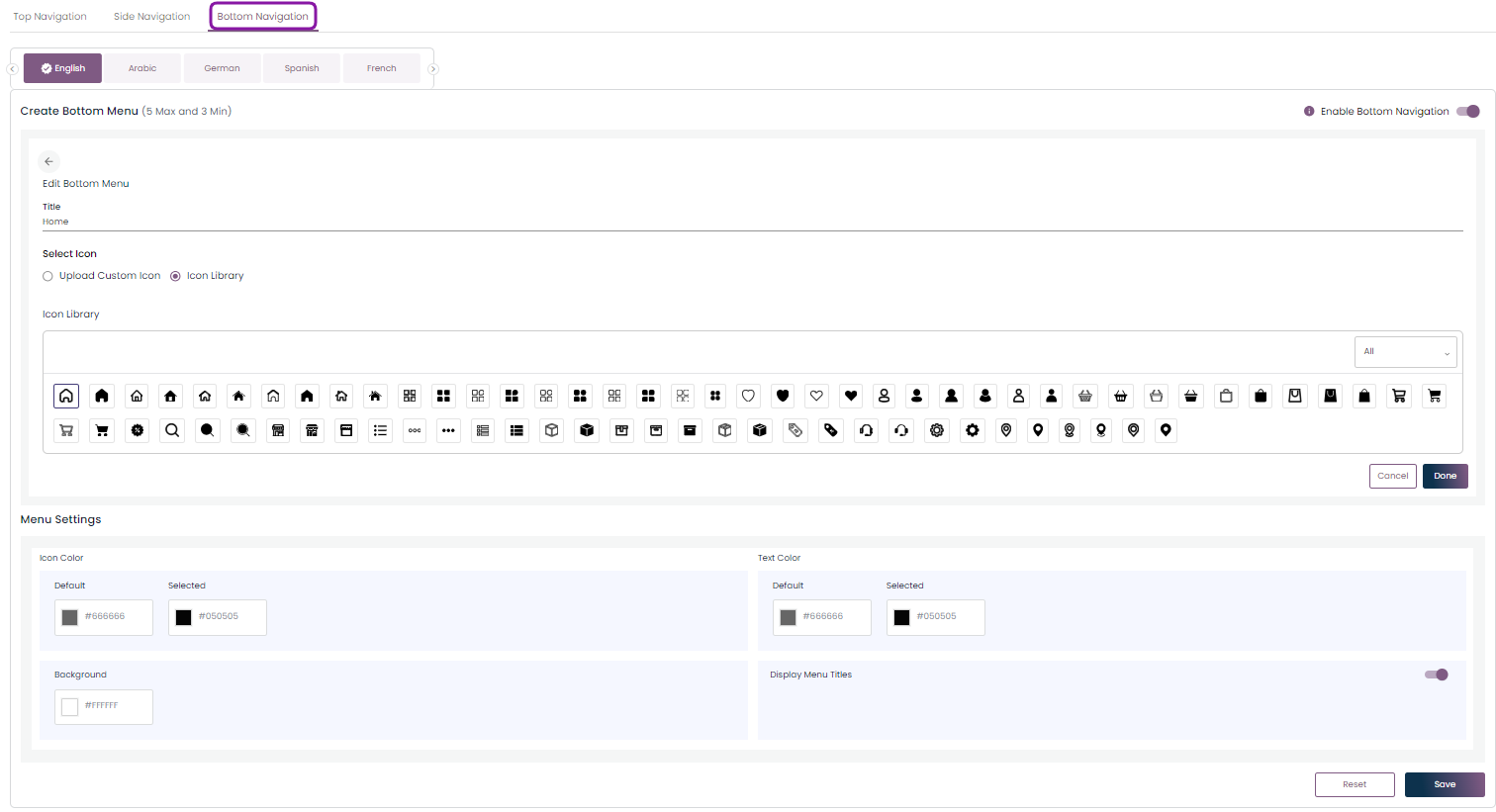
Bottom Navigation
Bottom navigation plays a crucial role in enhancing user interaction in mobile apps by providing quick access to key features, improving navigation efficiency, and maintaining consistency across different screens.
But it’s not just about convenience – bottom navigation also keeps things consistent. You know that no matter where you are in the app, those key features will always be right there at the bottom, ready and waiting for you. It will ensure you never get lost.
Let’s Consider A Scenario Where Bottom Navigation Significantly Enhances The Customer Experience
For instance, your customer is using a food delivery app to order dinner after a long day at work. He wants to get his meal delivered as quickly as possible
With the bottom navigation feature enabled in your mobile app, customers can now indulge in a seamless and delightful ordering experience from start to finish.
- Easy Access: Bottom navigation provides quick access to essential features like search, orders, and account, allowing users to navigate the app effortlessly.
- Consistency: With familiar icons always visible at the bottom of the screen, your customer can easily return to the home screen or access previous orders, ensuring a consistent and intuitive experience.
- Streamlined Navigation: He can swiftly browse nearby restaurants and cuisines, find their favorite restaurant, and explore the menu. Moreover, he will be able to add items to their cart with just a few taps.
- Focused and In Control: Throughout the entire ordering process, bottom navigation keeps users focused and in control, ensuring a seamless and stress-free experience.
- Enhanced Satisfaction: Bottom navigation enhances user satisfaction and encourages repeat app usage. It provides quick access to key features, maintaining consistency, and streamlining navigation
How Bottom Navigation Transforms Your App Experience From Ordinary To Extraordinary
- Effortless Access – Bottom navigation provides easy access to essential features like home, search, favorites, notifications, and profile. As a result, ensuring they’re within reach of the user’s thumb for effortless navigation.
- Keeps It Consistent – It maintains consistency by adhering to established design conventions, allowing users to quickly understand how to navigate the app regardless of their familiarity with the platform.
- Streamlined User Experience – Bottom navigation reduces cognitive load by presenting a fixed set of navigation options, eliminating the need to remember menu locations and leading to a more intuitive user experience.
- Visual Guidance – Recognizable icons or labels in bottom navigation tabs provide visual cues about their functionality, enhancing usability and navigation efficiency.
- Flexible Navigation -It supports multi-level navigation, enabling users to switch between primary and secondary options without cluttering the interface.
Summing It Up – Mobile App Menu Design Is Key To Best Browsing Experience
It’s clear that mobile app menu design is a cornerstone of user experience. Whether it’s top navigation, side navigation, or bottom navigation, each component plays a critical role in guiding users.
As we advance in the constantly evolving realm of technology, optimizing mobile app menu design remains high priority. It will ensure app will deliver exceptional user experiences and nurture long term customer retention.
About The Author

I love navigating the world of SaaS with finesse. As an SEO enthusiast and seasoned Copy Writer, I'm here to transform tech-speak into compelling narratives that resonate with online merchants. With a penchant for alliteration and a touch of humor, I bring a unique flair to SaaS content.
Related Posts

What E-commerce Brands Look for in a Mobile App Theme: A Complete Industry Guide
Choosing the right mobile app theme for an e-commerce brand…

A Smarter Approach to Abandoned Cart Recovery
Abandoned cart recovery is one of the most important yet…

10 Latest Trends in Mobile App Design for Online Merchants
Mobile app design is more than just making things look…


