How To Build Your Mobile App With MageNative Mobile App Builder Version 3.0
1.Overview
The MageNative Shopify Mobile App extension proves to be an invaluable tool for streamlining the development process of mobile applications. With Mobile App Builder for Shopify store, store owners can effortlessly transform their Shopify websites into fully-featured mobile apps equipped with all the functionalities present on the website and more.
MageNative serves as a comprehensive application development platform, facilitating the transition of website interfaces into the mobile application environment. You can customize the app to match the brand image and publish it with help of our experts to meet the requirements of your customers.
The application boasts an engaging interface that presents product information in a captivating and interactive manner, ensuring an enriching user experience. Moreover, its compatibility with both Android and IOS operating systems ensures widespread accessibility across different devices.
Key features are as follows:
- Attractive and User-Friendly Layout – Provides an attractive and user-friendly layout that makes the users instinctively experience how to use the interface.
- Custom Landing Pages – Design custom landing pages that speak directly to the audience by configuring different slider, banner, grid layout and more components.
- Product Listing Page – Maximize your product’s appeal and sales potential with enhanced product listing features.
- Mobile App Analytics – Gain valuable insights into user behavior, engagement, and performance metrics to refine your mobile strategy and drive growth with comprehensive mobile analytics.
- Navigation Settings – Use navigation settings to streamline app navigation by grouping products based on type, brand, and more.
- Multi-Lingual and RTL Support: It supports multiple languages and the right to the left theme. In the right to the left theme, writing starts from the right of the page and continues to the left.
- Drag and Drop: The drag and drop app builder allows you to build your app by simply dragging and dropping different blocks of the app.
- Real-time Synchronization: The app synchronizes with your store in real-time, so whatever changes you make in your store are automatically reflected in the app.
- Supports all product types: It supports all types of products available in the Shopify store.
- Search: The enhanced search feature is available to search the required product in the app based on the name, description, and category of the product.
- Barcode And QR Code Reader and Scanner: QR Code Reader is used for Product sharing and easy product search. Barcode Scanner is used for the Real-world product search.
- Segmented Push Notification: Merchants can leverage push notifications to send unlimited notifications and schedule them for segmented audiences as below:
- Inactive Users: To target those who have been inactive over the past several days with tailored messages to re-engage them.
- Welcome Notification: Deliver warm greetings to new users, providing a personalized introduction to your platform or services.
- Abandoned Cart Notification: Remind users who have left items in their cart to complete their purchase, helping to recover potential lost sales.
- Social Login: A single sign-on technology is used that enables users to authenticate themselves to the MageNative Shopify Mobile App by connecting through social media, such as Facebook and Google.
Thus, offering an option to register, log in with their regular social login ID and password rather than going through the regular process of registration for using the App.
2.Theme Settings
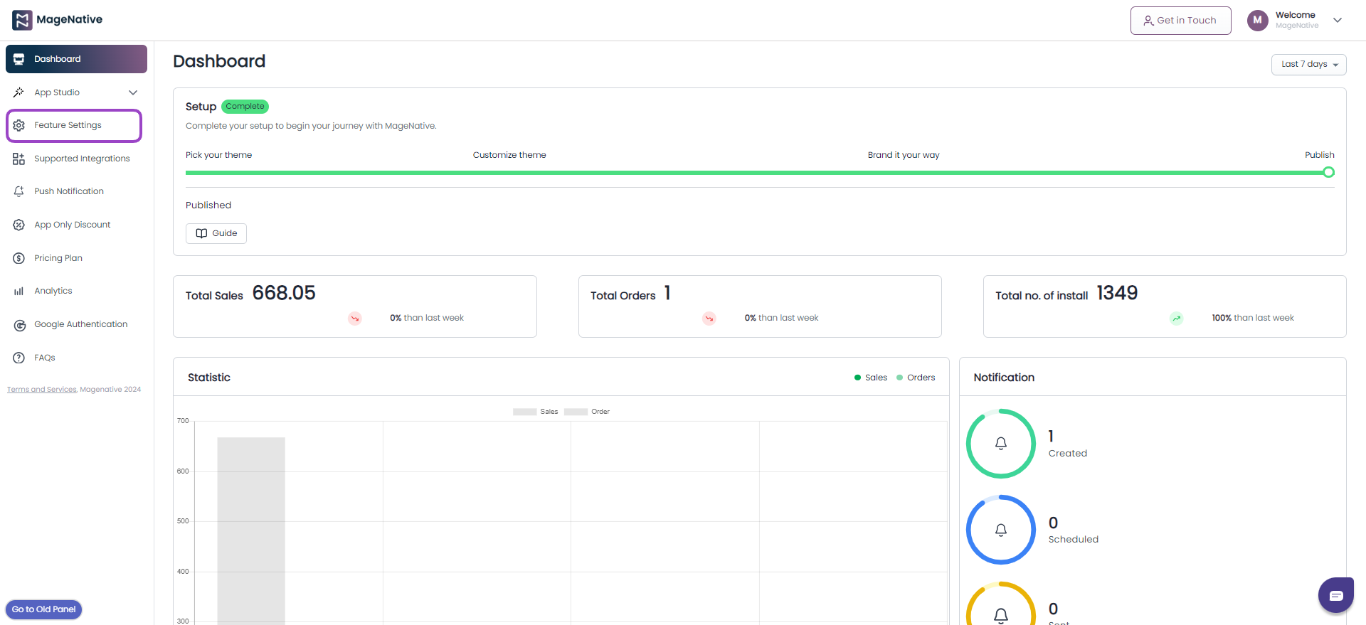
After installing the app, start by designing a homepage that seamlessly aligns with your brand’s identity and personal preferences. With MageNative mobile app builder app, you can seamlessly make customization with minimal effort and view your changes in real-time.
Click the ‘Let’s Get Started’ button from the dashboard.
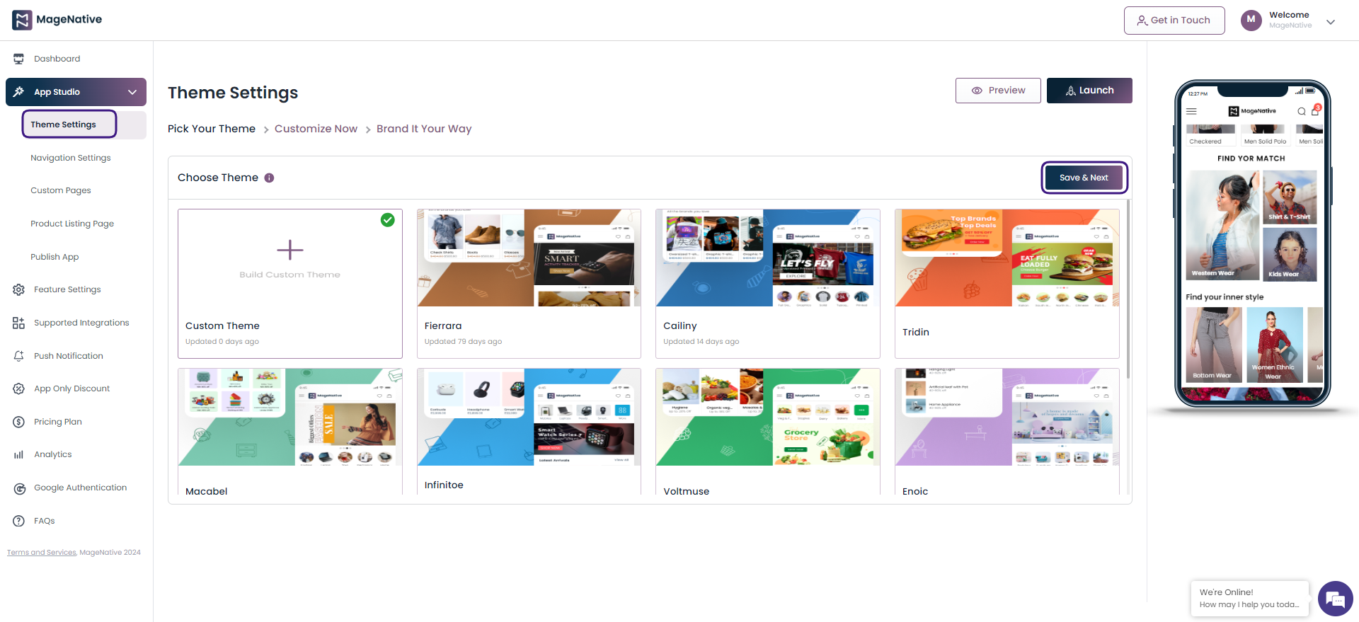
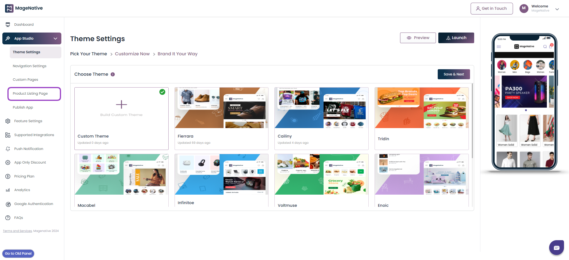
After this, you will be redirected to the Theme Settings page, here you choose a theme tailored to your store’s specific needs by selecting from a variety of options that best suit your brand and industry.
1- Pick Your Theme
- Under the Pick Your Theme select a theme tailored to your store’s specific needs by selecting from a variety of options that best suit your brand and industry.
- Click on the Save & Next button.
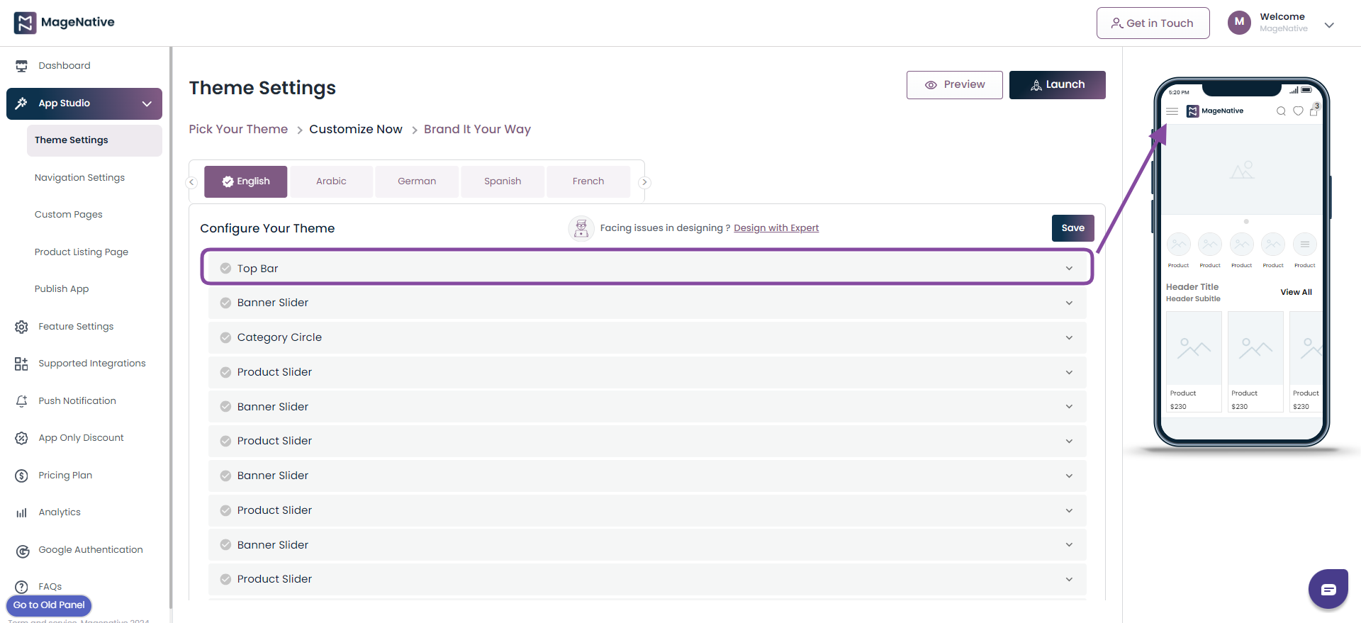
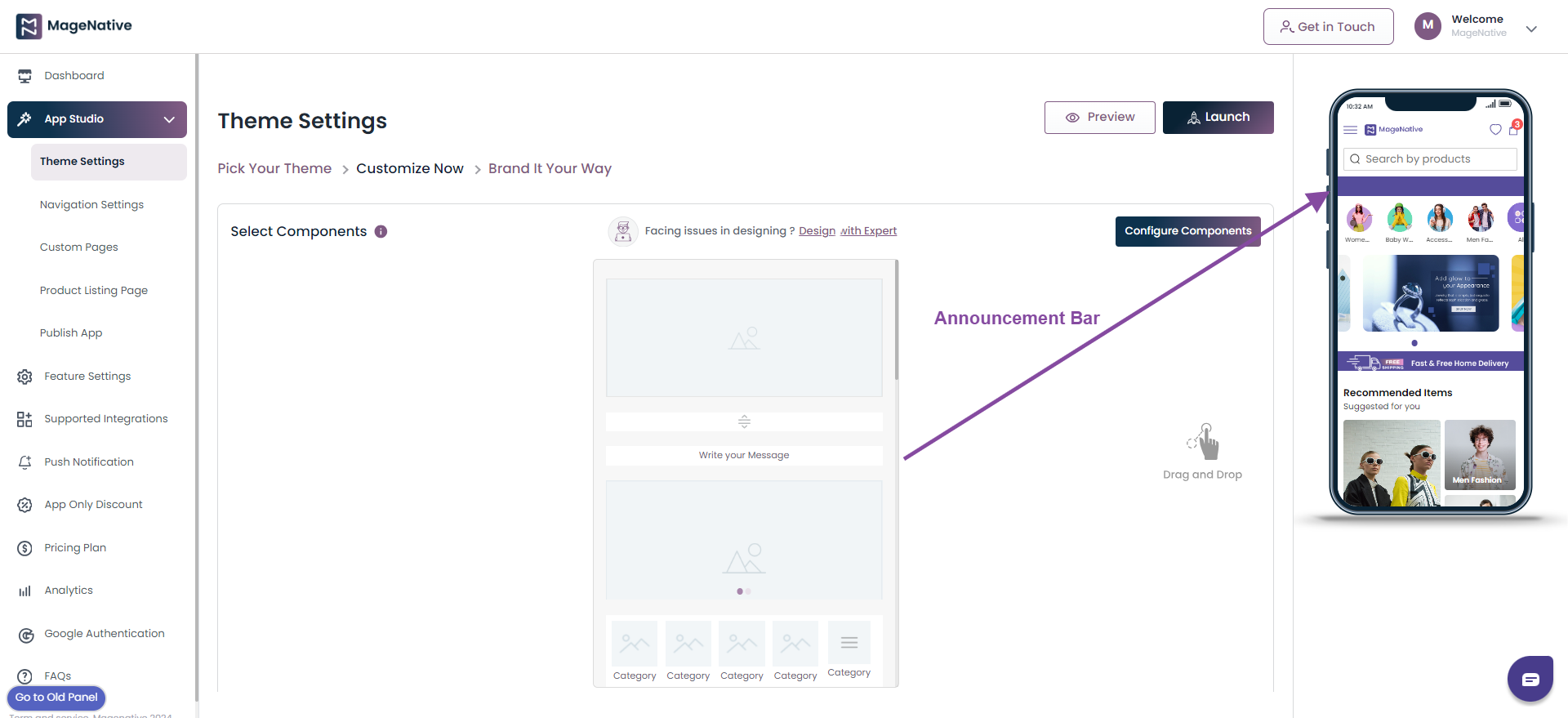
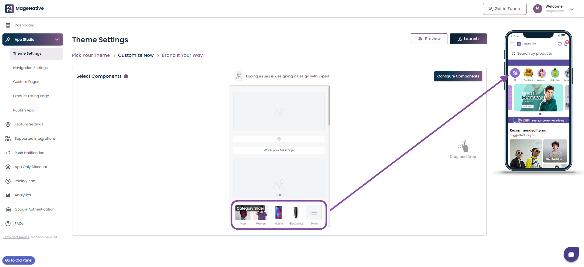
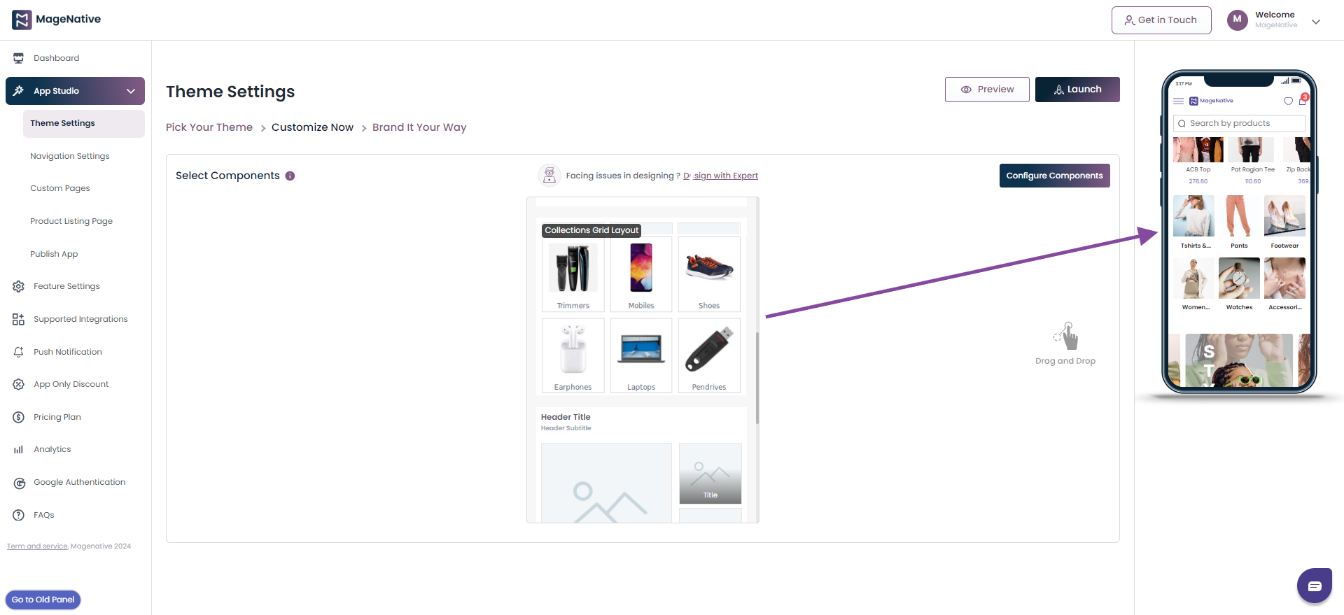
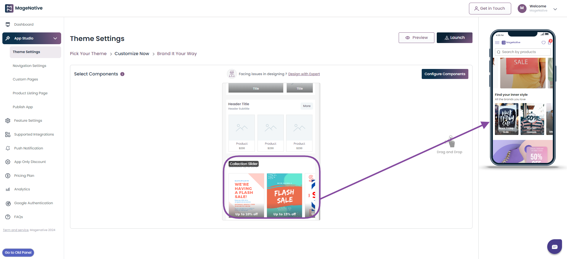
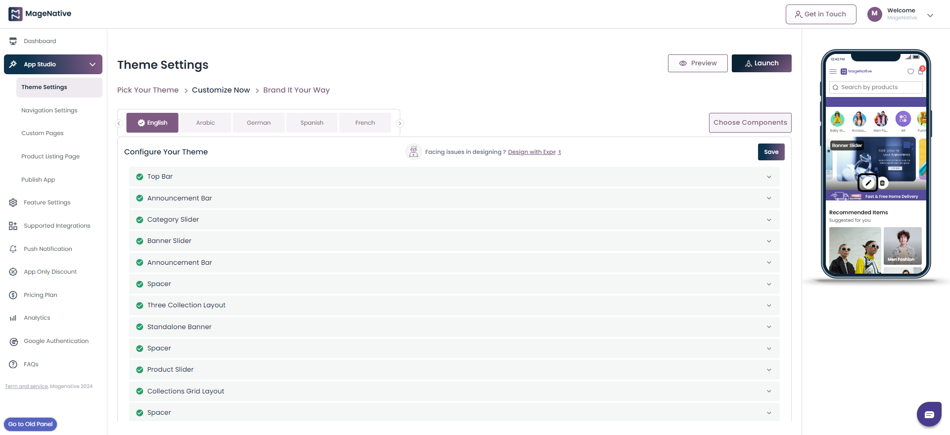
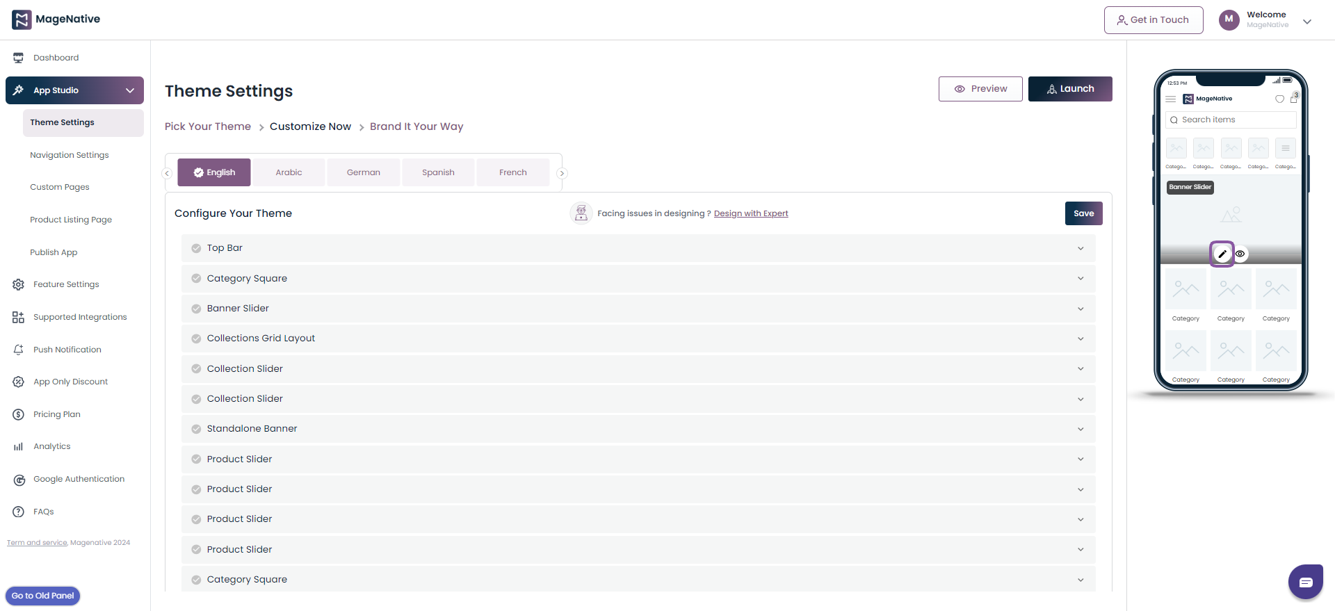
2- Customize Now
Here, You’ll find the list of Components enabled on your home screen.
On the right side you’ll find the mobile app interface, where you can effortlessly Drag & Drop components and witness real-time updates as you do the modifications.
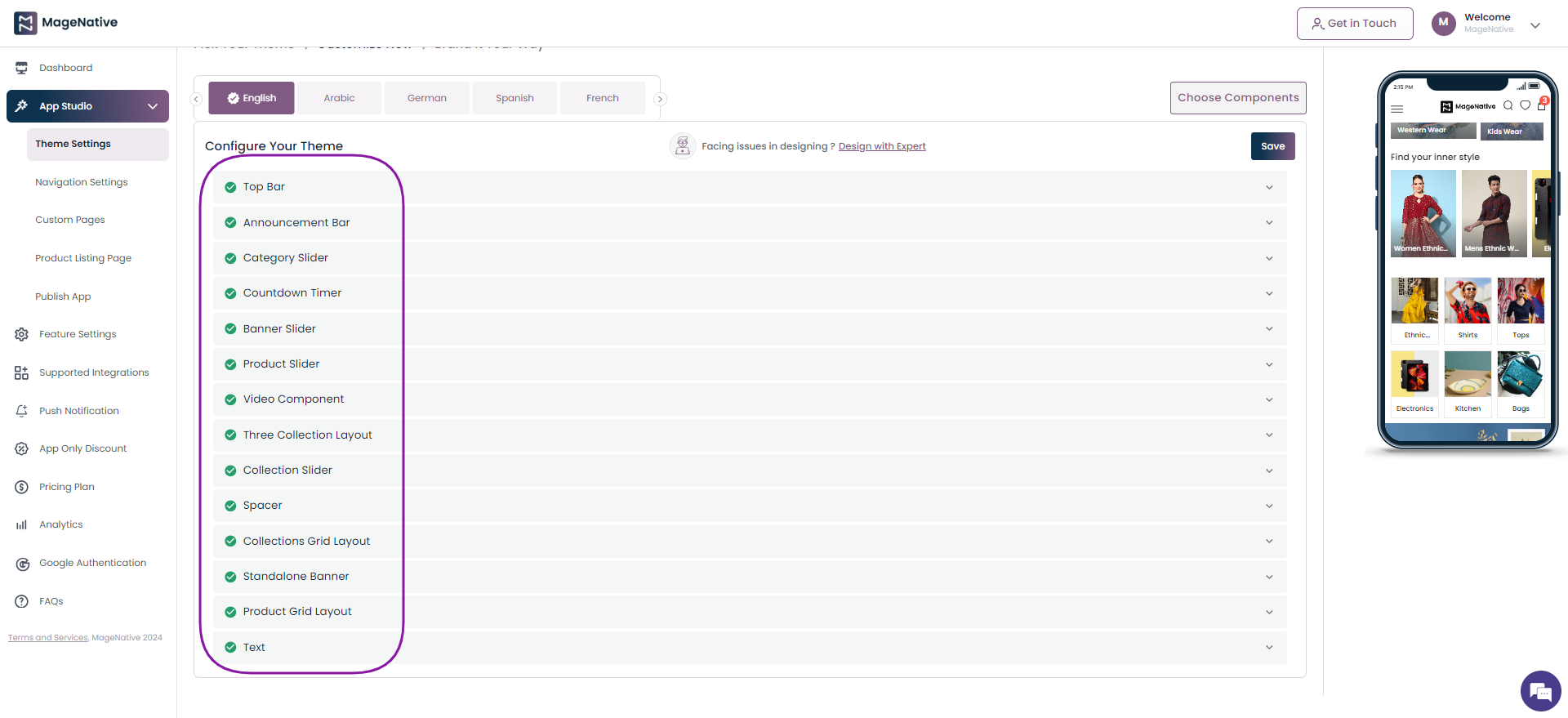
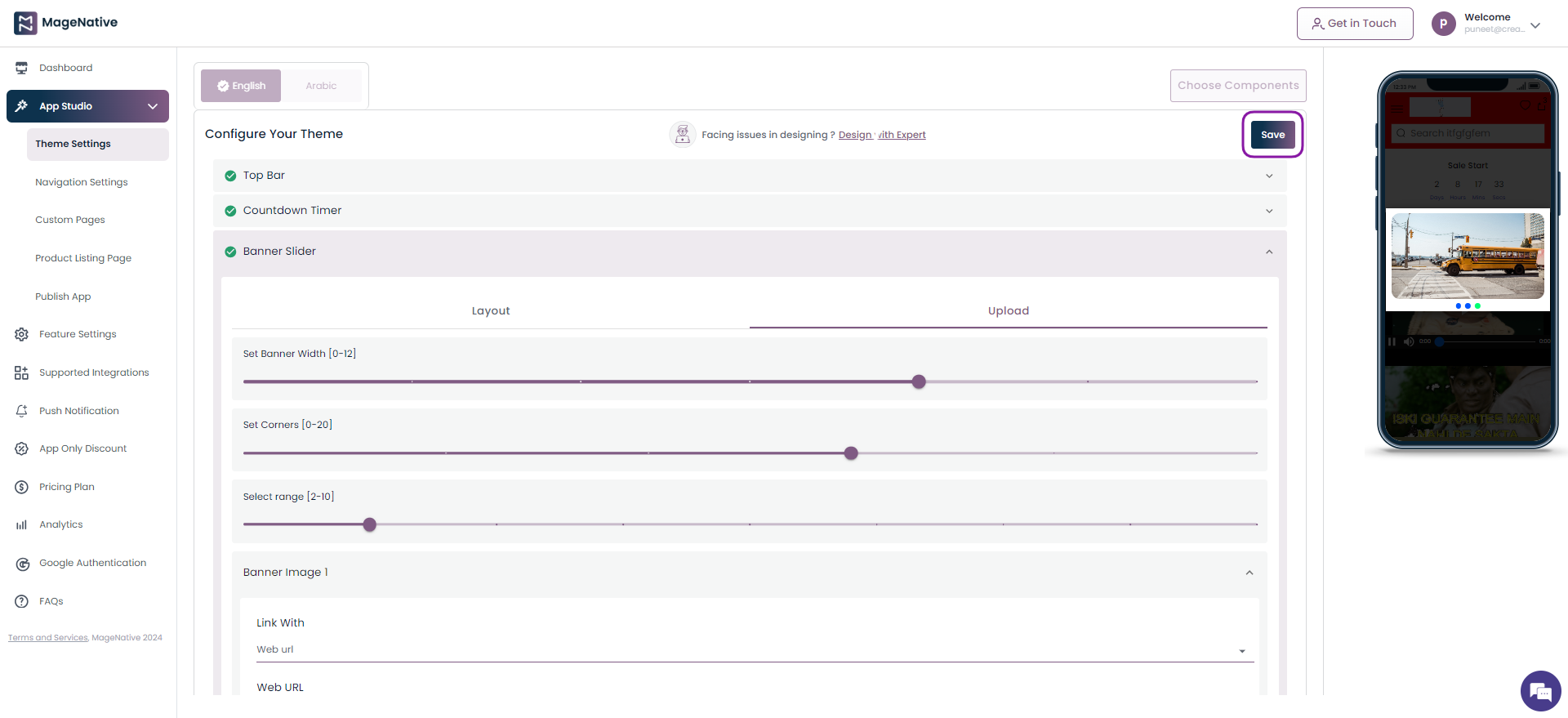
You can configure 11 design components as below to enhance the design of your app and align it with your brand identity.
- Top Bar
- Standalone Banner
- Spacer
- Announcement Bar
- Banner Slider
- Category Slider
- Product Slider
- Collection Slider
- 3 Collection Layout
- Collection Grid Layout
- Product Grid Layout
- Countdown Timer
- Video Component
- Text
Each component allows you to adjust its layout and enable you to upload any item into it.
3- Brand It Your Way
MageNative lets you personalize your mobile app to suit your brand’s image and color. This personalization is essential for your loyal customers to connect with your app and feel comfortable while using your app.
Click on the Brand It Your Way section.
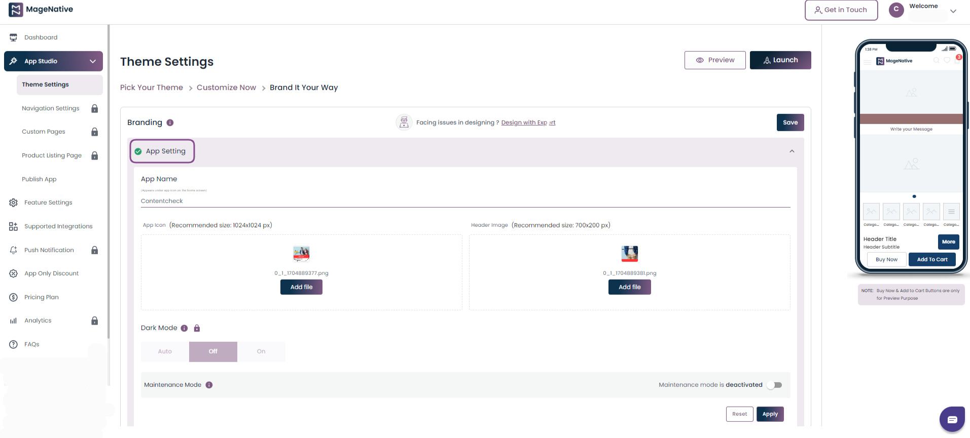
(i) App Setting: Here you are required to fill in all the details of your app in the App Setting section.
1- App Name: Here you need to enter the title of your app, which appears under the app icon on the home screen. So, select a title that aligns with your business type.
2- App icon: The app icon image needs to be 1024 px*1024 px size for the icon to be visible clearly.
3- Header Image: The minimum requirement for a Header image is 700px*200px.
4- Dark Mode: Also, MageNative has come up with the most recent feature i.e. Dark Mode which you can set as per your requirement, by choosing Auto, Off, or On Mode.
5- Maintenance Mode: Maintenance mode lets you display a message to your users when your app is temporarily out of service or is in the under-development phase.
(ii) Color and Font Selection: Under this section customize the colors and fonts within your app for a tailored and visually appealing experience.
Here’s where you can give an appealing touch to your mobile app the way you want. You can adjust the Global Color and Top Navigation Color in your app. All you need to do is hover over the color, and you can pick out the hex codes of the respective colors.
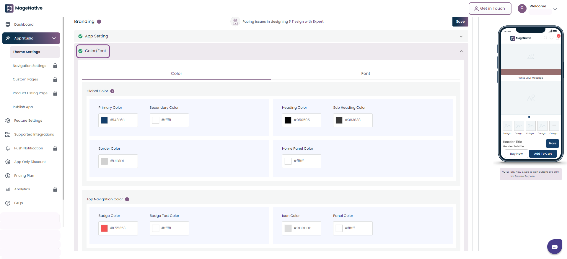
Save the changes you’ve made and preview them in real-time by clicking on the Apply button at the bottom of the page.
Then finally, you can click on the Save button in the top right corner of the app to save all the changes you have made in your mobile app.
3.Theme Components
Start customizing your mobile app in the Theme Settings section. Just drag and drop the component you want to add to your mobile app and preview the changes happening in real-time on the mobile screen next to it.
But, lets first have an overview of how to configure themes to create a visually appealing and user-friendly mobile app.
Table of Content
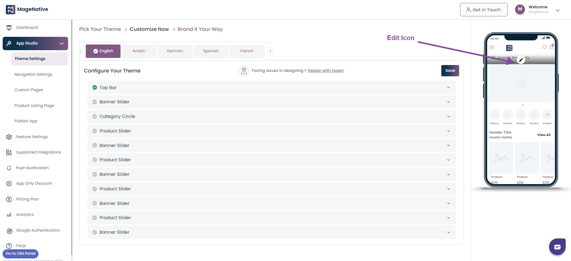
(I) Top Bar
The Top Bar appears at the top of your mobile screen. It provides navigation and actions related to the current screen. It is used for branding, wishlist, screen titles, search, and navigation.
Step 1 – Clicking on the Edit icon lets you change its Layout and Upload image elements.
- Layout: In the layout section, you can set the Search Position of the Display Layout Option. It can be set to one of the below.
- Search As Icon
- Middle Search
- Full Width Search
- Middle Logo
Also, under the Search Bar Placeholder choose the text to be displayed in the search bar.
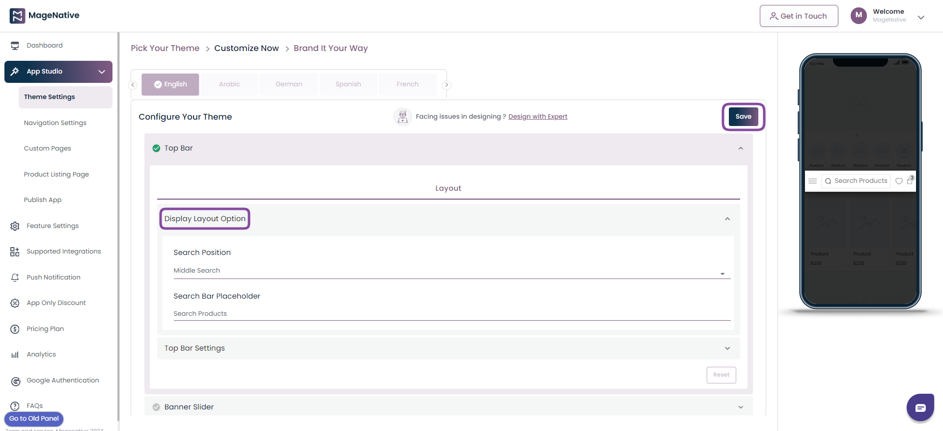
Step 2- Save: Once you are done with all the changes, click the Save button to preview the changes.
Reset: The Reset button lets you reset all the changes you have made in the component.There are a variety of components by making use of which you can build and customize your app.
You can see the list of components that are enabled on your home screen. Right next to it, you’ll see a preview of all the components and changes you make. Let’s discuss each component and its functionality.
(II)- Standalone Banner
A Standalone banner lets you display special offers or sales in your mobile app.
Step 1- Drag it to the mobile screen next to it and see in real-time how it will look in your app. (Note– applicable for custom themes only).
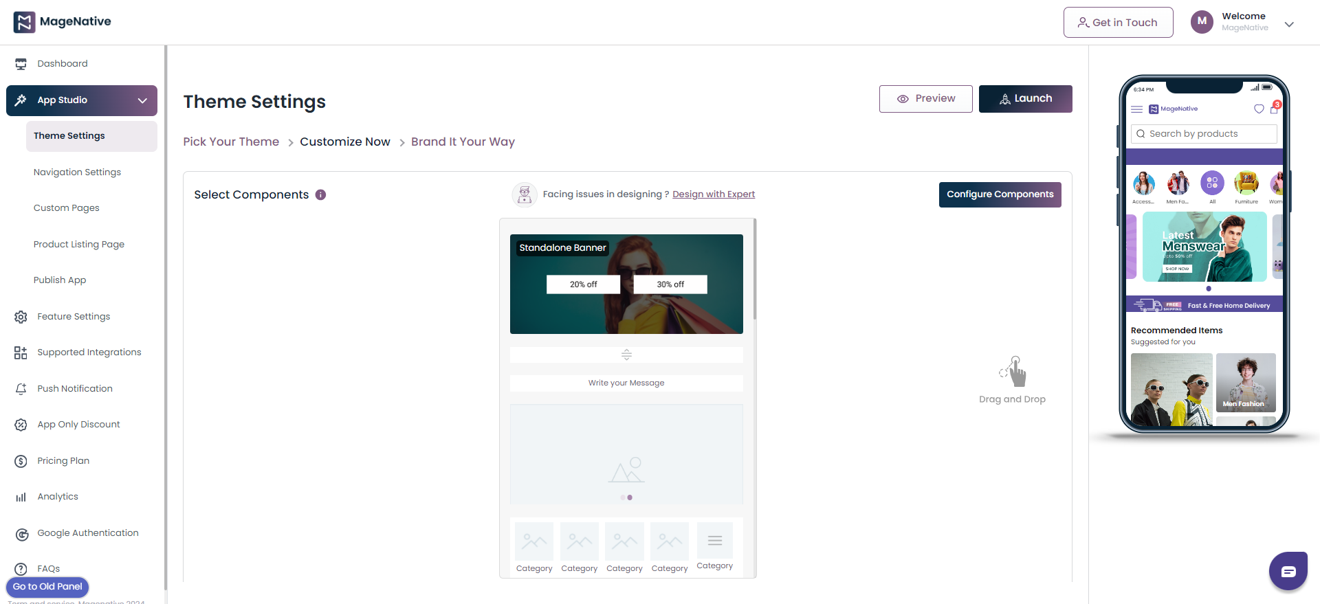
Step 2- When you click the Edit icon, you can easily view all its functionalities in the left side, where you can make modifications as per your requirement.
Users can also edit the components by clicking the configure component button.
(Note – This step is valid for the custom theme only for predefined themes; regular editing will work.)
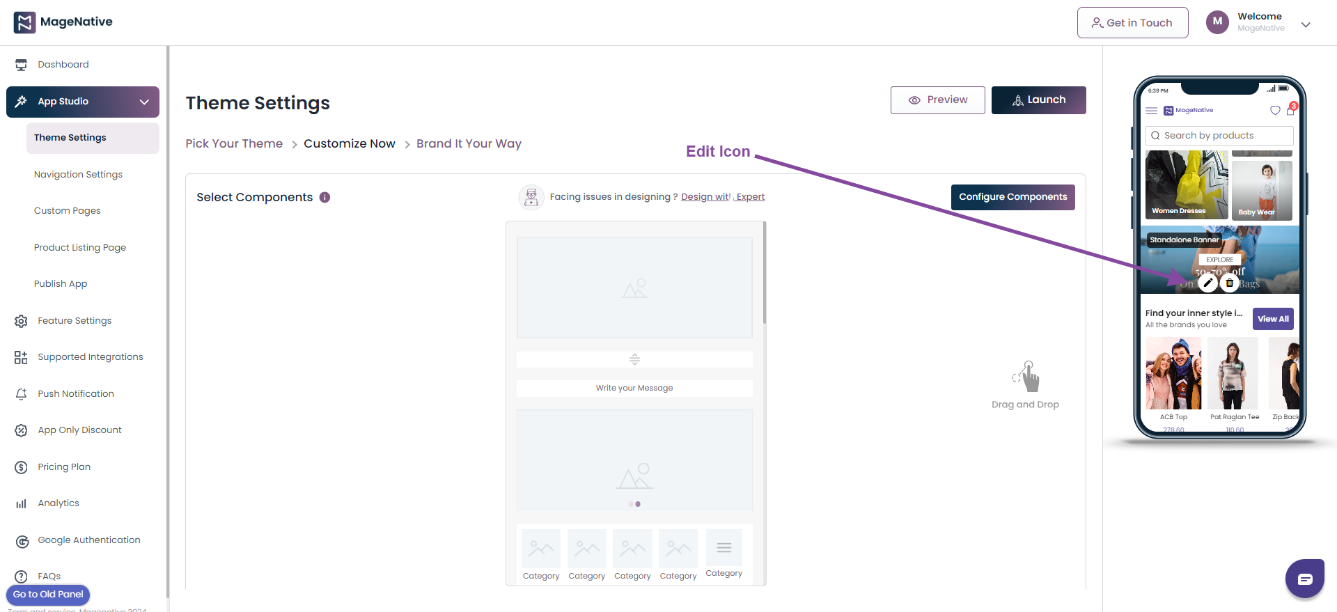
Step 3- After clicking on the Edit icon, you can modify the Layout of the banner and Upload desired images into it.
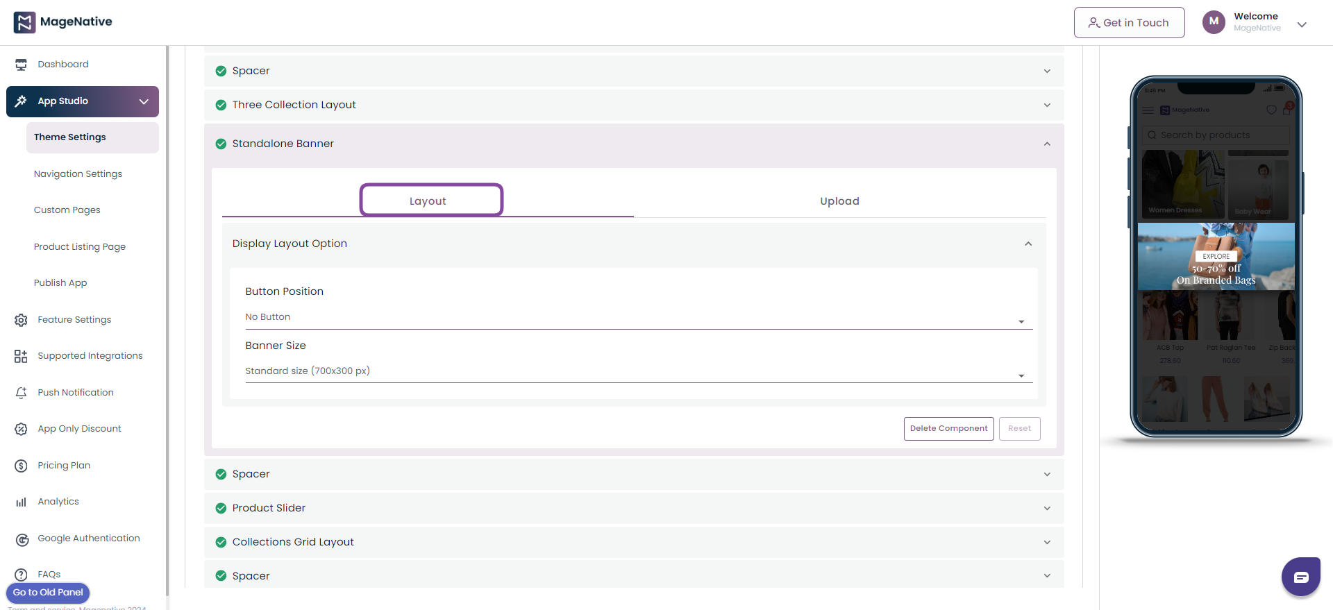
Layout:
Display Layout Option:
- Button Position: Choose the button position as one of the below
- Middle
- Bottom
- No Button
- Banner Size: Choose the suitable size for your banner from size available as below.
- 700px300 px
- 700×120 px
- 700×500 px
- 700×900 px
- Button Position: Choose the button position as one of the below
Upload:
Here in the Upload section, you can upload the image and add a Banner Link to it.
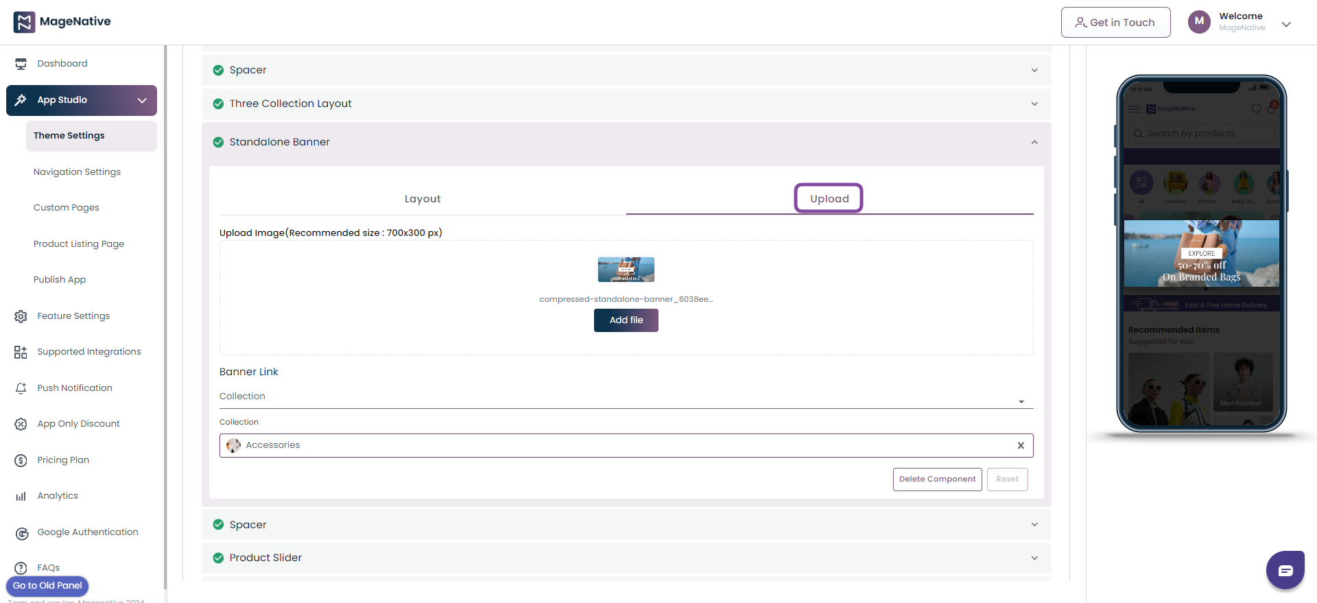
Step 4- Save: Once you are done with all the changes click on the Save button to save all the changes.
Step 5- Delete Component: You can delete the component by clicking on the Delete Component button.
Step 6- Reset: The Reset button empowers you to reset all the changes you have made in the component.
(III) – Spacer
Spacer lets you give space between the components to make them more appealing.
Step 1- Under the Set Height choose the height value on the scale provided and it will get reflected on the mobile app screen on the right side.
Step 2- Click on the Select Color to select the appropriate color. Now click on the save to save the changes done.
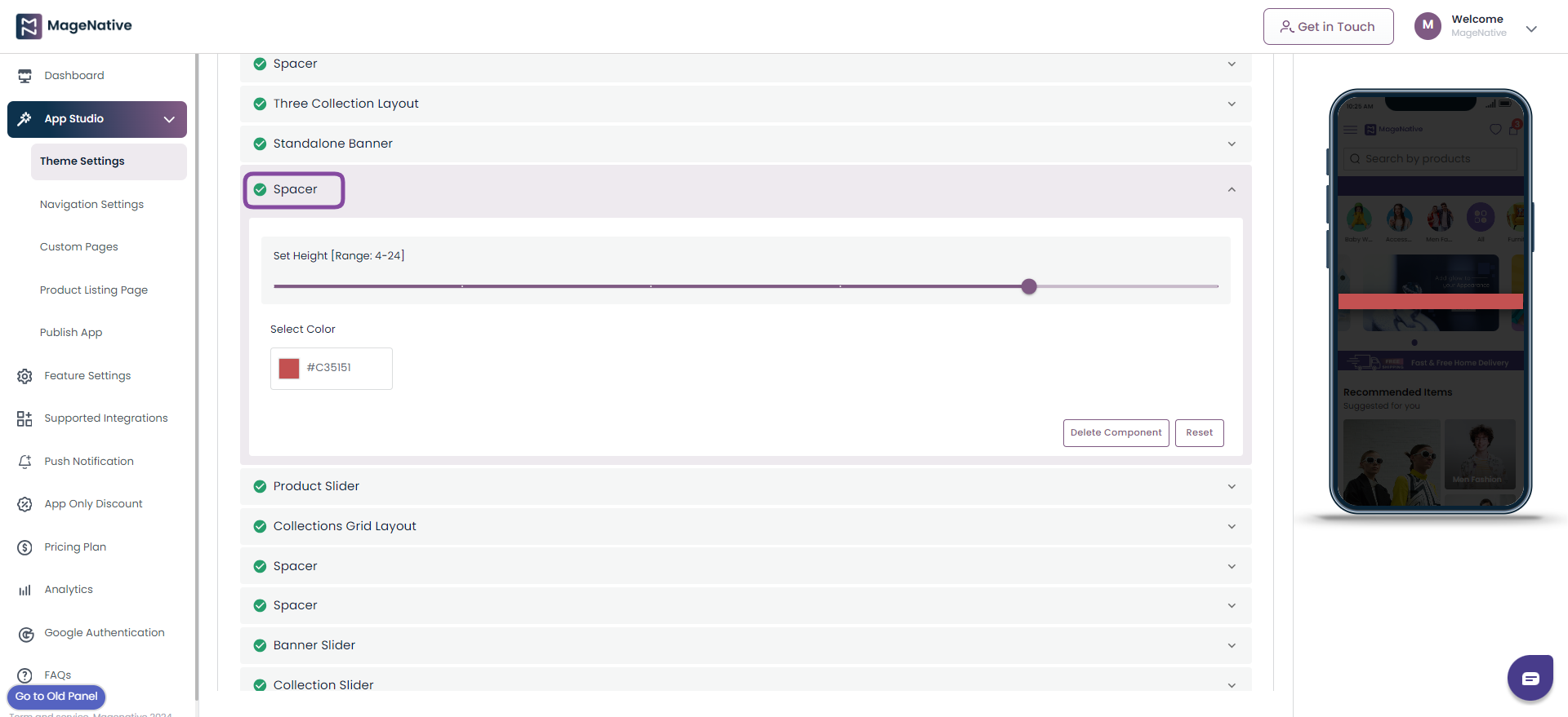
Step 3- Save: Once you are done with all the changes click on the Save button to preview the changes.
Step 4- Delete Component: You can delete the component by clicking on the Delete Component button. (Note: Delete Component Button is only available for Custom theme and not for pre-built themes.)
Step 5- Reset: The Reset button empowers you to reset all the changes you have made in the component.
(IV)- Announcement Bar
The announcement bar lets you announce any special offer, new arrivals, or any other special event on your mobile app.
Step 1- Click on the Edit icon on the announcement bar.
Step 2- It lets you modify the following things:
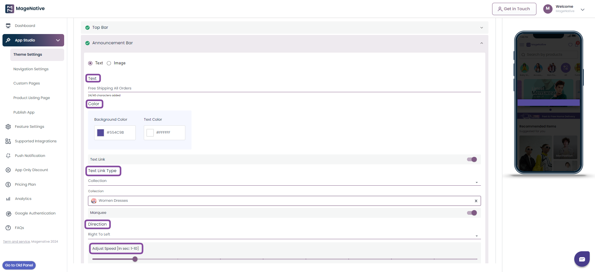
- Text – The name to be displayed on announcement bar
- Color -The text and background color of annoucement bar
- Text Link Type– The link on which you want to redirect customers. You can redirect it to Collections, Custom Pages, Product, and Web url
- Marquee – To adjust direction of text in maequee
Step 3- Save: Once you are done with all the changes click on the Save button to preview the changes.
Step 4- Delete Component: You can delete the component by clicking on the Delete Component button. (Note: Delete Component Button is only available for Custom themes and not for pre-built themes.)
Step 5- Reset: The Reset button empowers you to reset all the changes you have made in the component.
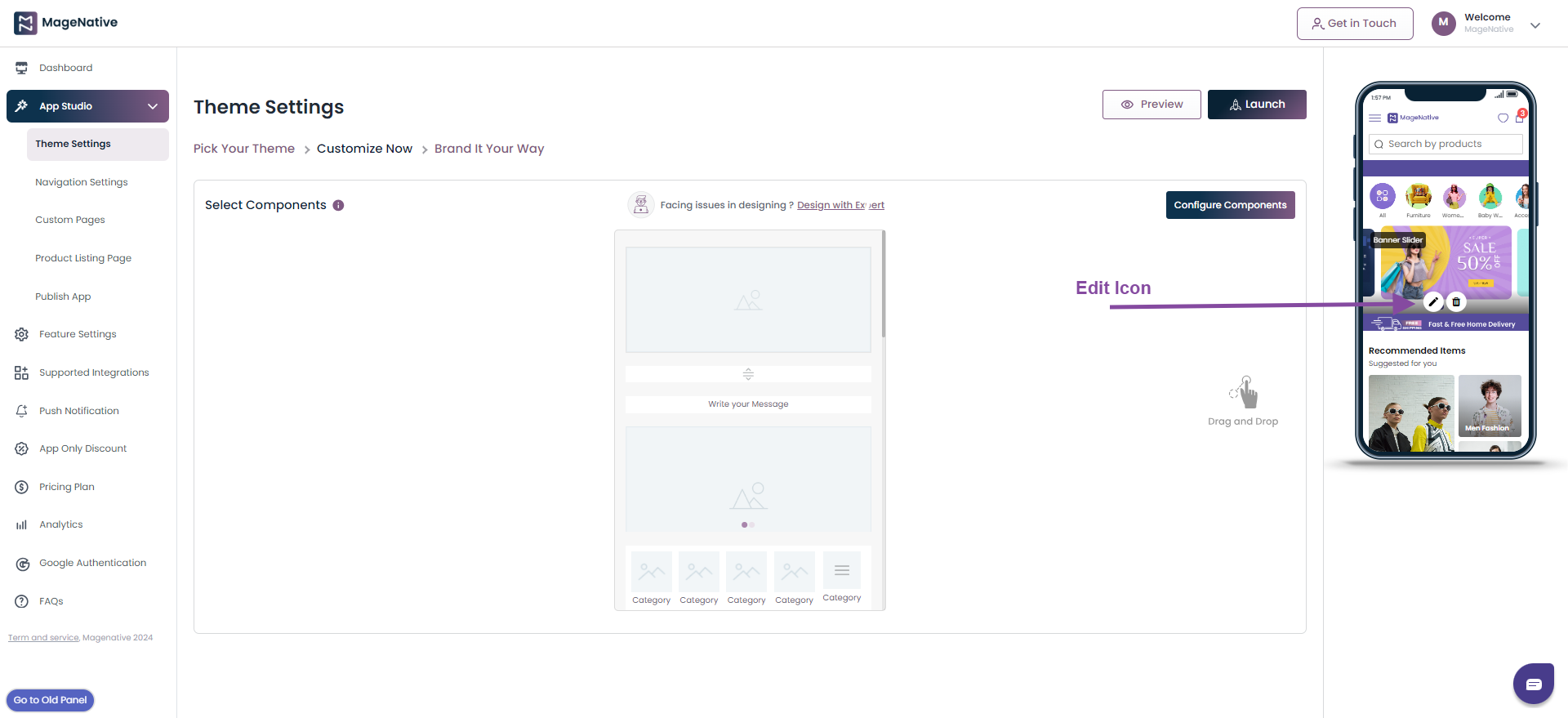
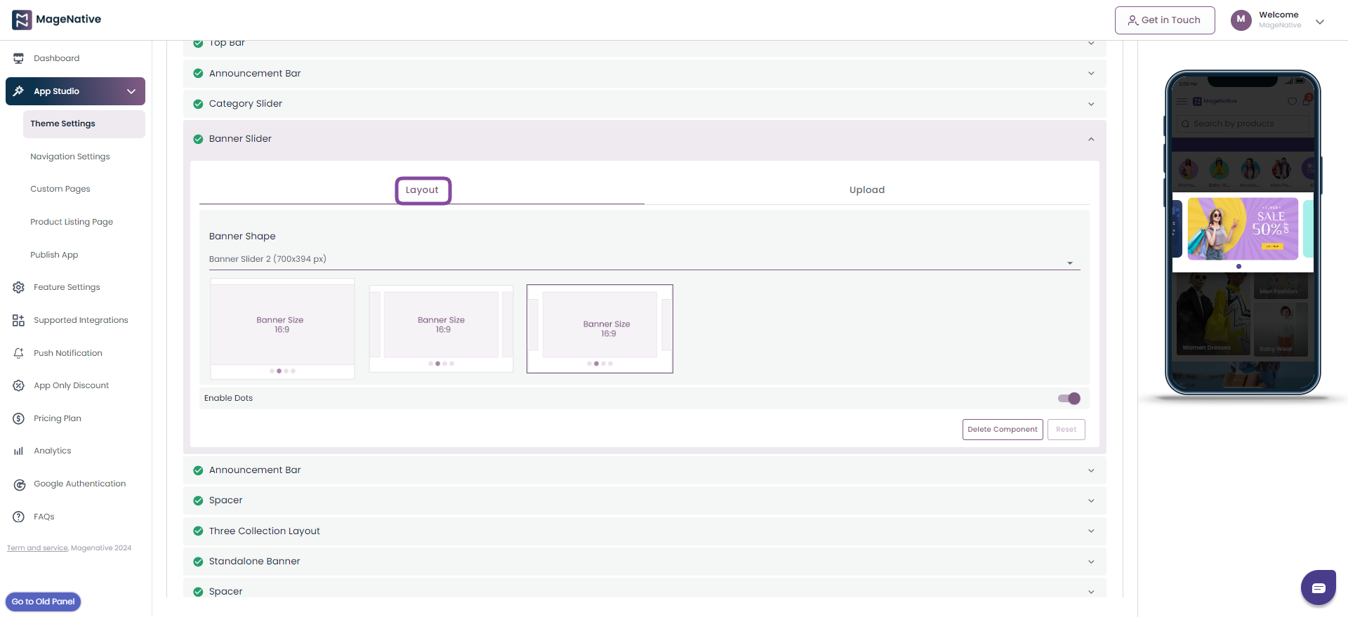
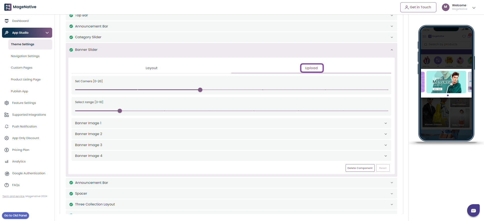
(V)- Banner Slider
The Banner Slider lets you add different banners to your app to make it look more enticing and appealing.
Step 1- You can Drag it to the mobile screen next to it and see how it will look in your app.
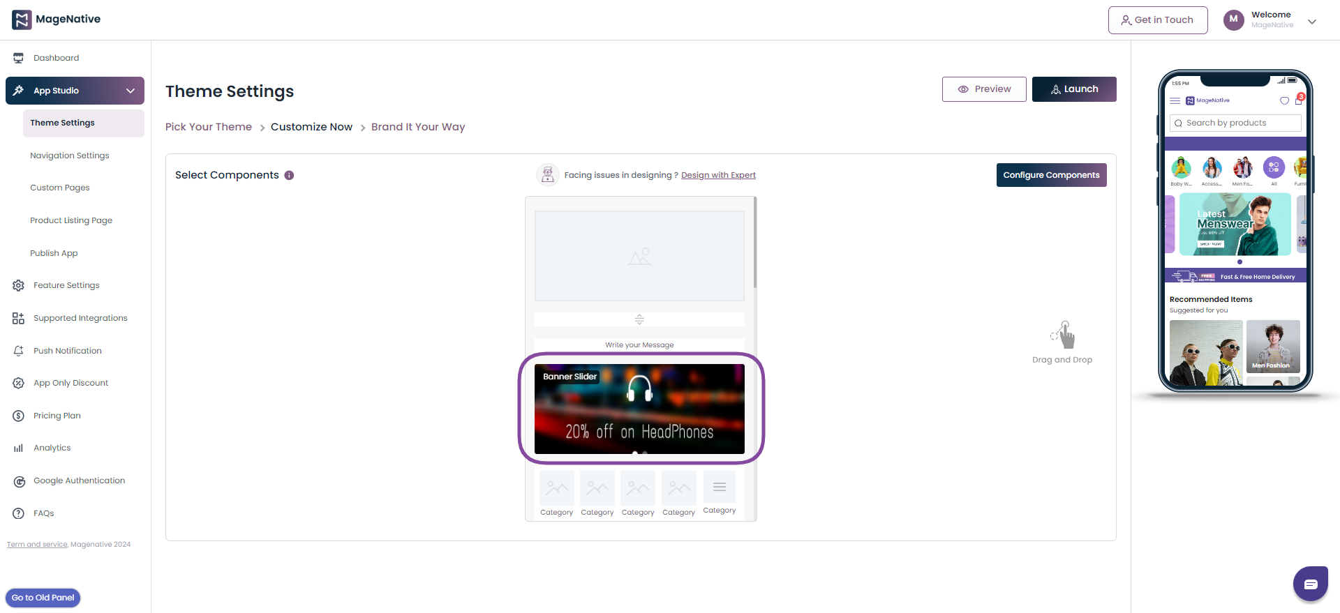
Step 2- The Edit icon allows you to view all functionalities in the left side, where you can make modifications as per your requirement.
Step 3- Click on the Edit icon to modify the Layout of the banner slider and Upload desired images into it.
Layout Section:
- In the Layout section, you can adjust Banner Shape as per your requirement.
- You can enable/disable the dots below the banner with Enable Dots.
Upload Section:
Here you can upload banner images and set Banner width, adjust Corners, and Select Banner Ranges as per your requirement.
Step 4- Save: Once you are done with all the changes click on the Save button to preview the changes.
Step 5- Delete: You can delete the component by clicking on the Delete Component button.
(Note: Delete Component Button is only available for Custom theme and not for pre-built themes.)
Step 6- Reset: The Reset button empowers you to reset all the changes you have made in the component.
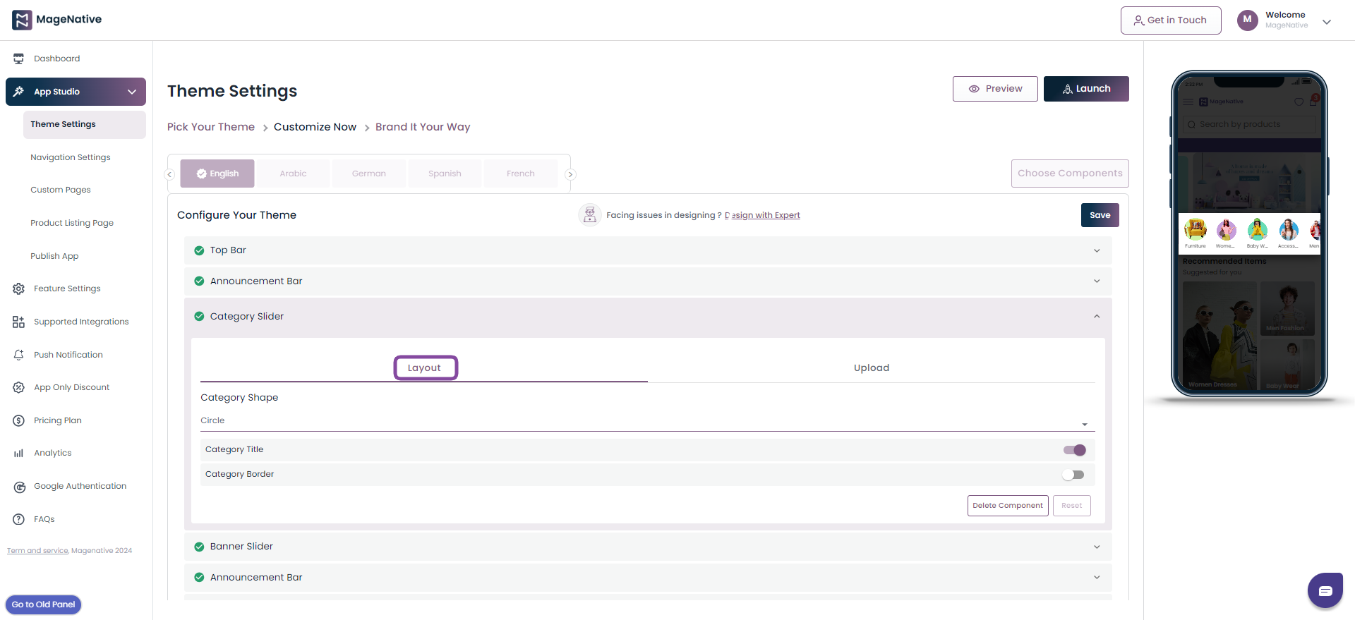
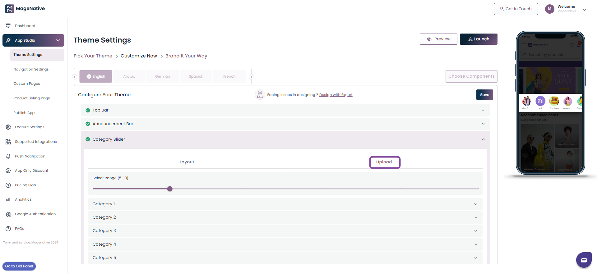
(VI)- Category Slider
You can categorize your products and offers using the Category Slider component. It will ensure customers can easily find the product they are looking for. For example, you can segment products into categories like Men, Women, etc.
Step 1- Drag the component to the mobile screen next to it and see what it will look like in your app.
Step 2- The Edit icon lets you change the layout in the category slider. Also, you can upload an image element into it.
Step 3- Click the Edit icon to view all its functionalities in the left side and edit it as per your requirement.
Step 4- Layout: Select the Layout section to choose the category shape, category title, and category border.
Step 5- Upload: In this section you can upload product images. It also lets you choose the page to link with your category and add category title.
Step 6- Save: Once you are done with all the changes click on the Save button to preview the changes.
Step 7- Delete Component: You can delete the component by clicking on the Delete Component button. (Note: Delete Component Button is only available for Custom theme and not for pre-built themes.)
Step 8- Reset: The Reset button empowers you to reset all the changes you have made in the component.
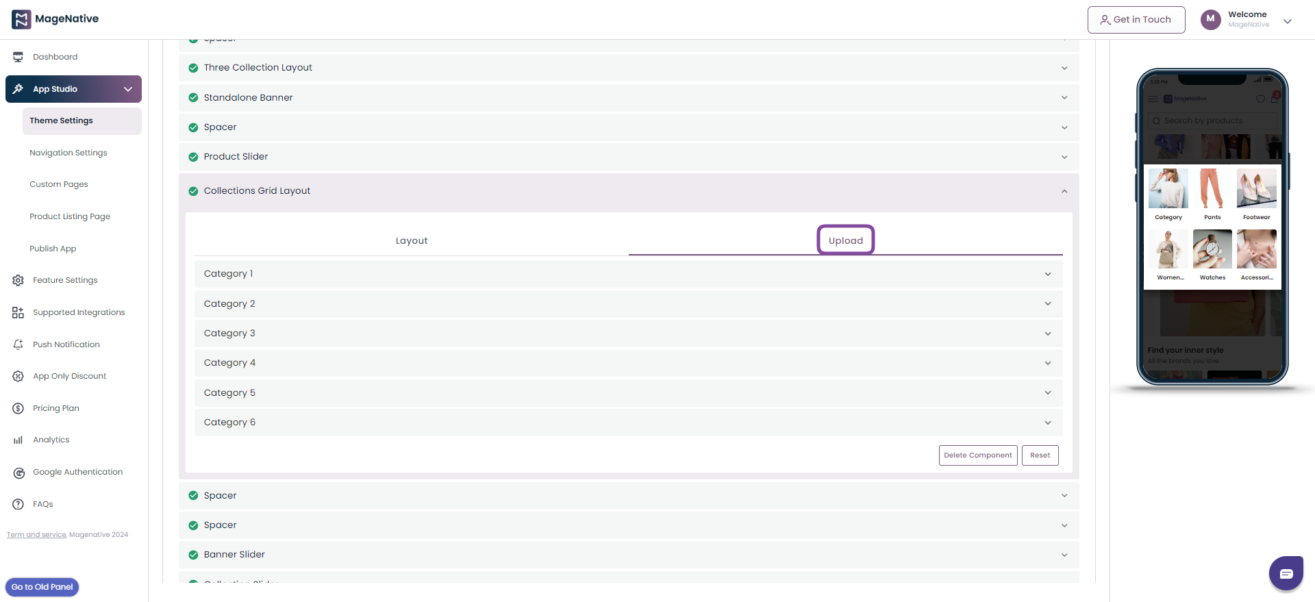
(VIII)- Collection Grid Layout
The collection grid layout lets you showcase your product collection in the form of a grid. Here you can adjust its layout by adding ‘no of rows’, ‘Item shape’, or ‘text alignment’.
Step 1- Drag it to the mobile screen next to it and see how it will look in your app.
Step 2- Click the Edit icon to view all its functionalities in the left corner, where you can make modifications as per your requirements.
Step 3- Using Edit feature you can modify the Layout of the banner and Upload desired images.
Step 4- Layout: In the Layout Section you can adjust number of rows, category shape, and text alignment. Also, it allows you to enable/disable header title, category grid title, and category grid border.
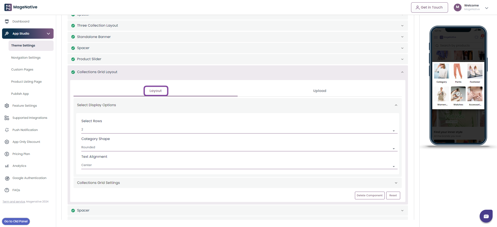
Step 5- Upload: Here you upload the category image, add category title, and link it with relevant page on the mobile app.
Step 6- Save:Once you are done with all the changes click on the Save button to preview the changes.
Step 7- Delete Component: You can delete the component by clicking on the Delete Component button. (Note: Delete Component Button is only available for Custom theme and not for pre-built themes.)
Step 8- Reset: The Reset button empowers you to reset all the changes you have made in the component.
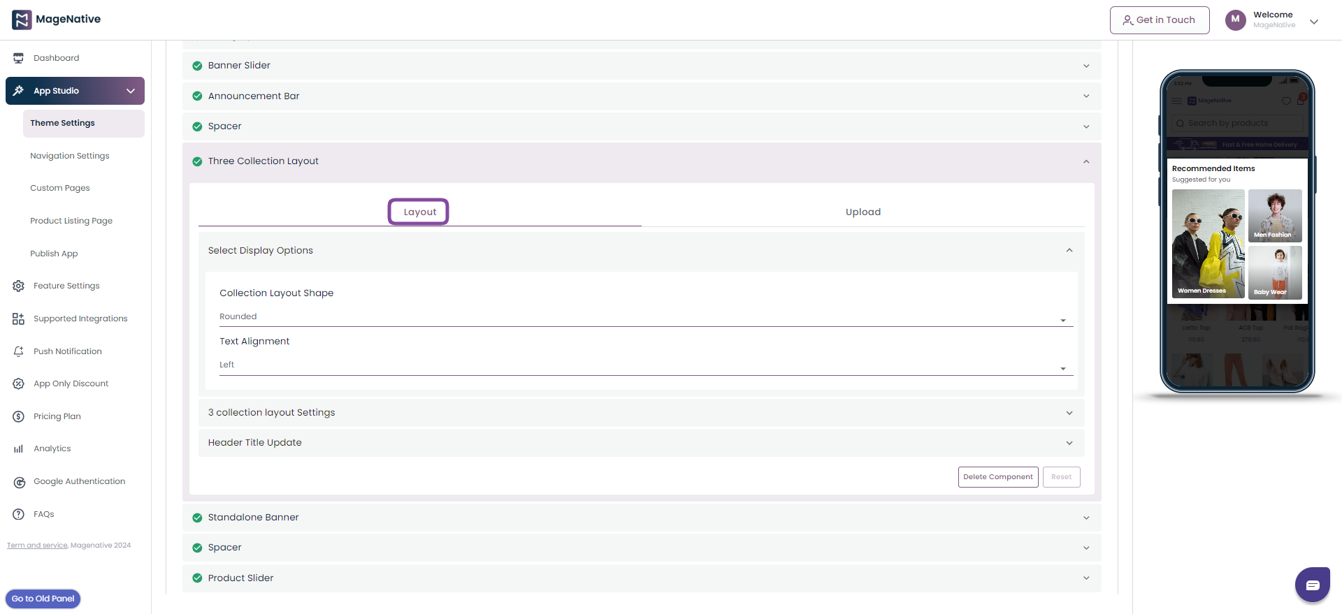
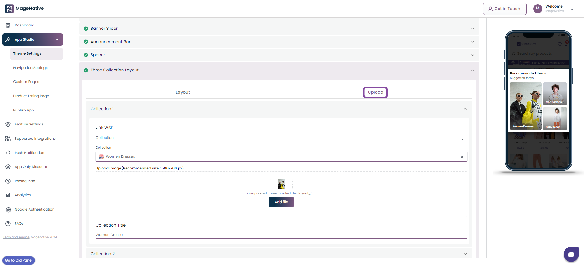
(IX)- Three Collection Layout
Another useful component in the app is the three collection layout, here you can show one main featured item and related items on the screen.
Step 1- Drag it to the mobile screen next to it and preview how it looks like.
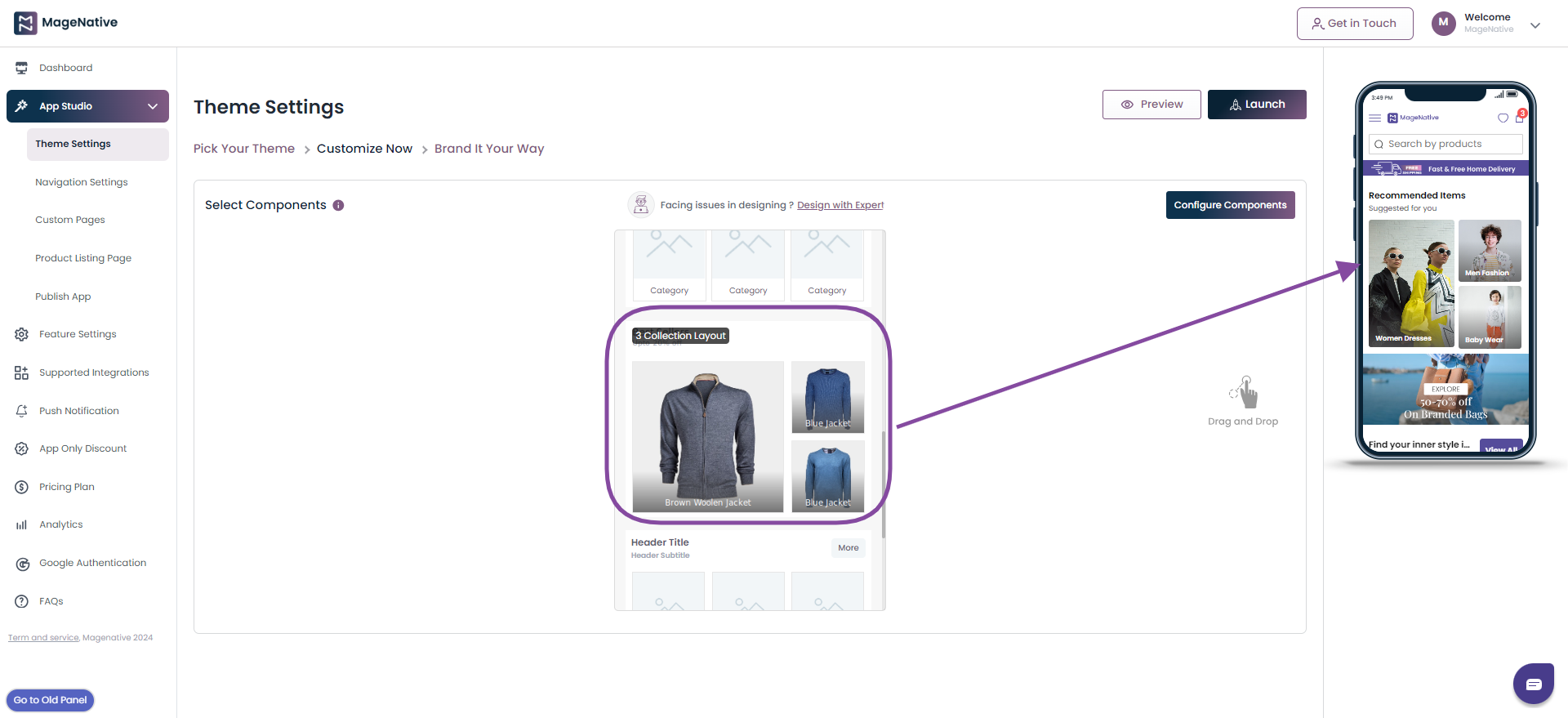
Step 2- Click on the Edit icon to change the Layout and Upload image elements in it.
Layout:
In the layout section, you can update the below properties.
- Choose the shape for collection layout
- Alignment of the text in collection layout
- Add or remove the header
- Add or remove the header subtitle
- Offer countdown timer
- Add or remove border around the collection
Upload:
Under the upload section, you can update the below properties.
- Upload image for your collection layout
- Link collection layout with a section of your mobile app
- Add a collection title
Step 3- Save: Once you are done with all the changes click on the Save button to preview the changes.
Step 4- Delete Component: You can delete the component by clicking on the Delete Component button.
Step 5- Reset: The Reset button empowers you to reset all the changes you have made in the component.
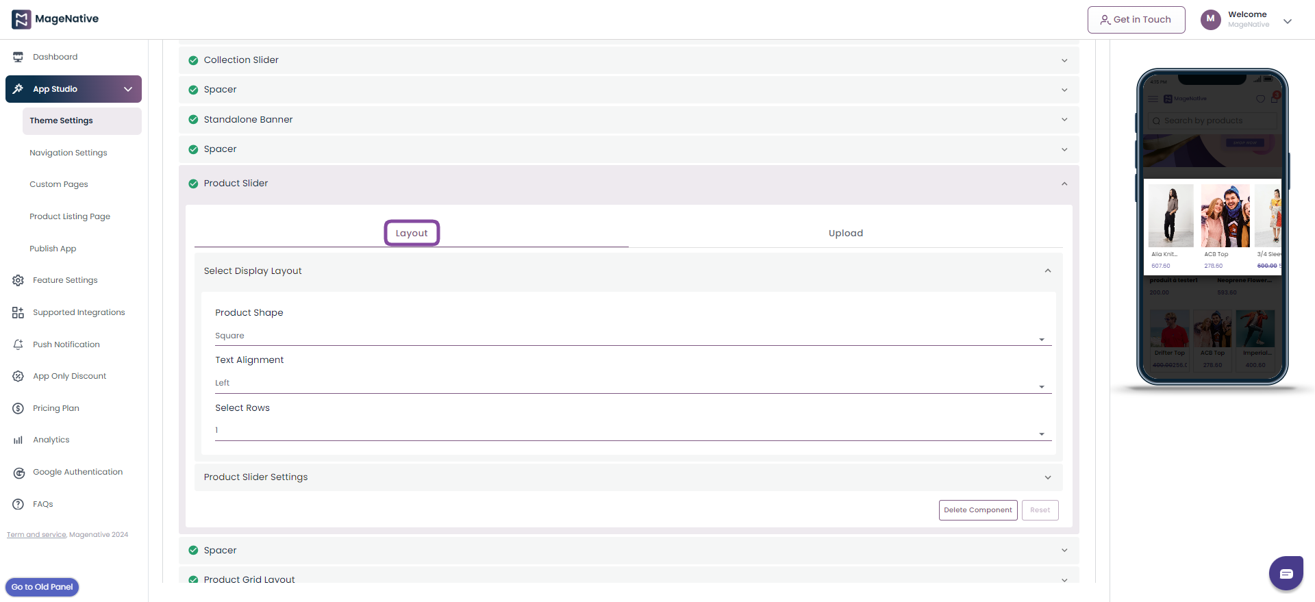
(X)- Product Slider
The product slider lets you showcase a product collection in the form of a grid.
Step 1- Drag it to the mobile screen next to it and see how it will look in your app.
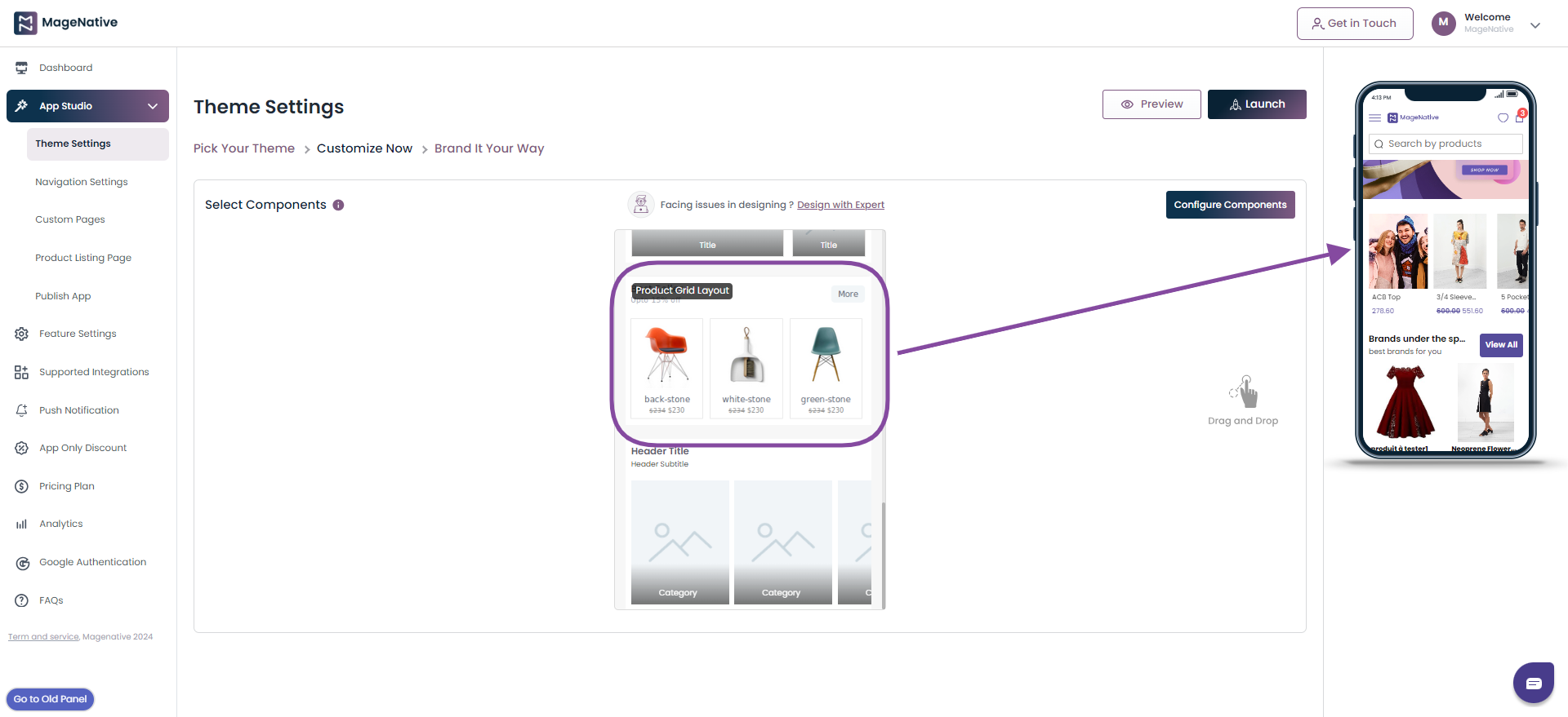
Step 2- Click on the Edit Button to change its layout or upload products.
Layout: In the layout section, you can update the following properties
- Choose the shape for your product
- Align the text to center, left, and right.
- Select the number of product rows to be displayed in product slider.
- Add or remove product border, product title, product price, special price, and header
Upload: In this section you can choose the number of products to displayed in the grid and method of linking it in the collection.
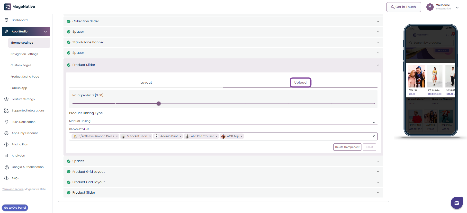
Step 3- Save: Once you are done with all the changes click on the Save button to preview the changes.
Step 4- Delete Component: You can delete the component by clicking on the Delete Component button.
Step 5- Reset: The Reset button empowers you to reset all the changes you have made in the component.
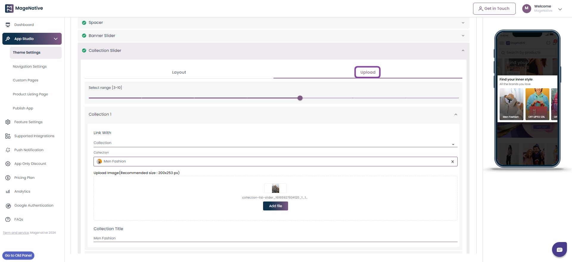
(XI)- Collection Slider
The collection slider lets you showcase the collection of the product.
Step 1- Drag it to the mobile screen next to it and see how it will look in your app.
Step 2- Click on the Edit icon to change its layout or upload products.
Layout: In the layout section, you can update below properties.
- Select the collection name
- Choose the text aligment as center, left, and right
- Add or remove the header
- Add or remove the header subtitle
- Add or remove product border in the collection slider

Upload: Here you can udpate the below.
- Link products with your mobile app url or to a specific collection.
- Upload image for the connection slider
- Add title for your collection
Step 3- Save: Once you are done with all the changes click on the Save button to preview the changes.
Step 4- Delete Component: You can delete the component by clicking on the Delete Component button.
Step 5- Reset: The Reset button empowers you to reset all the changes you have made in the component.
(XII)- Countdown Timer
This feature allows you to add countdown timers to collections of products in your mobile app, enabling you to create irresistible offers and deals.
Step 1- Drag it to the mobile screen next to it and see how it will look in your app.
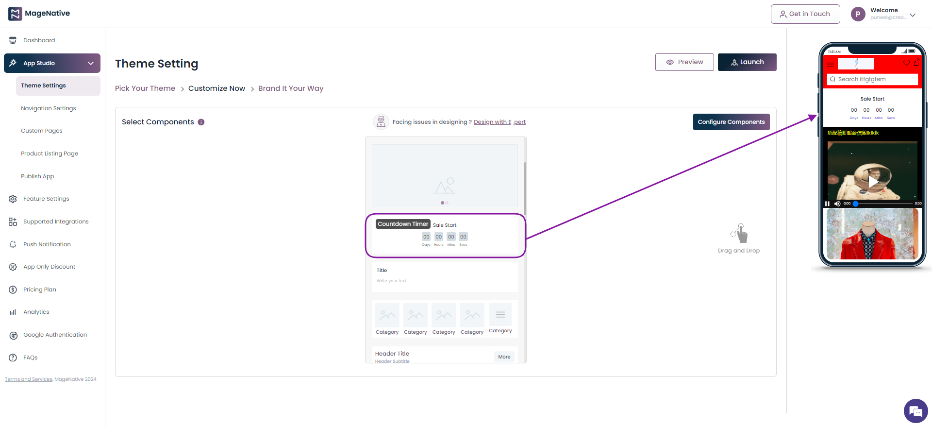
Step 2- Click on the edit icon on the countdown timer section.
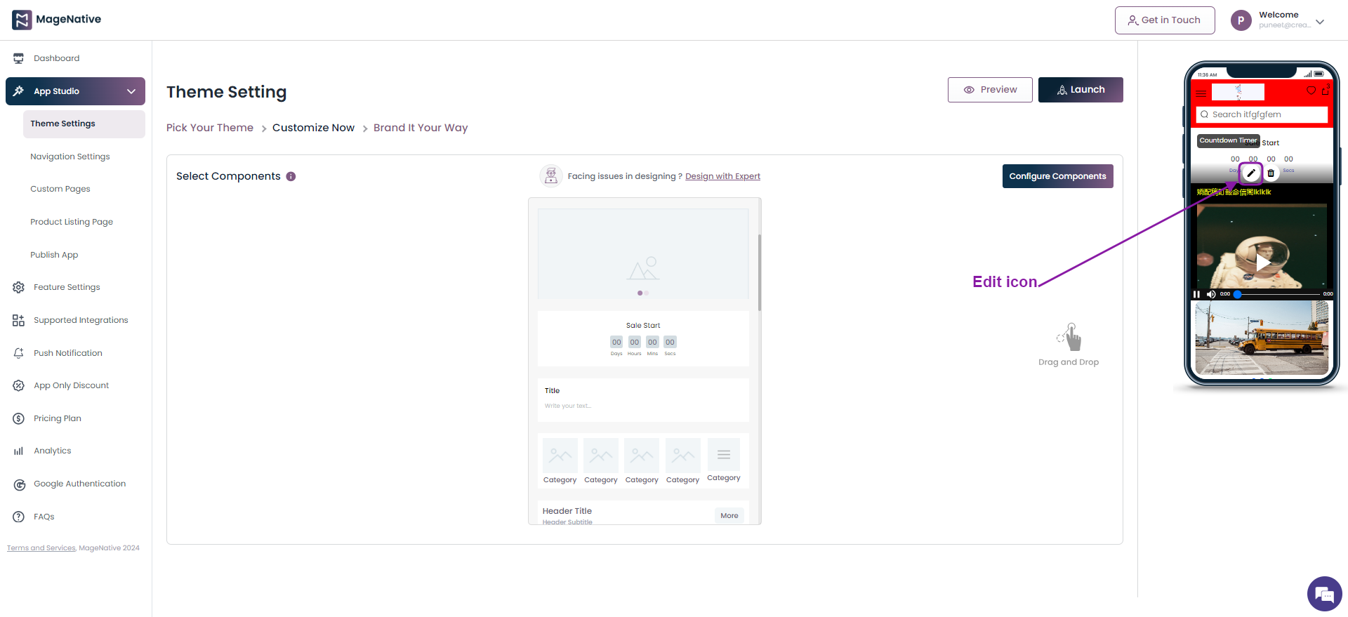
Step 3- It will open up the Countdown Timer option.
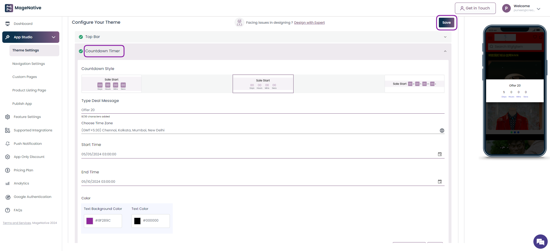
Step 4 – Input the following details
- Countdown Style – Considering the brand’s aesthetic and the overall look and feel of your app to choose a countdown style that best compliments the mobile app design.
- Type Deal Message – Add a short, attention-grabbing message to your promotions and deals. It will help to convey the value of your deal and encourage users to take action.
- Choose Time Zone – Select the specific time zone in which they want their promotions or deals to be scheduled or displayed.
- Start Time –Mention the date and time when you would like a promotion or deal to begin.
- End Time – Specify the date and time when a promotion or deal will end.
- Text Background Color – Choose the background color of the text in the deal message.
- Text Color – Opt for the color that you want to be of the text in the deal message.
Step 5 – Click on the Save button.
Note – The text background color and text color option is disabled for the countdown style in the center.
(XIII)- Text Box
The Text Box feature allows you to add text of your choice be it customer testimonials, product reviews, or personal endorsements, directly into your mobile app.
Step 1- Drag it to the mobile screen next to it and see how it will look in your app.
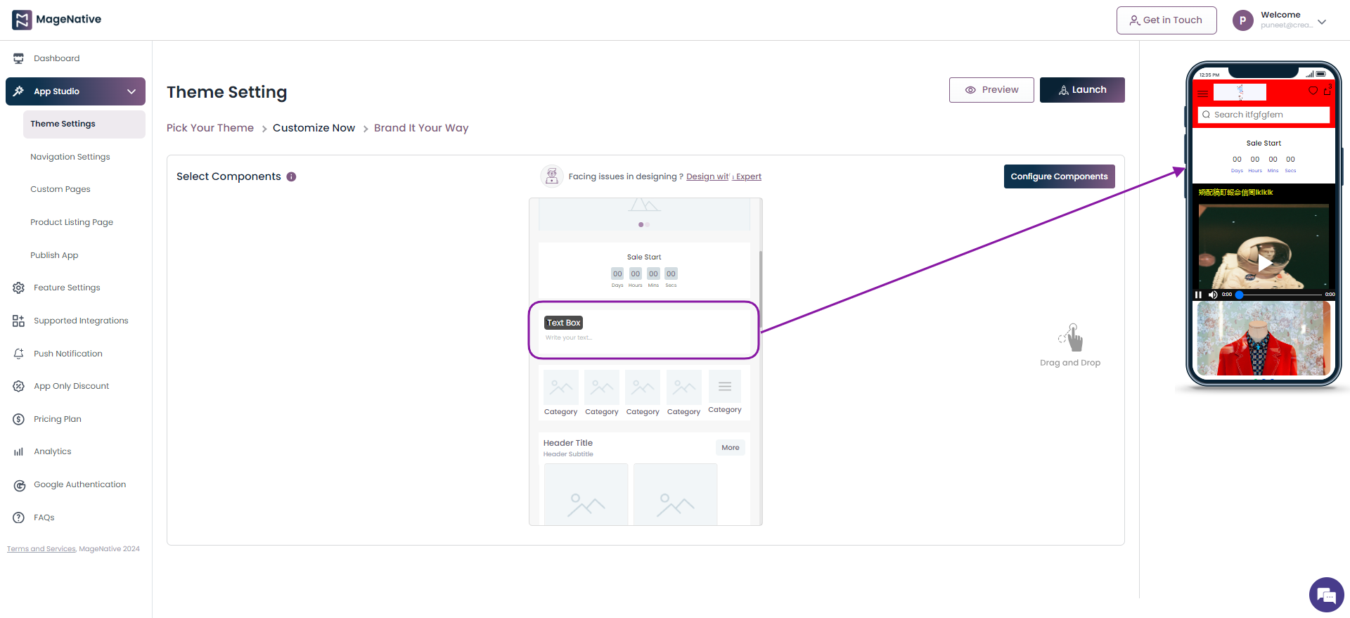
Step 2 – Click on the edit icon on Text Box section.
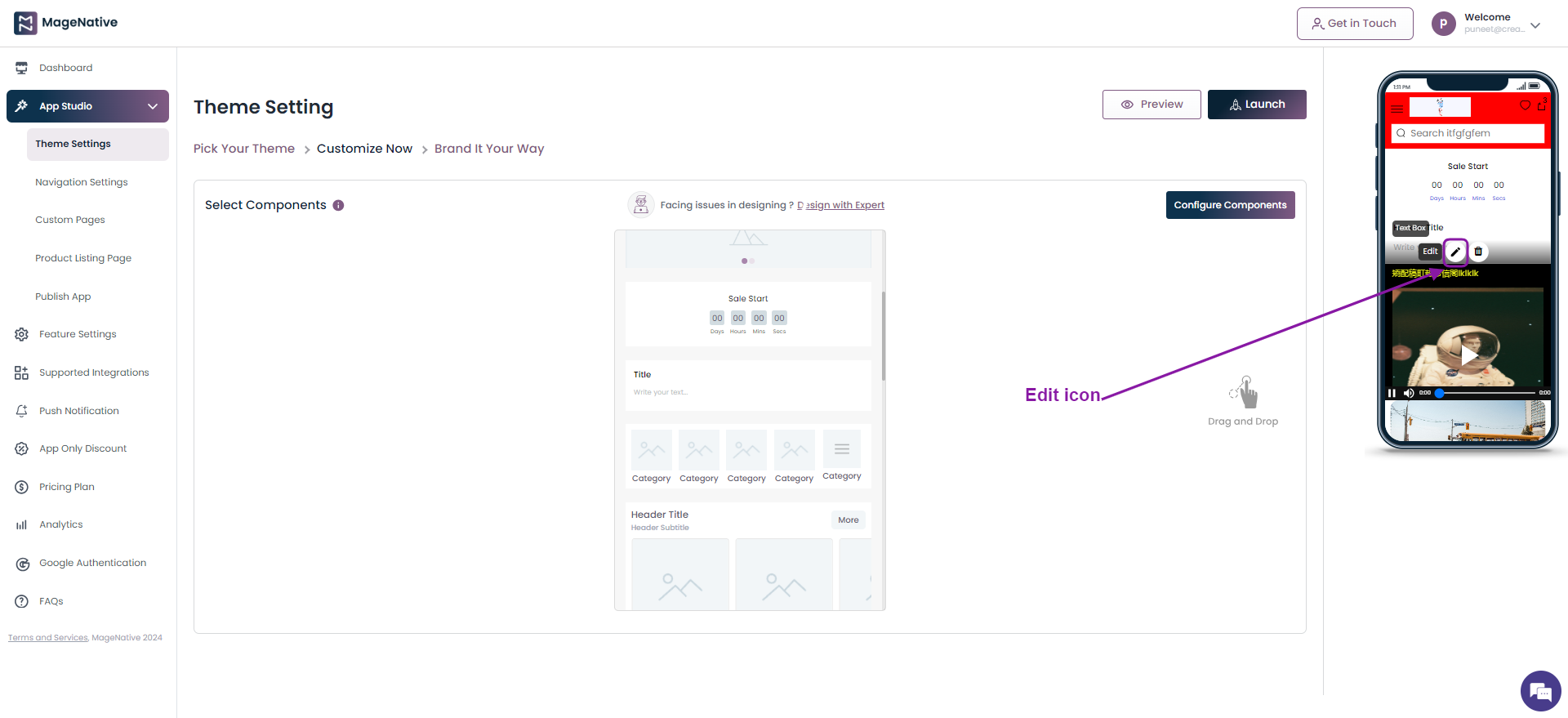
Step 3- It will open up the Text Box option.
Step 4 – Input the following details.
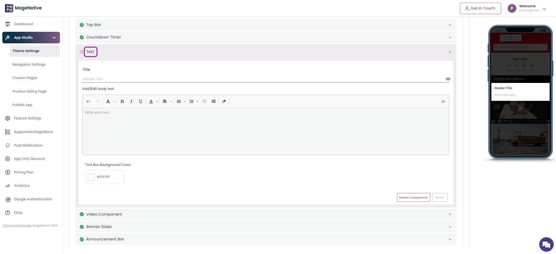
- Title – Enter the title of the text to be displayed in the text box on your mobile app.
- Add/Edit body text – Input the desired text to be displayed in form of text message. Moreover, the text added to the text box can be modified in various ways, including:
- Heading Styles: Different heading levels can be applied.
- Text Formatting: Text can be underlined, italicized, or bolded.
- Text Color: You can choose the color of the text.
- Text Alignment: Alignment options include center, left, or right alignment.
- Bullet Points: Bullet points can be customized as circles, dots, or squares.
- Formatting Removal: Users can remove any applied formatting.
- HTML Elements: HTML elements can be inserted for further customization
- Text Box Background Color – Choose a color to be displayed in the text box background.
Step 5 – Click on the Save button.
Watch the video tutorial for further guidance.
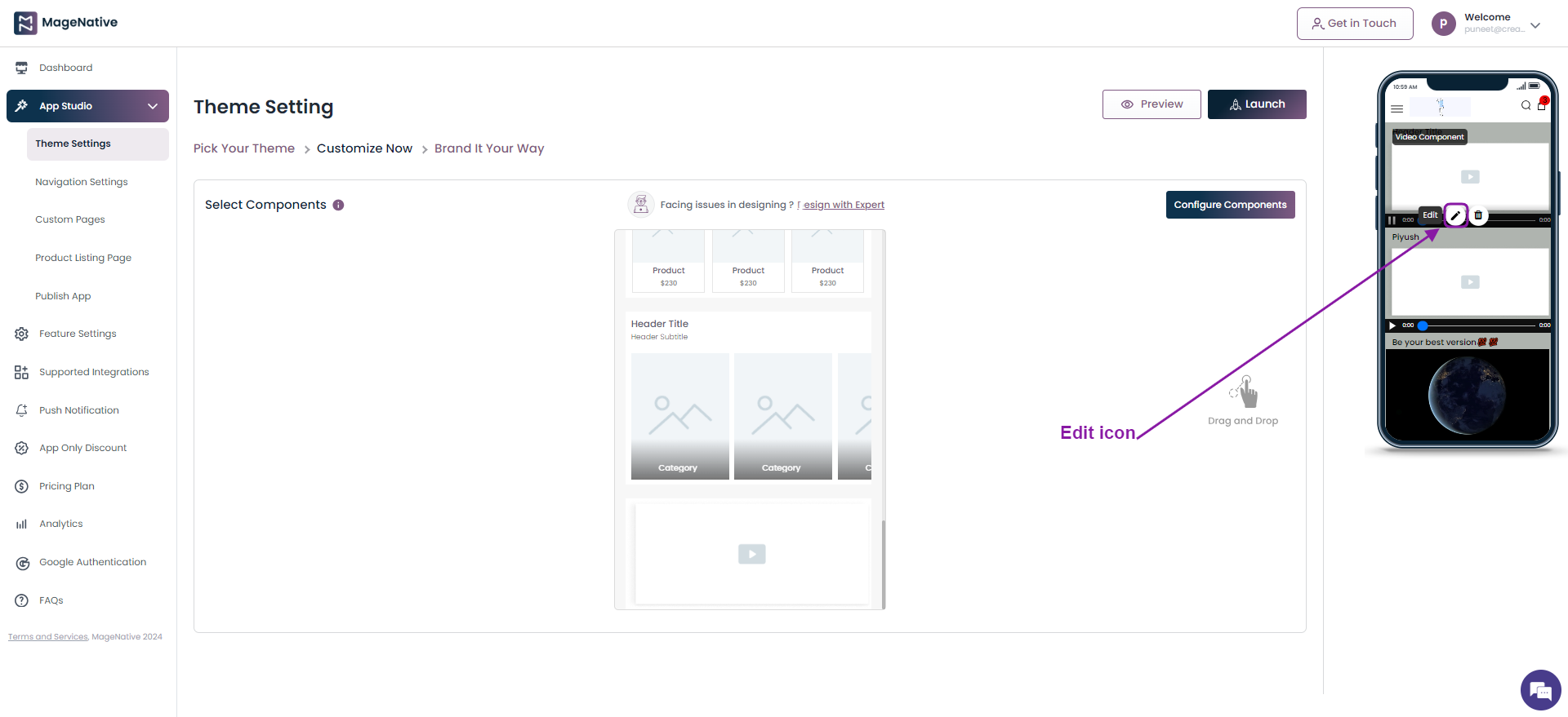
(XIV)- Video Component
The video component allows you to seamlessly integrate captivating videos into your app interface, enhancing user engagement and providing an immersive experience for your audience.
Step 1 – Click on the Theme Setting under the App Studio present on the sidebar menu.
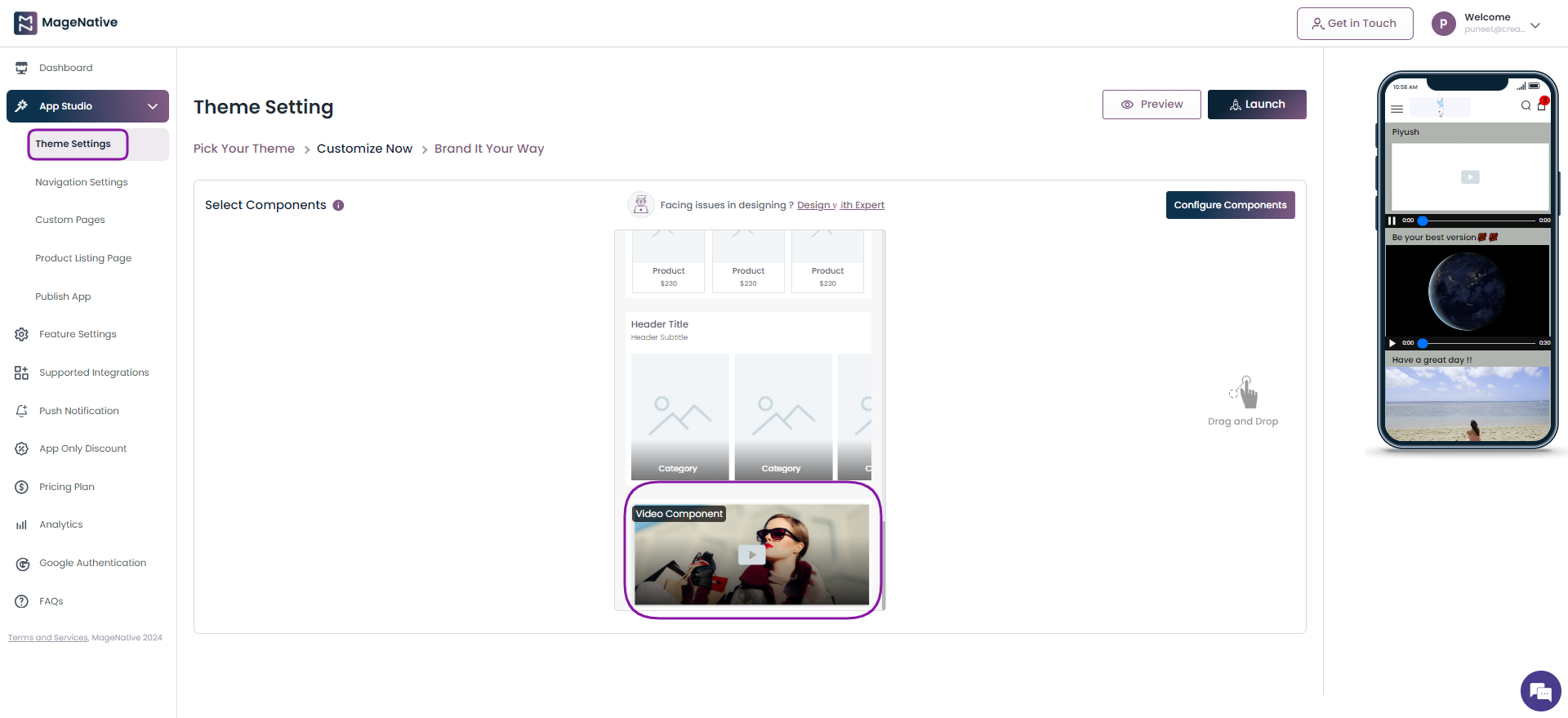
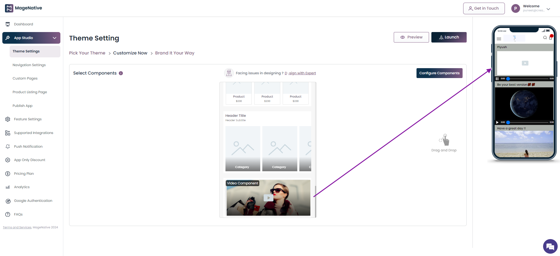
Step 2 – Locate the Video Component on the mobile app panel present in the center to drag and drop it on the mobile app on the right side.
Step 3 – Click on the edit icon.
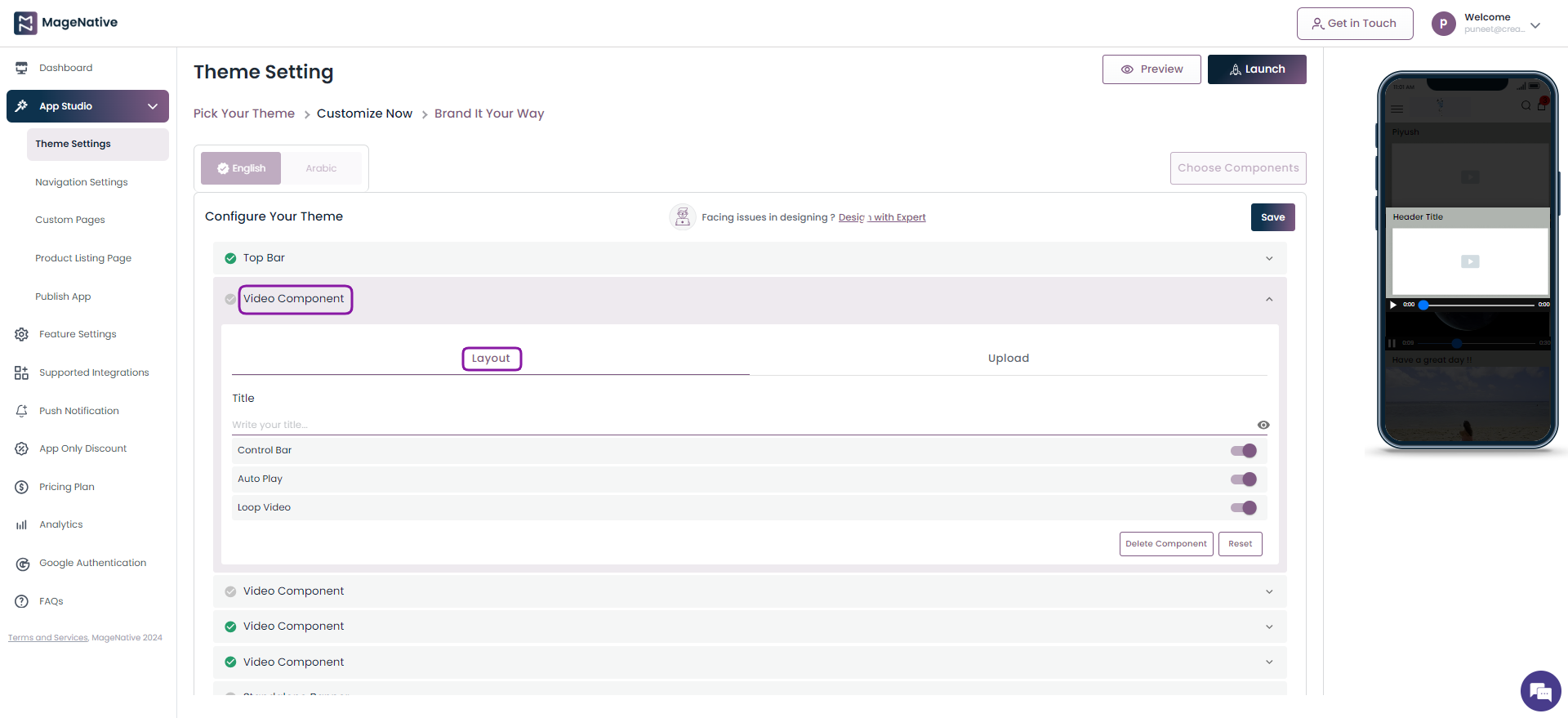
Step 4 – It will open up the Layout section of the Video Component. Add the required details.
- Add a suitable title that you would like to display for your video
- Choose to enable/disable the control bar, auto play, and loop video. These setting are meant to keep shoppers engaged and immersed in the video experience, potentially leading to longer viewing times.
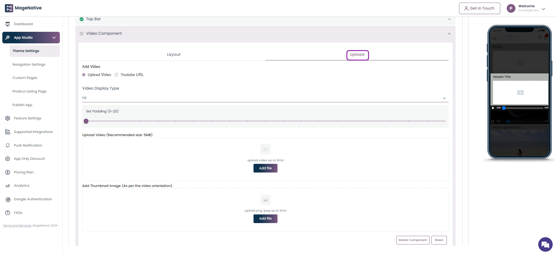
Step 5 – Click on the Upload section followed by choosing Upload Video. Now add the necessary details
- Choose the appropriate dispaly type between Fill, Fit, and Free Size.
- Choose padding value to increase/decrease the width of padding around the video.
- Upload the video of your choice with maximum size of 5MB.
- Upload the thumbnail image with maximum size upto 2MB.
Step 6 – Click on the Save button.
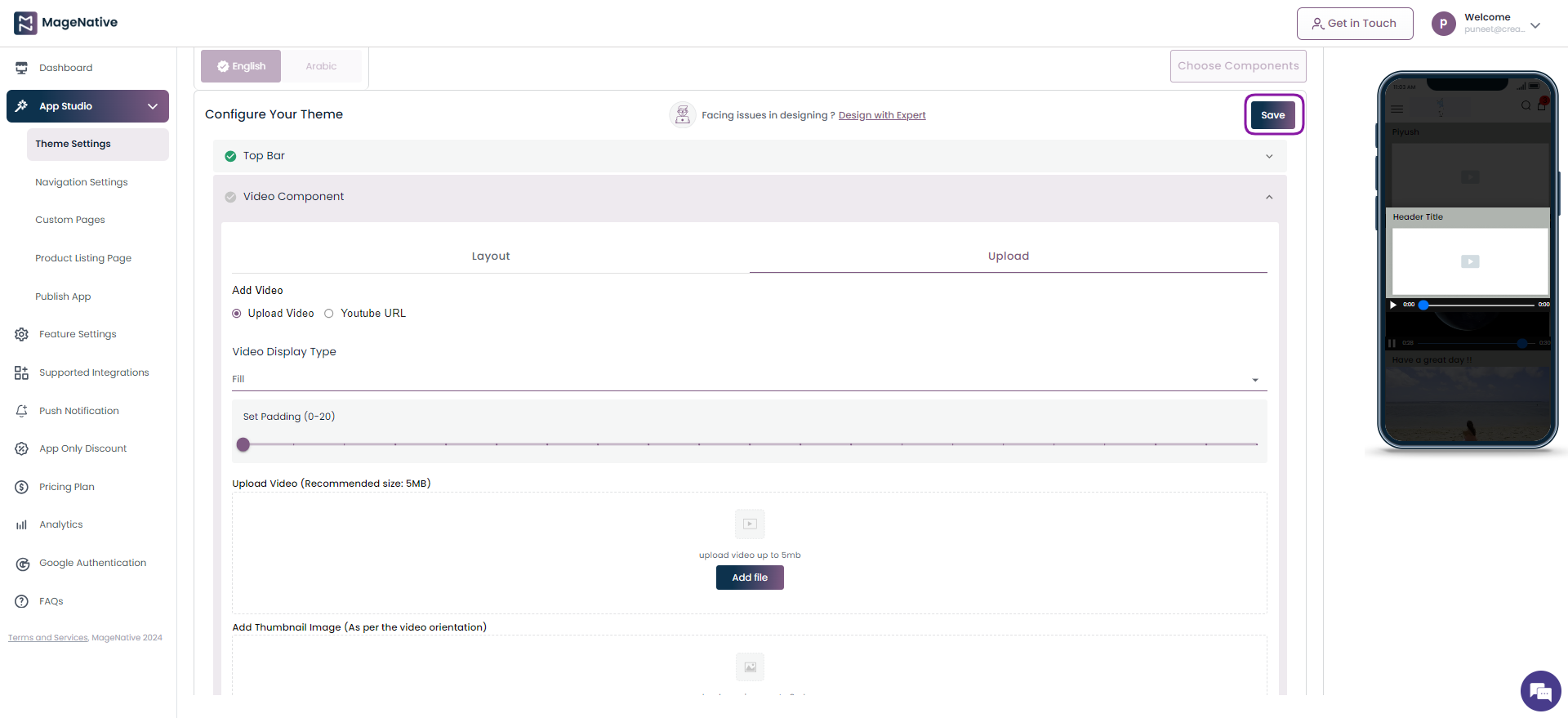
Watch the video tutorial for further guidance.
That’s it! ? hope this will help you use different components and themes and customize your app in a better way.
4.Preview Your Apps
Preview your app instantly without repeatedly entering details. Simply add a component and see the changes in real-time. View your app instantly with a single click. Changes appear immediately, allowing you to see exactly how the app will look to users without additional steps or delays.
Follow The Steps Below To Preview Your App
- Choose the theme of your choice, such as Predefined or Custom.
- For a Predefined theme, click the Edit icon to fill in the data in the app components.
As you fill in the data for the components, simply click the Preview button and follow the steps to preview the app.
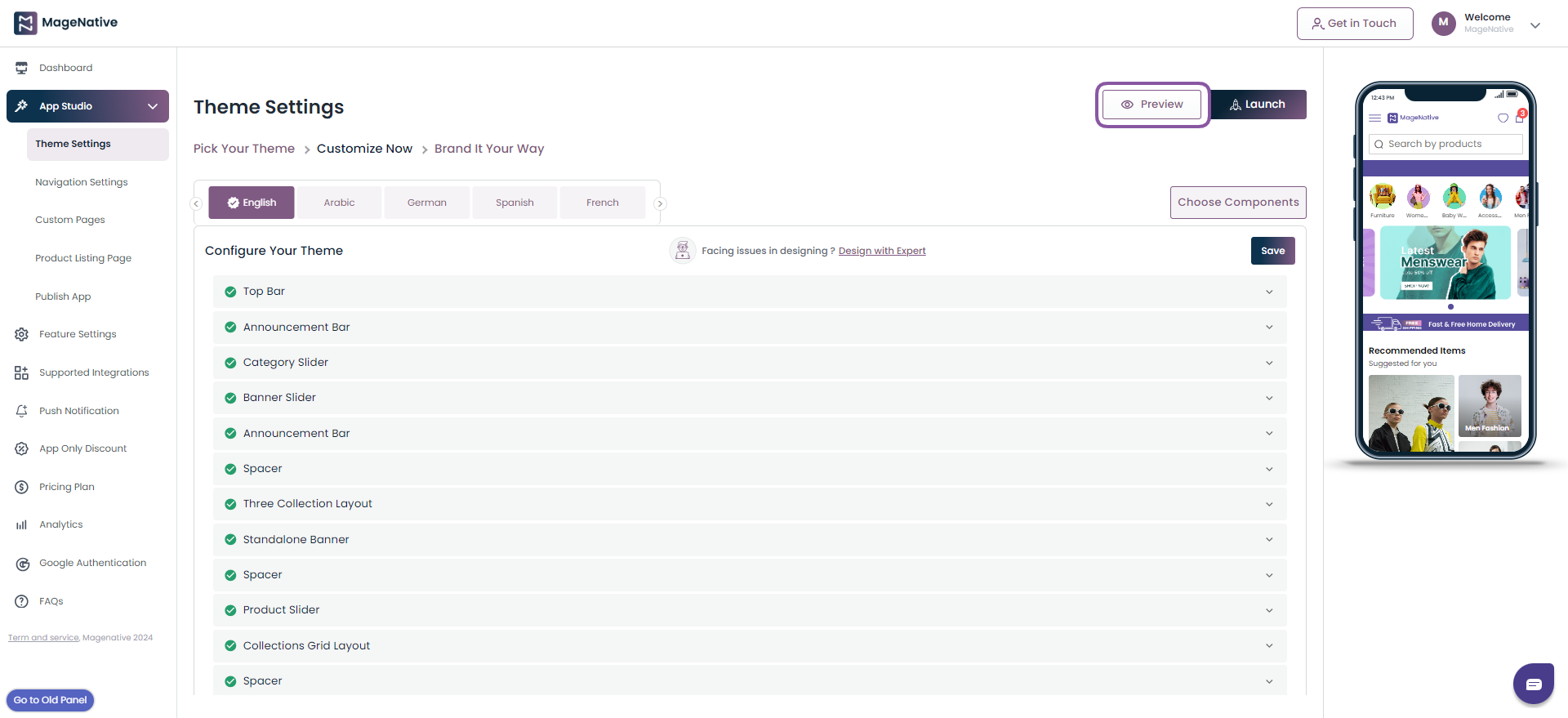
- In the case of Custom Theme, choose the components of your choice by dragging and dropping.
- As you choose the components, click on the edit button to fill in the data in the component.
- After adding and filling in the components, click the Preview button to directly preview the app by following the steps.
- If you ever get stuck designing your app’s home page, connect with us by clicking on the Chat icon in the bottom right corner. Alternatively, you can reach us through WhatsApp at +91 6393 417 500.
Note: We suggest filling in the data in the ‘Brand it your way’ section as well to match your brand’s identity and publish your app on the Play/App Store.
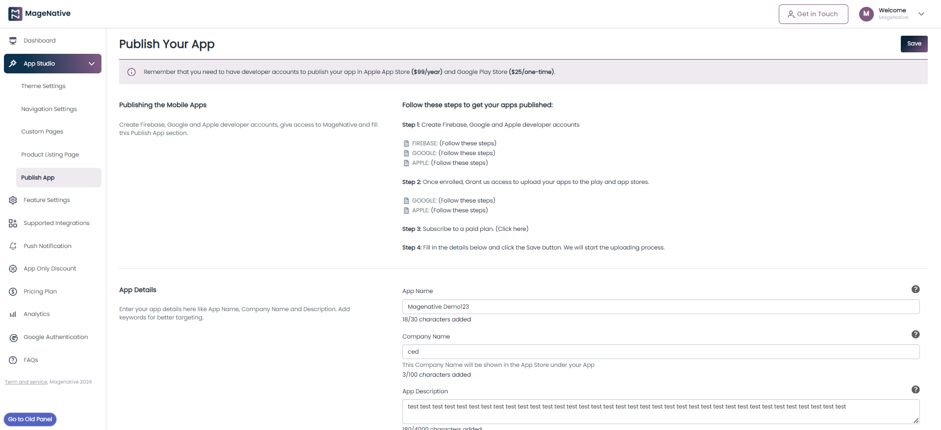
5.Publish Apps
Here is a simple guide with all the main steps required to publish your mobile apps.
Assuming that you have created your app and made sure it’s functioning perfectly, there are a couple of simple steps left to launch your mobile app as discussed below.
Step 1- Getting Google and Apple developer accounts
If you want to publish your app on behalf of your brand’s name, you must have developer accounts for both Apple and Google Play stores. It is a way of allowing you to have full control of your app.
Here, we have already prepared a guide for you to make the process as simple as possible.
You can check the guides below for creating developer accounts for each of these platforms:
Guide For Creating Apple Developer Account
Guide For Creating Google Play Developer Account
Once enrolled, Grant us access to upload your apps to the play and apple stores. Refer to the guide below to grant us access.
Follow this Guide To Grant The developer account Access
After this, subscribe to a paid plan for MageNative App
Click here for a paid subscription plan
Step 2. Filling Up the App Details Form
After completing each process for the developer accounts, you need to fill out the App Details Form below.
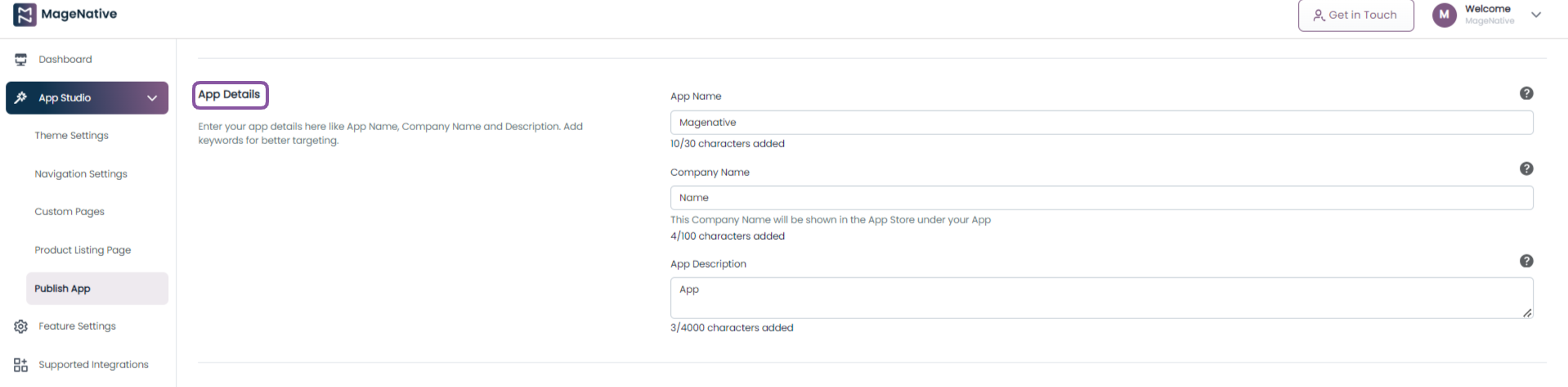
App Name: Here you need to fill out the app name; the recommended length for the app name is 30 characters.
Company Name: After filling in the app name, you need to fill out the company name. The Company Name will be shown in the App Store under your App. You can add the company name up to 100 characters.
App Description: In the app description section, you need to fill out the app description maximum length of 4000 characters.
Step 3- Fill Out The Personal Details
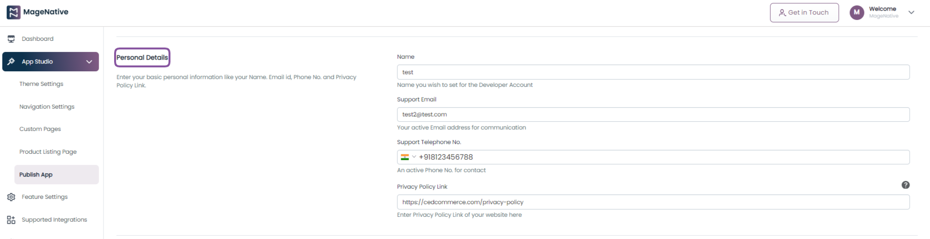
Name: Set the appropriate name you wish to set for your developer account
Support Email: Fill out your active email address for communication
Telephone number: Here you need to enter your active phone number for communication.
Privacy Policy Link: Attach the privacy policy link of your website in the textbox.
Step 4- Upload App Images
Here you need to upload the app logo and graphic banner images.
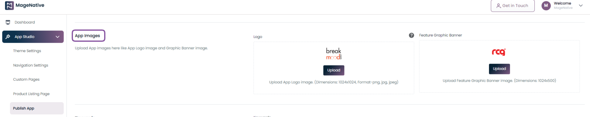
Logo: The app logo image needs to be 1024 px * 1024 px size for the logo to be visible clearly.
Feature Graphic Banner: The requirement for a Feature Graphic Banner image is 1024px * 500px.
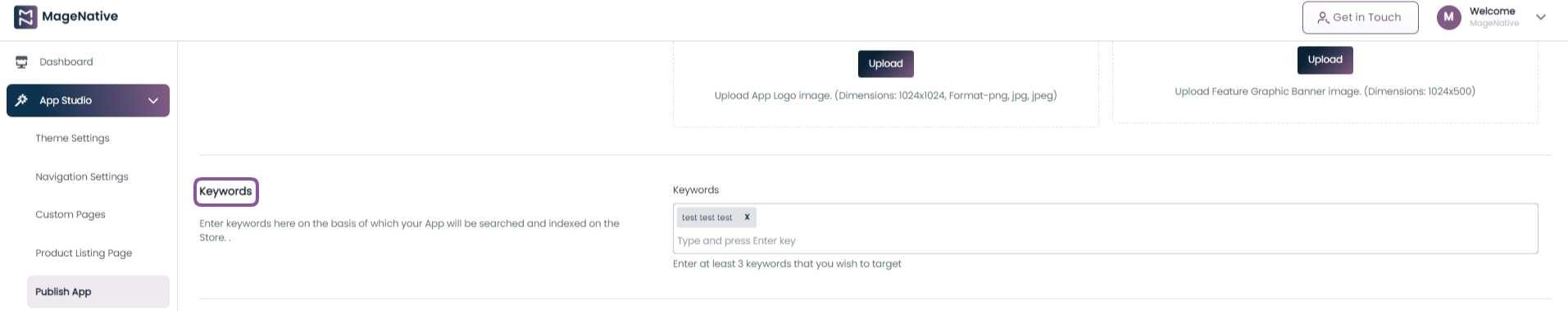
Step 5- Keywords
Here you need to fill in at least 3 key phrases based on which your App will be searched and indexed on the Store.
Step 6- Account Details
Once you’re done with the enrollment, provide the Apple Developer Account Name and Google Developer Account Name here. Also, you can ignore provided you are not enrolled in Apple or Google Developer Account.
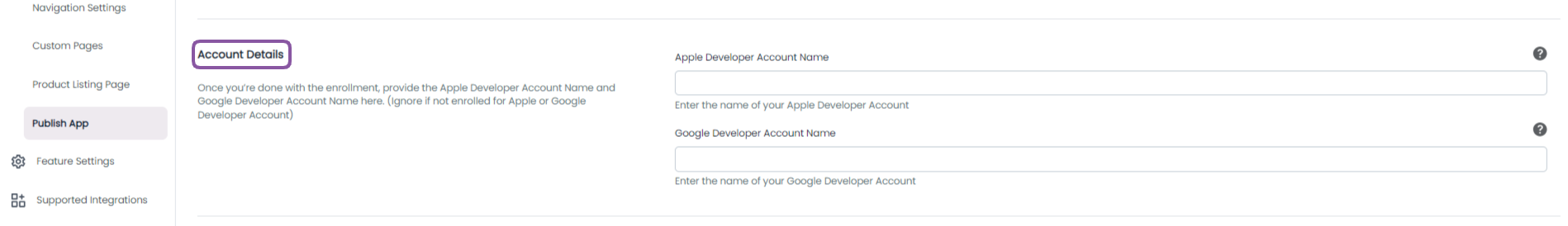
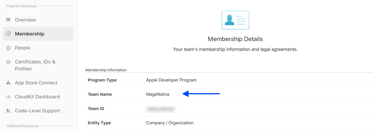
Apple Developer Account Name: This is the name you used to enrol in the Apple developer program. If not enrolled already, please check this Guide.
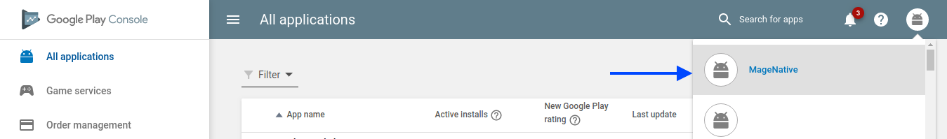
Google Developer Account Name: This is the name you used to enrol in the Google developer program. If not enrolled already, please check this Guide.
Step 7- Promotional video
From here you can upload a promotional video of your app. The video will be displayed and played in the App Store/ Play Store.
 After accomplishing the above steps, our team will take over the process and follow all the processes needed to publish your app on Apple Store and Google Play Store.
Once the process is complete, your app will be published in the app stores.
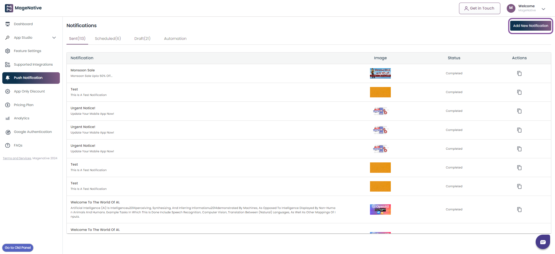
6.Push Notifications
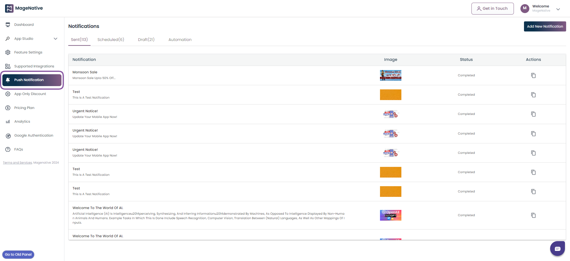
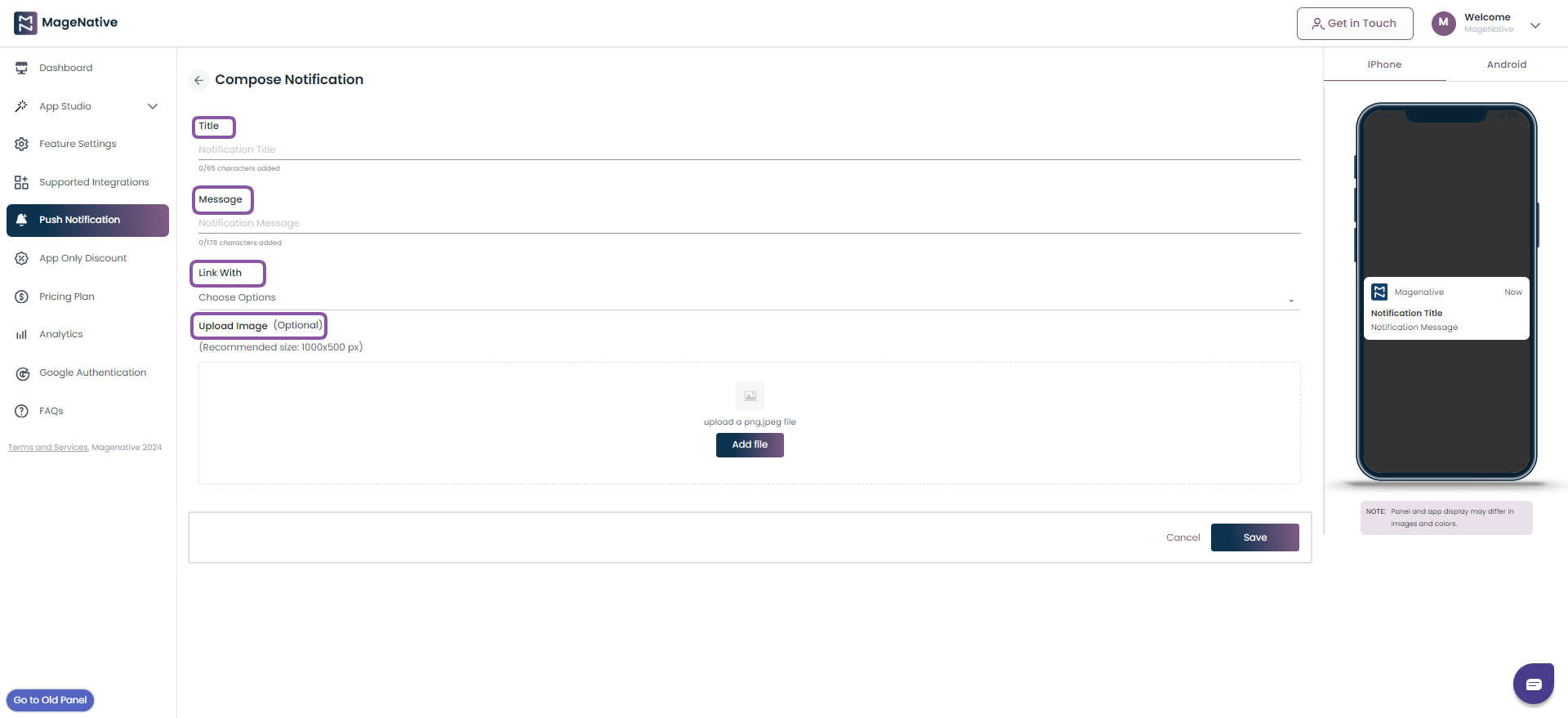
Step 2- Then click on the Add New Notification button at the top-right corner of the page.
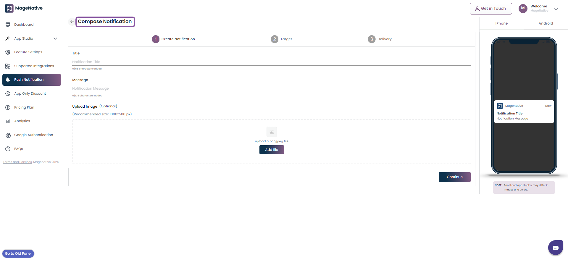
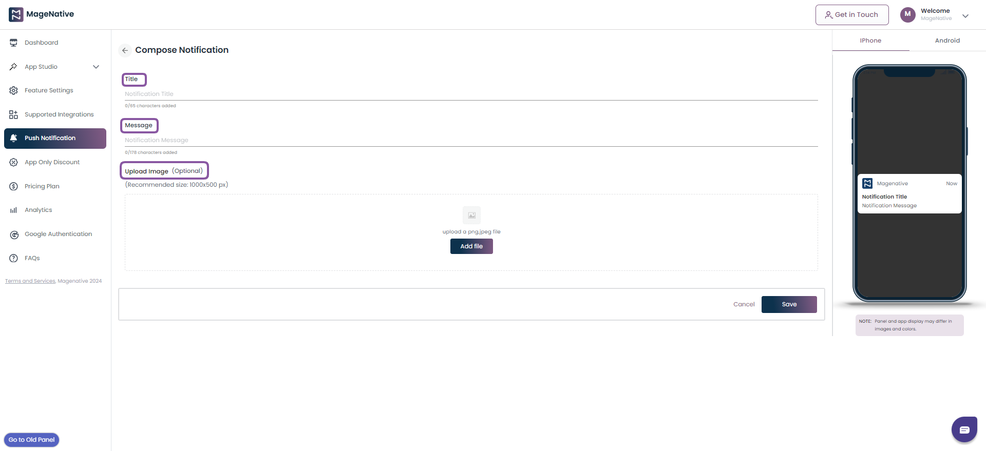
Step 3- It will open up the compose notification box. Input the value in the fields as below
- Title
- Message
- Upload Image
Now, click on the Continue button to move to the next section.
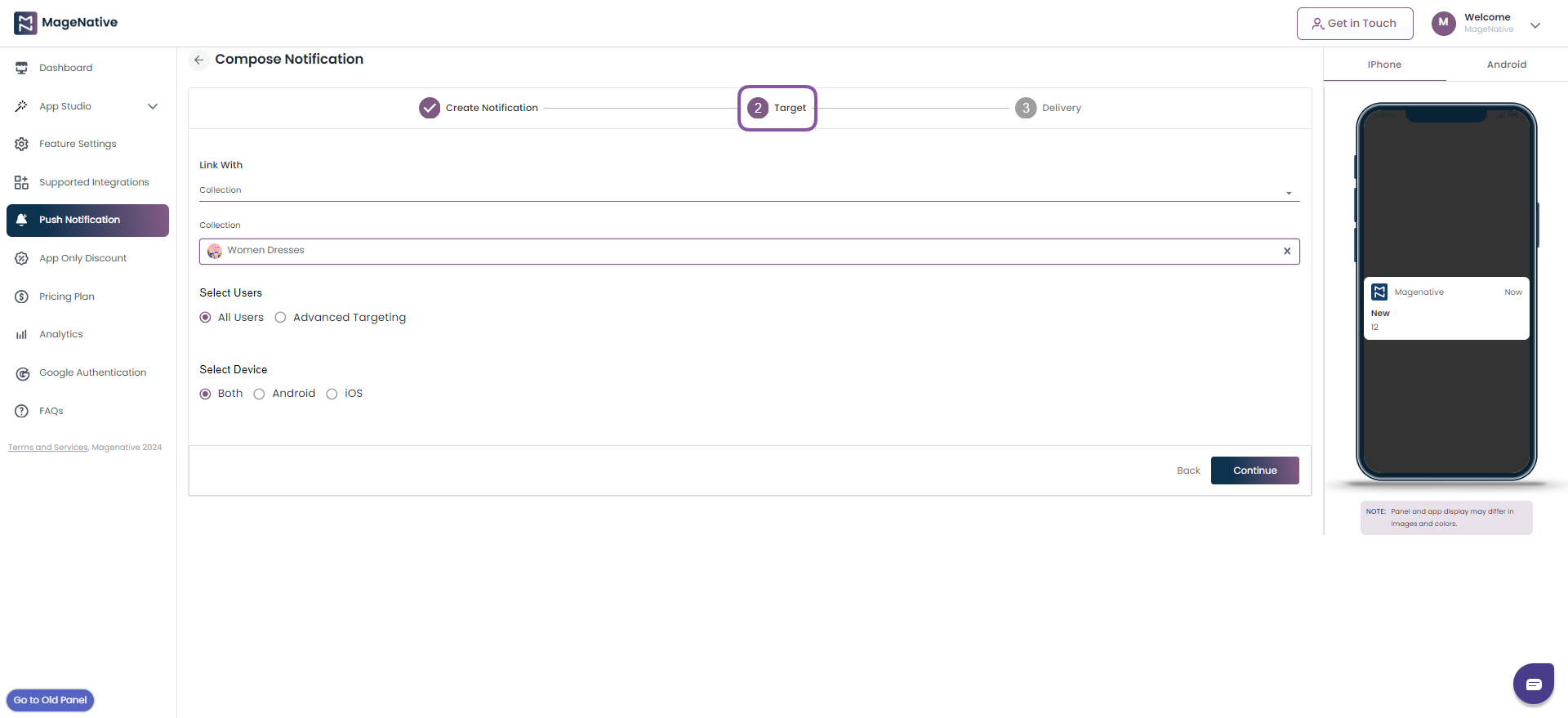
It will open up the target section. Here add the below details required to choose your customers to whom you wish to send the push notifications.
- Select the app section to be linked with push notification
- Select is the notification to be send to all users or specific users.
- Choose the device to deliver the notification
Now, click on the Continue button to move to next section.
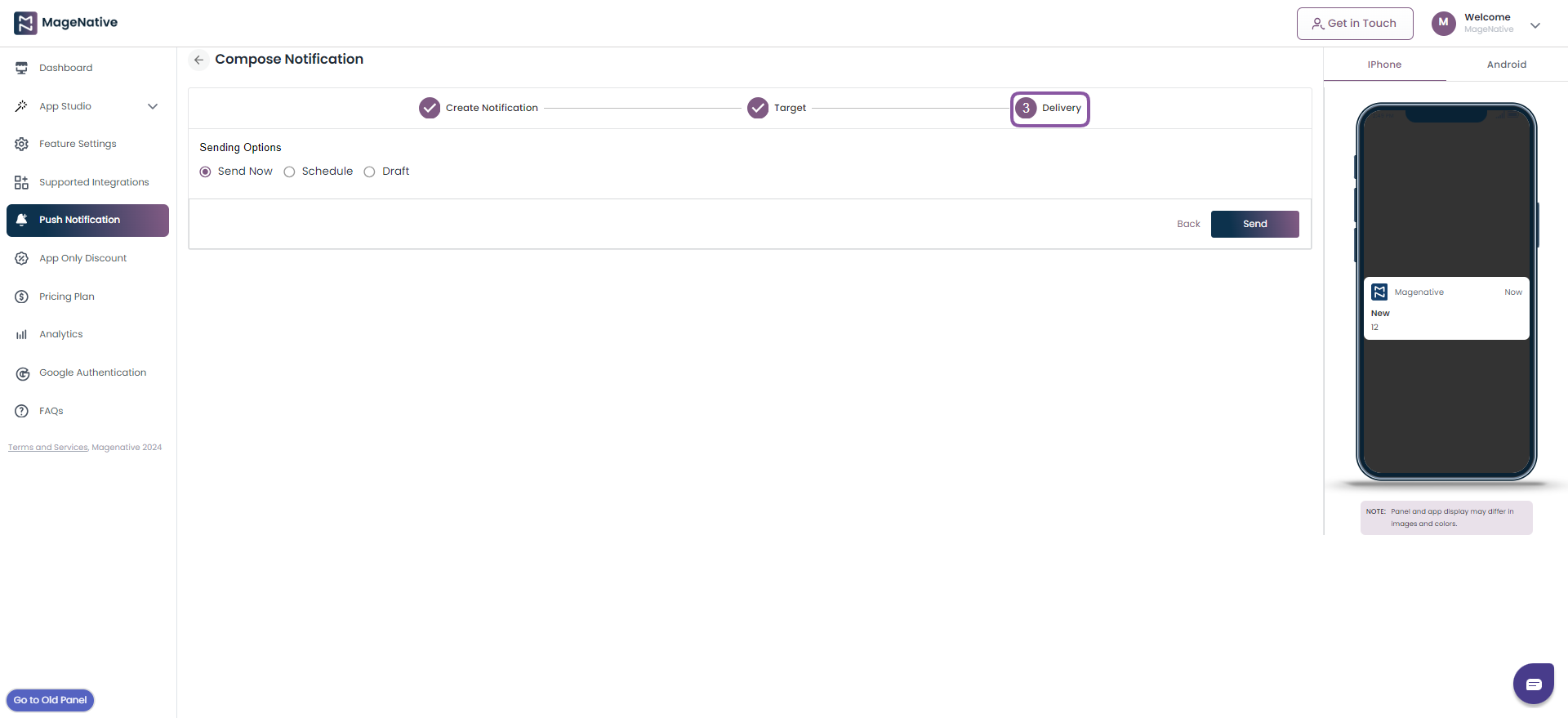
On the last section to compose notification, choose one among the below sending criteria.
- Send now
- Schedule
- Draft
And, click on the Send button.
Step 4- If you want to make any modifications to your notification, you can edit it by clicking on the Actions icon. It will allow you to update the push notification details.

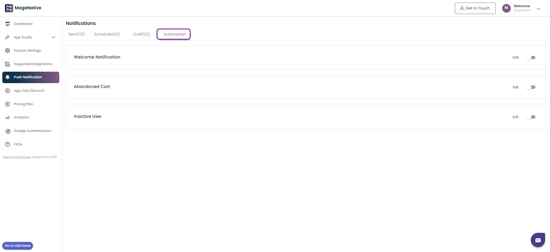
Push Notification Automation
You can automate your push notification to be send to the customers based on below segmentation.
- Welcom Notification
- Abandoned Cart
- Inactive User
Step 1- Click on the Push Notification link in the left side menu bar. Now, click on the Automation section under the notification panel.
Welcome Notification
Step 1- Click on the Edit option to open the Compose Notification window.
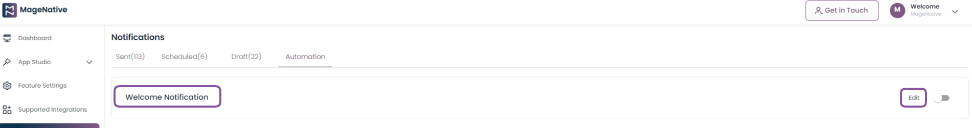
Step 2- Under the Compose Notification window update the required details (highlighted in screenshot below) as per your requirements. And, click on the Save button to save the changes.
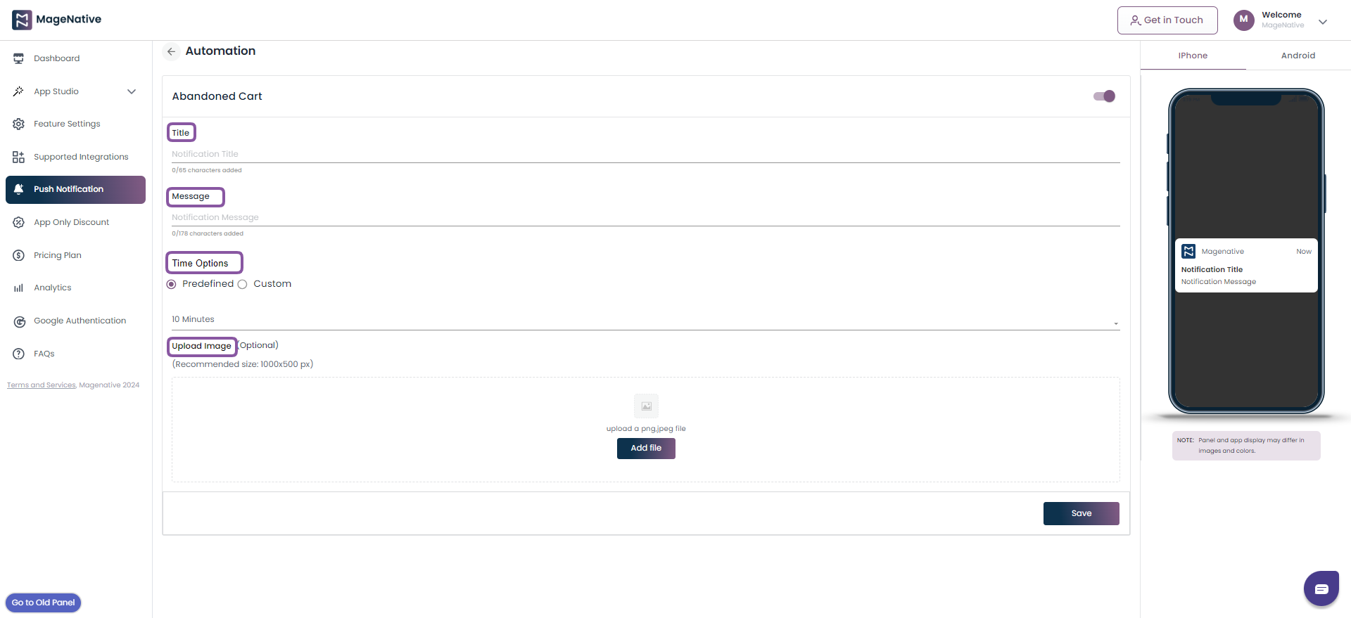
Abandoned Cart
Step 1- Click on the Edit option to open the Abandoned Cart window.

Step 2- Under the Abandoned Cart window update the required details (highlighted in screenshot below) as per your requirements. And, click on the Save button to save the changes.
Inactive User
Step 1- Click on the Edit option to open the Compose Notification window.

Step 2- Under the Compose Notification window update the required details (highlighted in screenshot below) as per your requirements. And, click on the Save button to save the changes.
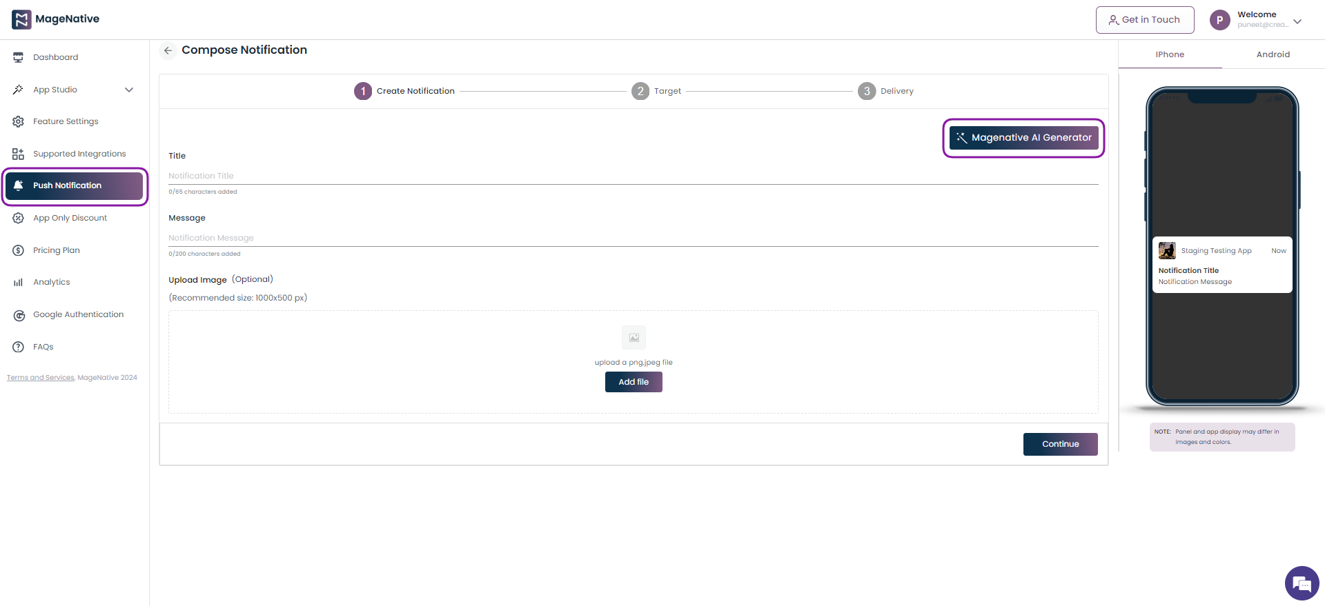
NotifyGenie AI Generator
Enhance your push notifications using MageNative’s AI Generator feature, redefining your customer engagement strategies. Create customized messages that cater to individual preferences. Plus, effortlessly generate relevant images to complement your notifications, ensuring they catch the eye and resonate with your audience.
Step 1- Choose the Push Notification present on the sidebar menu. Now, click on the MageNative AI Generator button.
Step 2- It will open up pop up for push notification generation, Select from the prompts present on the pop up and copy it using the copy icon on the selected prompt.
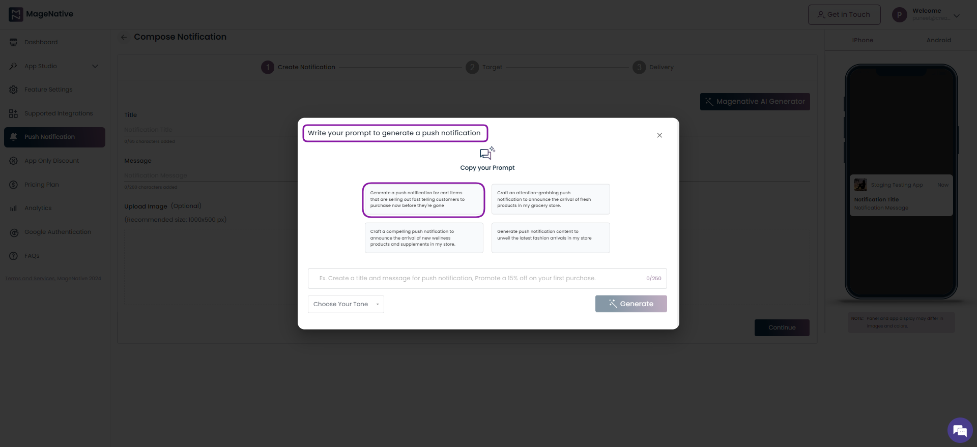
Step 3- Paste it in the field present below the prompts. Choose the appropriate tone from the Choose Your Tone drop down box followed by clicking on the Generate button.
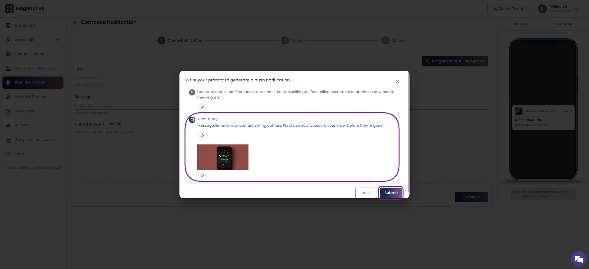
Step 4 – As a result, it will generate the text and image for the push notification. Click on the Submit button to schedule your push notification.
Step 5- It will redirect you to Compose Notification page. Choose among the below options to schedule the push notification.
- Send Now – Select it to send the push notification instantaneously. Click on the Send button.
- Schedule – Choose this to schedule your push notification for future. Click on the the Schedule button
- Draft – Opt for it if you want to save the push notification as draft. Click on the Save in Draft button
Watch demo tutorial for further guidance.
That’s it!? Begin leveraging Push Notifications effectively to enhance customer engagement immediately.
7.How To Enable App Only Discounts
Offering discounts and rebates on purchases is an effective way to attract customers to your store. 93% of U.S. shoppers cite discounts and offers as important factors when deciding whether or not to purchase from a retailer or brand. Moreover, offering an attractive discount to a bunch of shoppers who utilize a mobile app will entice them to purchase more, increasing conversion rates.
Enabling this feature is quite simple- let’s go through these easy steps.
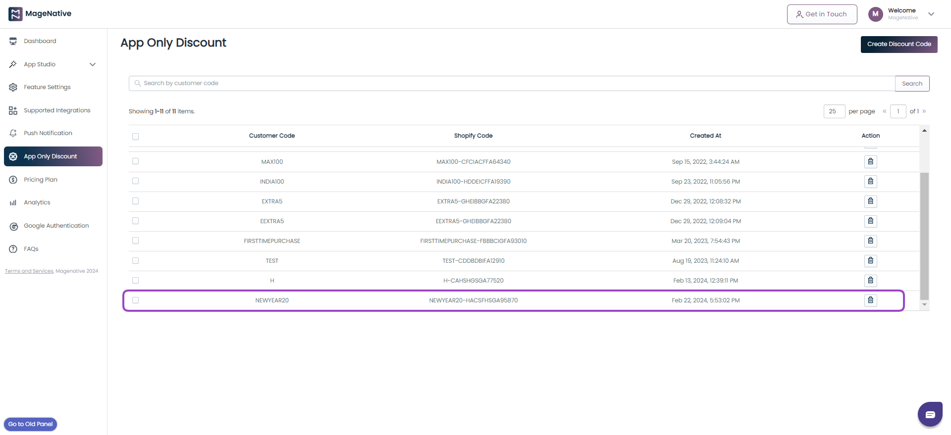
Step 1 – Navigate to your MageNative app dashboard, and click on App Only Discount link in the left menu bar.
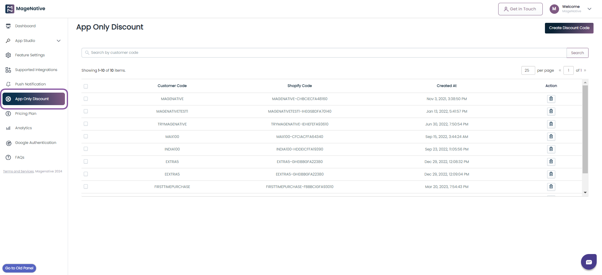
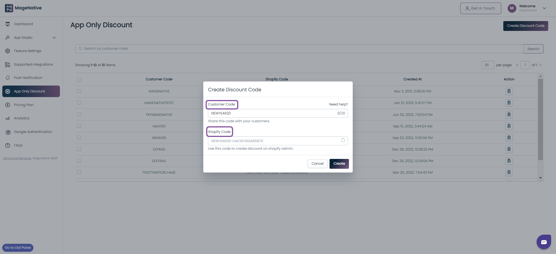
Step 2- Click on the Create Discount Code button at the top right. A dialog box will appear to input the Customer Code.
- The customer code entered will automatically generate a Shopify Code in the text box below it.
- Copy this Shopify Code which will be required further in the Shopify store admin panel to create a discount.
- After filling in the details, click on the Create button.
Step 3. Now, you can see the generated code in the box below.
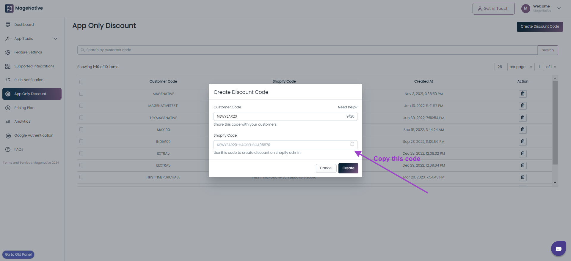
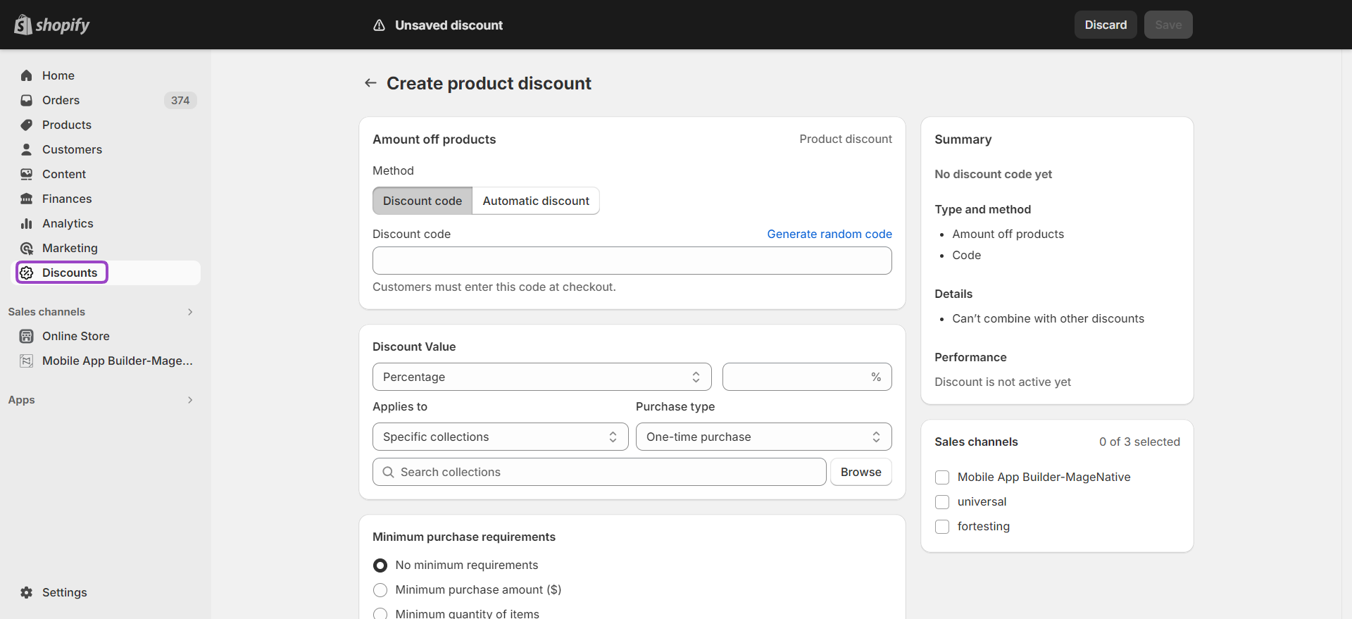
Step 4. Once you click on the Create button, it will redirect you to your Shopify store admin panel.
- Here you need to enter the Shopify code copied previously.
- Also, fill in all the required details like type of discount, discount value, discount applicable on minimum purchase, usage limit, and active dates for discount etc.
- After Filling in all the required details, click on the Save button at the top right to create a discount.
- Your discount is created. Check the newly created discount in your MageNative app.
Step 5- Now you can see the newly created discounts in the App only discount section of the Magenative app.
Step 6- That’s it!? Now you can share the customer code for a discount with your customers through the notification panel or any other way you want.
Hope this guide will help you in generating discounts for your customers. We are consistently working to help you enhance your mobile app selling experience. Attract more customers, better retention, and ultimately, more conversion!
8.Make Products/Collections available for MageNative App
How to make Products available for Mobile App Builder-MageNative
- Log in to your Shopify Admin
- Go to the Products -> All products
- Select the Product(s) which you want to make available for the Mobile App Builder-MageNative
- Click on More actions and Add available channel(s)…
- Select the checkbox corresponding to the Mobile App Builder-MageNative and uncheck every other checkbox
- Click on the Make products available button
- Wait for some time and the products will be available in your mobile apps
- After making the products available make sure to make the Collections available too
How to make Collections available for Mobile App Builder-MageNative
- Log in to your Shopify Admin
- Go to the Products -> Collections
- Select the Collection(s) which you want to make available for the Mobile App Builder-MageNative
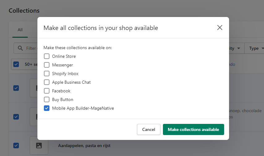
- Click on More actions and Make collections available
- Select the checkbox corresponding to the Mobile App Builder-MageNative and uncheck every other checkbox
- Click on the Make collections available button
- Wait for some time and the collections will be available in your mobile apps
9.Step-by-Step Guide to Infuse Your Mobile App with Enchanting Augmented Reality Features!
Are you ready to unlock the extraordinary potential of Augmented Reality (AR) and transform your mobile app into an immersive experience?
With AR adoption skyrocketing, and reaching an estimated 1.73 billion users by 2024, incorporating AR into your app will be a game-changer. It grabs users’ attention and boosts customer engagement by up to 300%, while also driving conversion rates by an impressive 94%.
Discover how integrating AR into your mobile app can revolutionize the way you interact with your audience, elevate brand experiences, and propel your business ahead of the competition.
It’s high time to unlock the potential of AR in your Shopify mobile app with just a few easy steps.
Step 1- First, log in to the MageNative app panel and then click on the Feature Settings link located in the left menu bar.
Step 2- To proceed, navigate to the Categories tab to select the Feature option under it.
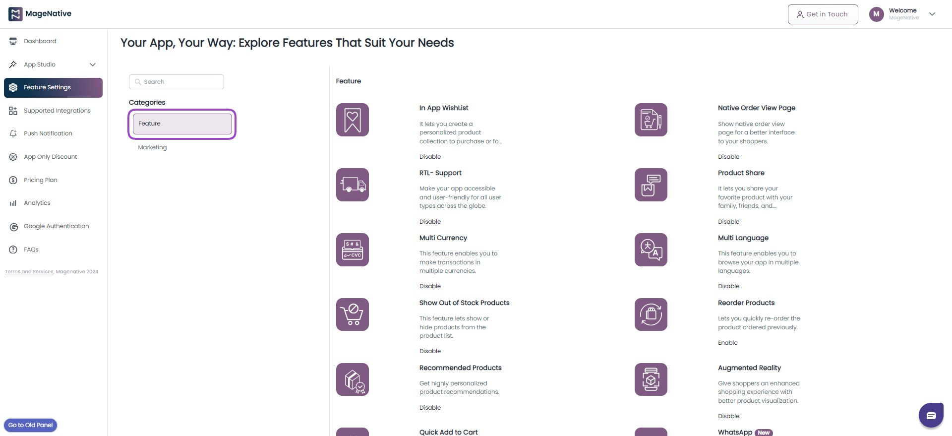
Step 3- Here, you’ll find the AR feature listed on the page. Click on the Enable link to activate the feature in your mobile app.
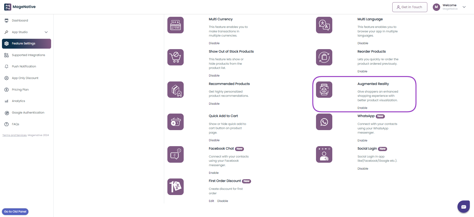
Upon successfully enabling the feature in your application, you will gain the ability to view products in a 3D model format. However, it is essential to note that for optimal functionality, please ensure you upload the images in the .usdz or .glb format only from the Shopify admin panel.
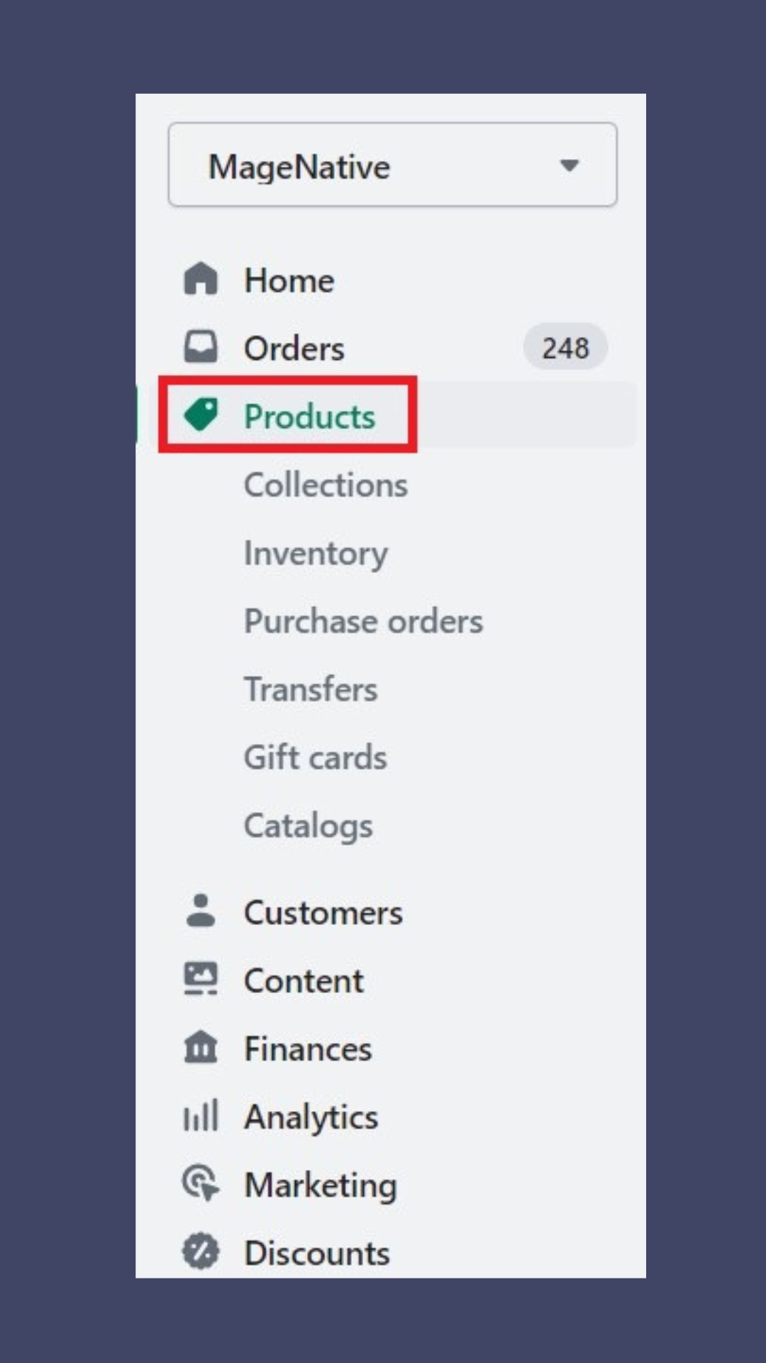
Now, Let’s proceed to explore the process of uploading 3D/AR Models from the Shopify admin interface.
Step 4 – After accessing the Shopify admin panel, navigate to the left menu bar and click the ‘Products’ link from the left menu bar.
Step 5- Now, select the desired product you wish to showcase in a 3D model/ Augmented Reality (AR) format. Let’s suppose you have selected ‘Table Lamp’ from the product list. From here, you need to upload the image in .usdz or .glb format.
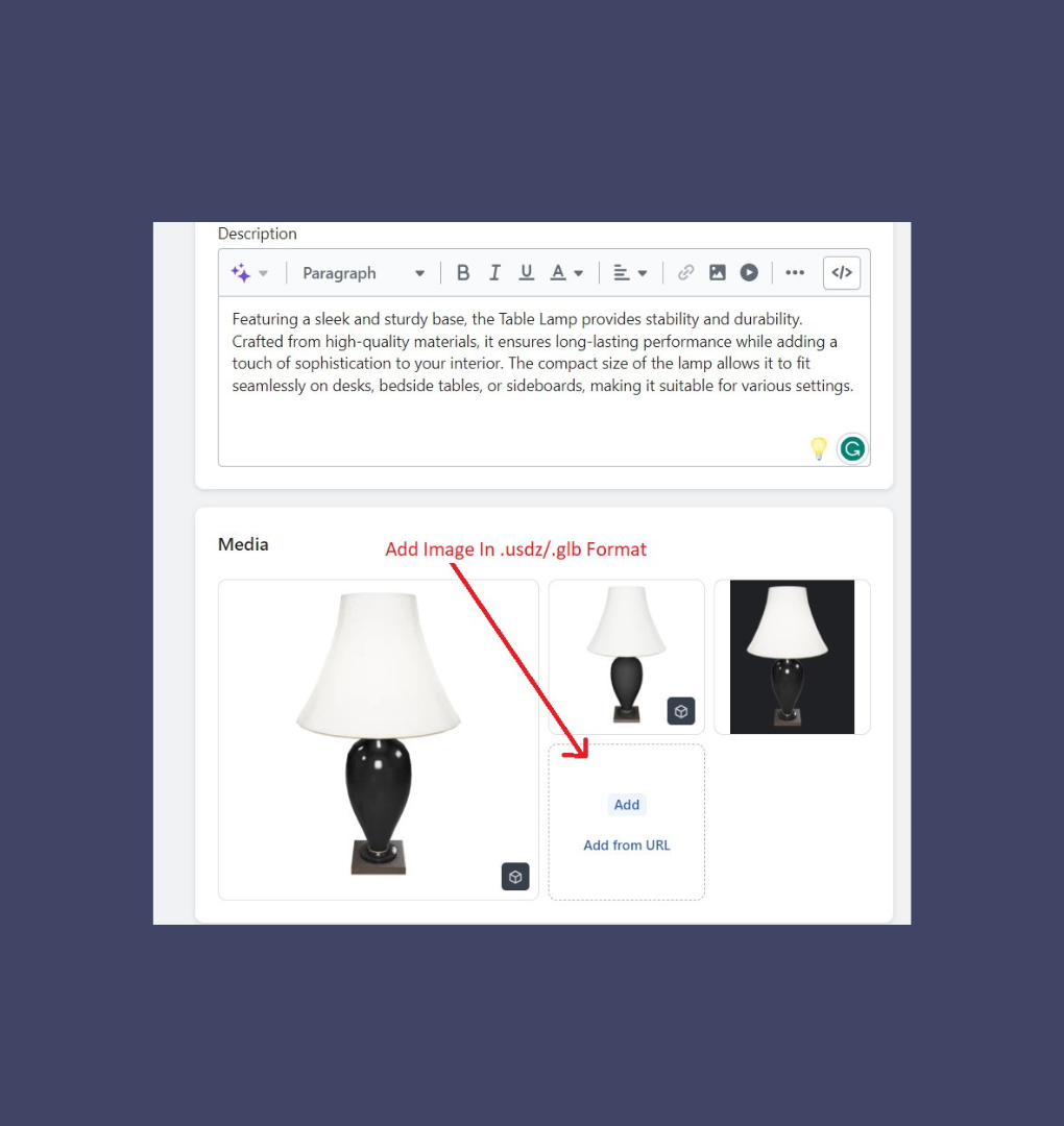
Step 6- After adding .glb and .usdz files from the Shopify admin you can now view those products in 3D/AR format:
- Go to your mobile app:
- Search your mobile app for the product(Table Lamp) you want to view in 3D/AR format.
Step 7- Products enabled with 3D/AR features are marked with a 3D/AR symbol.
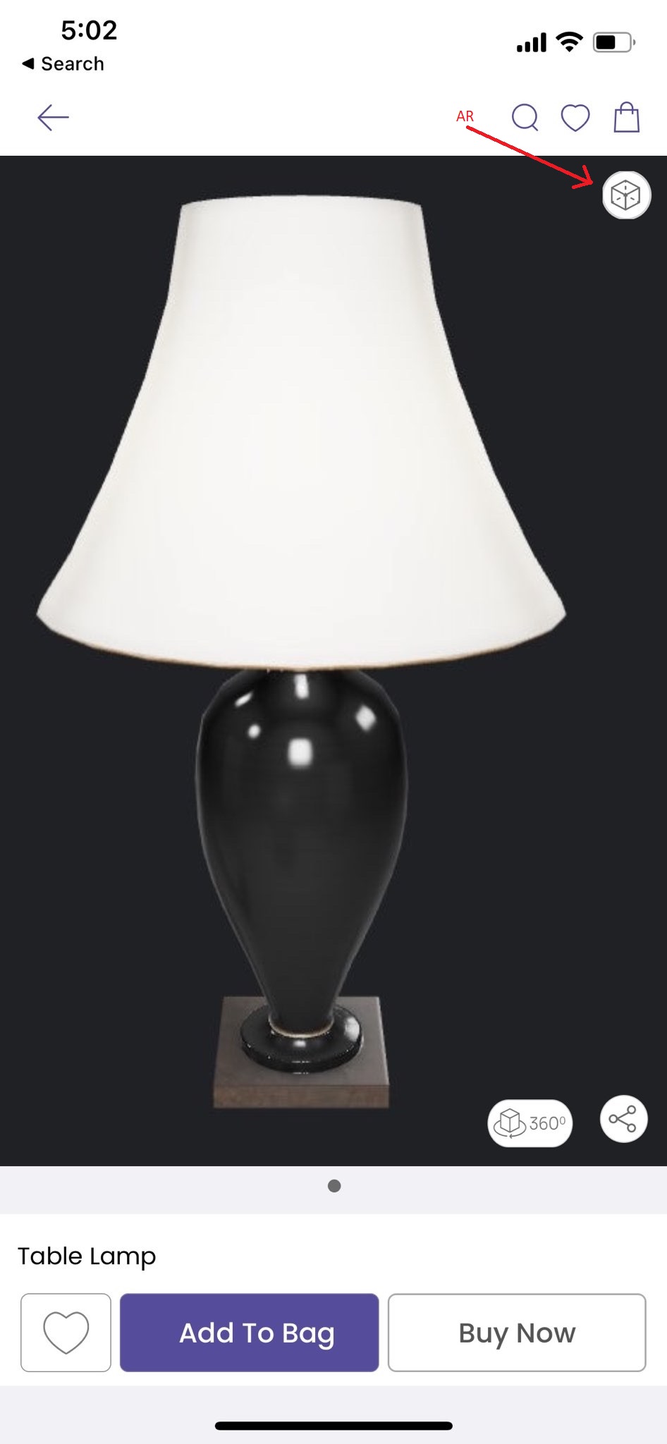
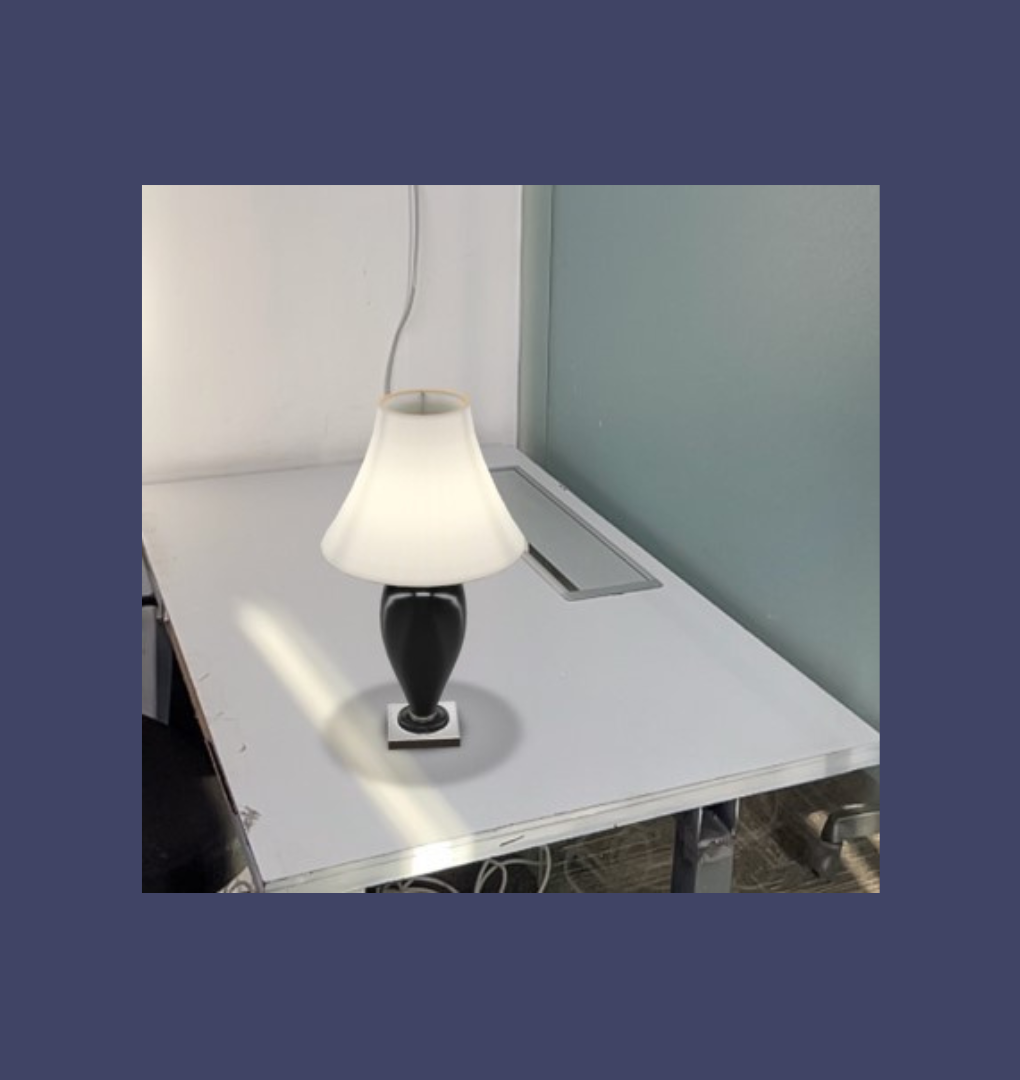
Step 8- You are now able to observe the chosen product in a three-dimensional/augmented reality (3D/AR) format. With your mobile camera, position the product wherever you desire and immerse yourself in an unforgettable experience.
10.Product Listing Page- PLP
The Product Listing Page (often referred to as PLPs or category landing pages) streamlines the process for customers to quickly browse and find products they wish to purchase. As a result, it is important for the page to facilitate easy product discovery and engagement, while also reducing the time to make a purchase.
A top-notch Product Listing Page (PLP) offers user-friendly filtering and sorting features, to help customers in finding their desired items. On this page, customers can easily access crucial product information:
- Product Title
- Product images
- Product descriptions
- Pricing details
- Star ratings
- Review count
This information empowers users to take actions easily such as adding to their wish list, making comparisons, or making a purchase effortlessly.
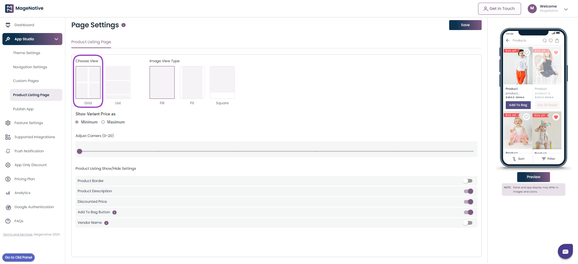
1. In the admin panel, on the side menu bar click on App Studio.

2. In the drop-down menu in the side menu bar click on the Product Listing Page.
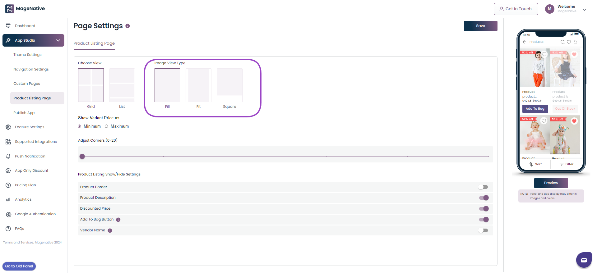
3. Now, you can choose how you want to view your page:
A. Grid: Elements are organized in rows and columns, creating a grid where customers can easily browse and compare multiple products at once.
B. List: This layout is suitable for showcasing products one by one, and users scroll horizontally to view more options.
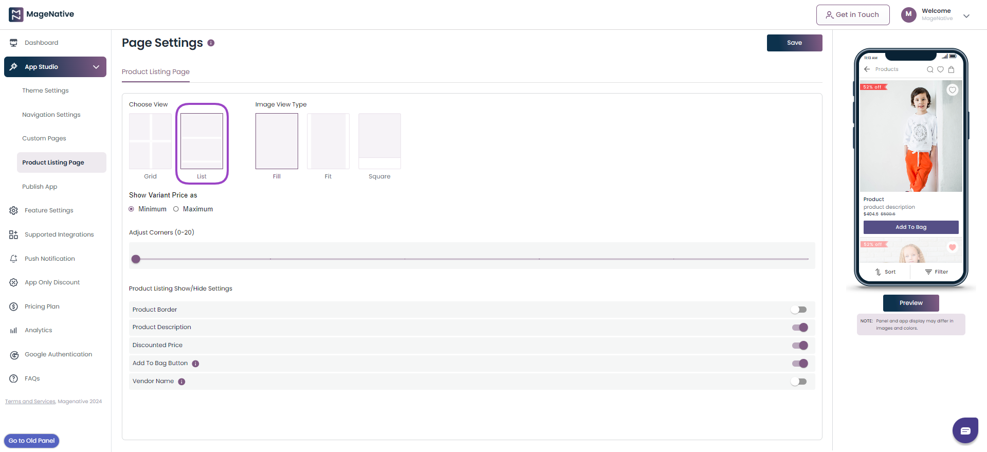
4. Now, choose how you want your image to in the grid view or line view should look like:
A. Fill: The image will crop to fill the frame.
B. Fit: The width of an image in relation to its height.
C. Square: The width and height are the same.
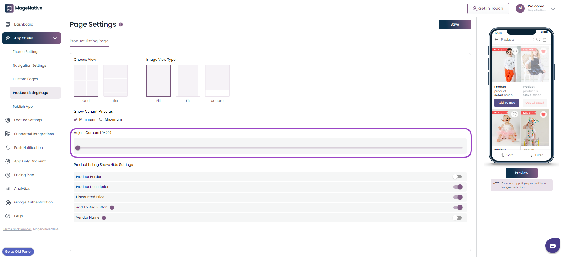
5. Now, you can adjust corners of the image you have uploaded to make the corners look curved.
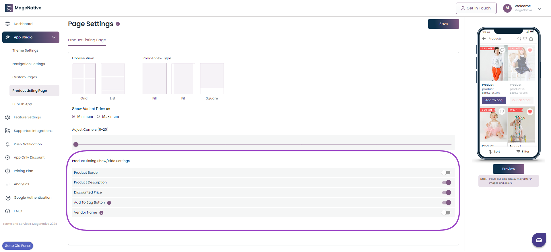
6. Product Listing Show/Hide Setting: You can hide or show, Enable/Disable the following categories on the Product Listing Page.
A. Product Border: This gives the product’s border a visual distinction, provides alignment, and highlights the product border.
B. Product Description: This provides product information and gives clarity about the full description of the product.
C. Discounted Price: Show the comparison between the actual price and the selling price.
D. Add to Bag Button: You can either add the button to this or only a tag to it.
E. Vendor Name: You can hide or unhide the seller’s name.
A brief overview of how to design captivating product listing pages
That’s it !? Now Incorporate these user-friendly customization options for your Product Listing Page through the admin panel, ensuring a seamless and visually appealing shopping experience that not only captivates your customers but also accelerates their journey from product discovery to effortless purchase.
11.Navigation Settings
The Navigation Menu section allows you to personalize your menu by incorporating categories and subcategories, assigning names according to your preference. MageNative enables you to customize your side, top, and bottom navigation with simple steps.
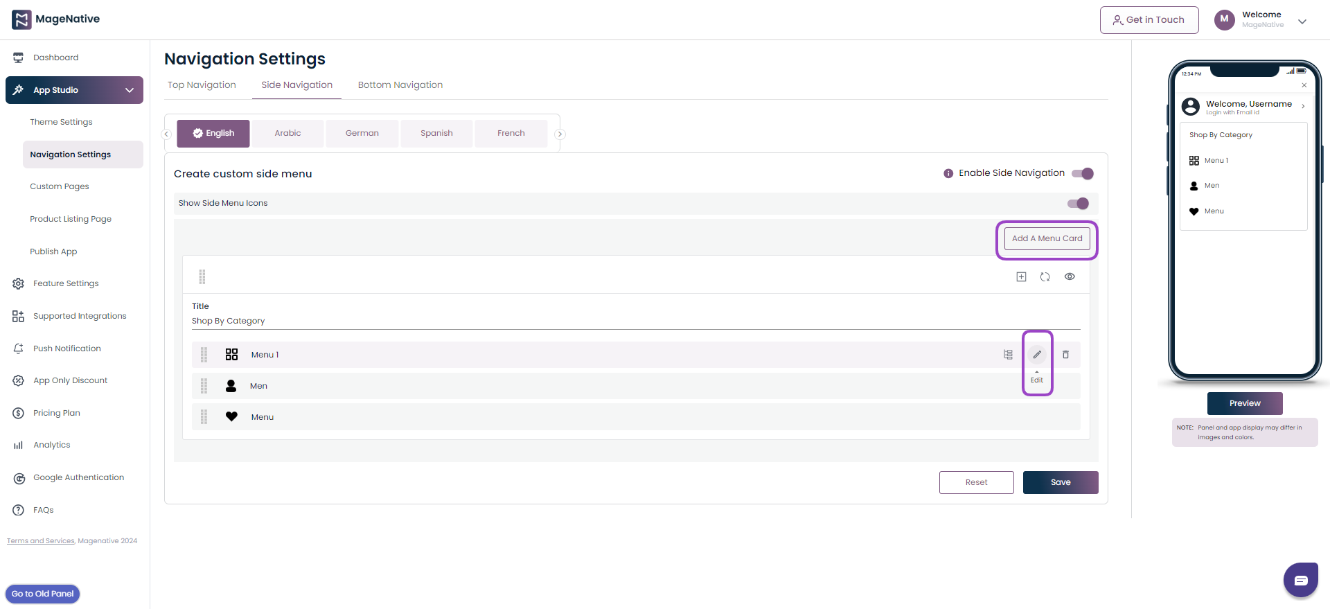
A side navigation, also known as a navigation drawer or hamburger menu plays an important role in overall app navigation. It enables users to directly access their desired category, manage their account, choose a country, select a language, explore promotions and marketing, and engage in multilevel navigation.
Side Navigation
1. open the MageNative admin panel and locate the App Studio in the left panel. Now click on Navigation Settings to edit your Side Navigation.
3. Now choose the Side Navigation option
4. By default we show main menu, in order to change you can add a card or edit the current menu as well.
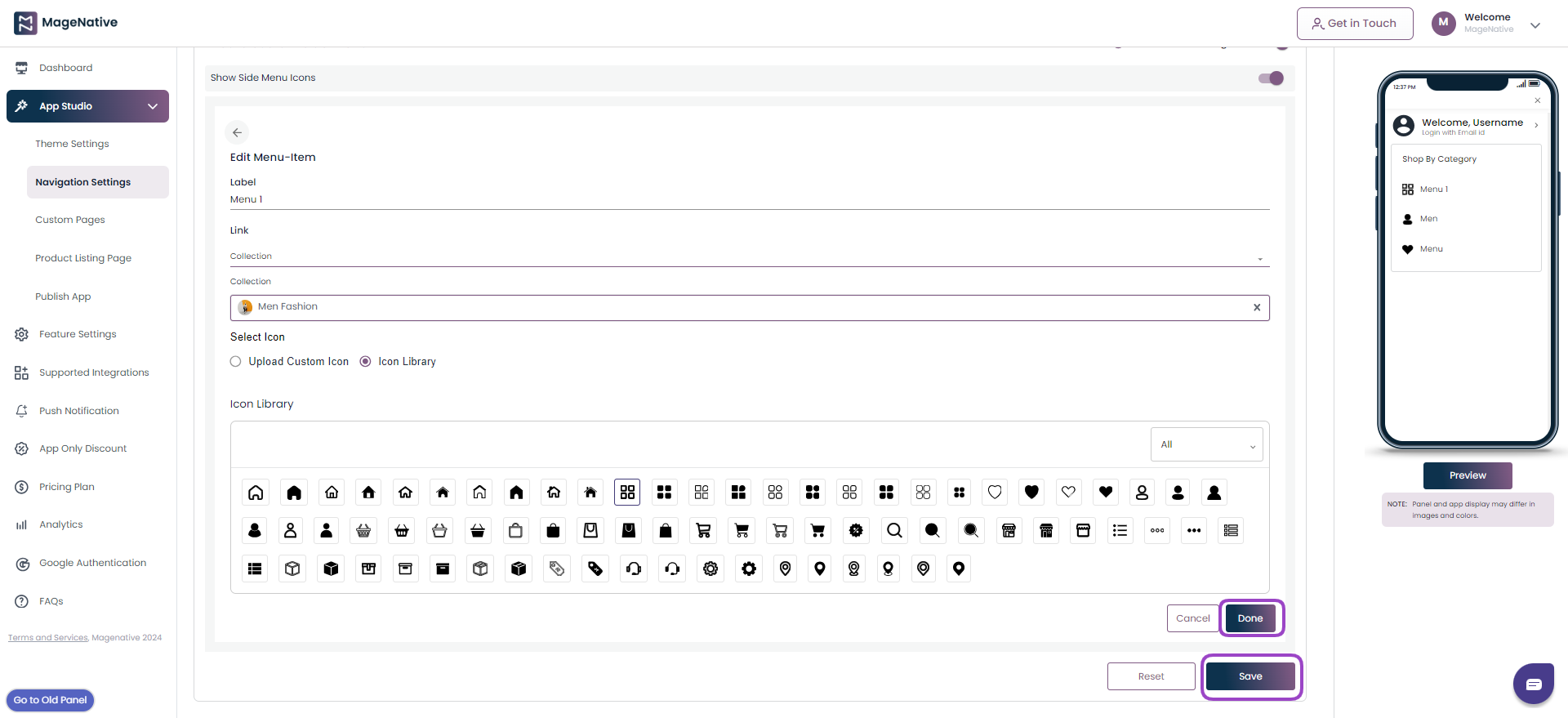
5. You can also choose the icons from our Icon Library or even upload the icon that correctly represent your collection.
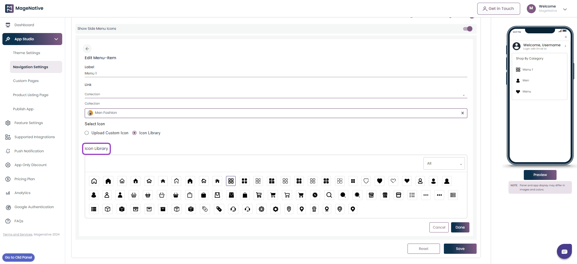
6. As you finish the changes, click on Done and Save button. Your newly built side menu is ready to preview.
Top Navigation
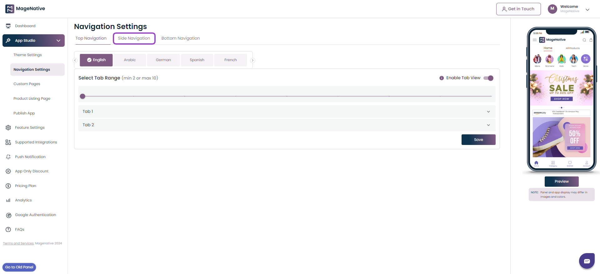
1. Click on the Top Navigation section at the top under the Navigation Settings. You can set the number of tabs you want, with a minimum of 2 and a maximum of 10.
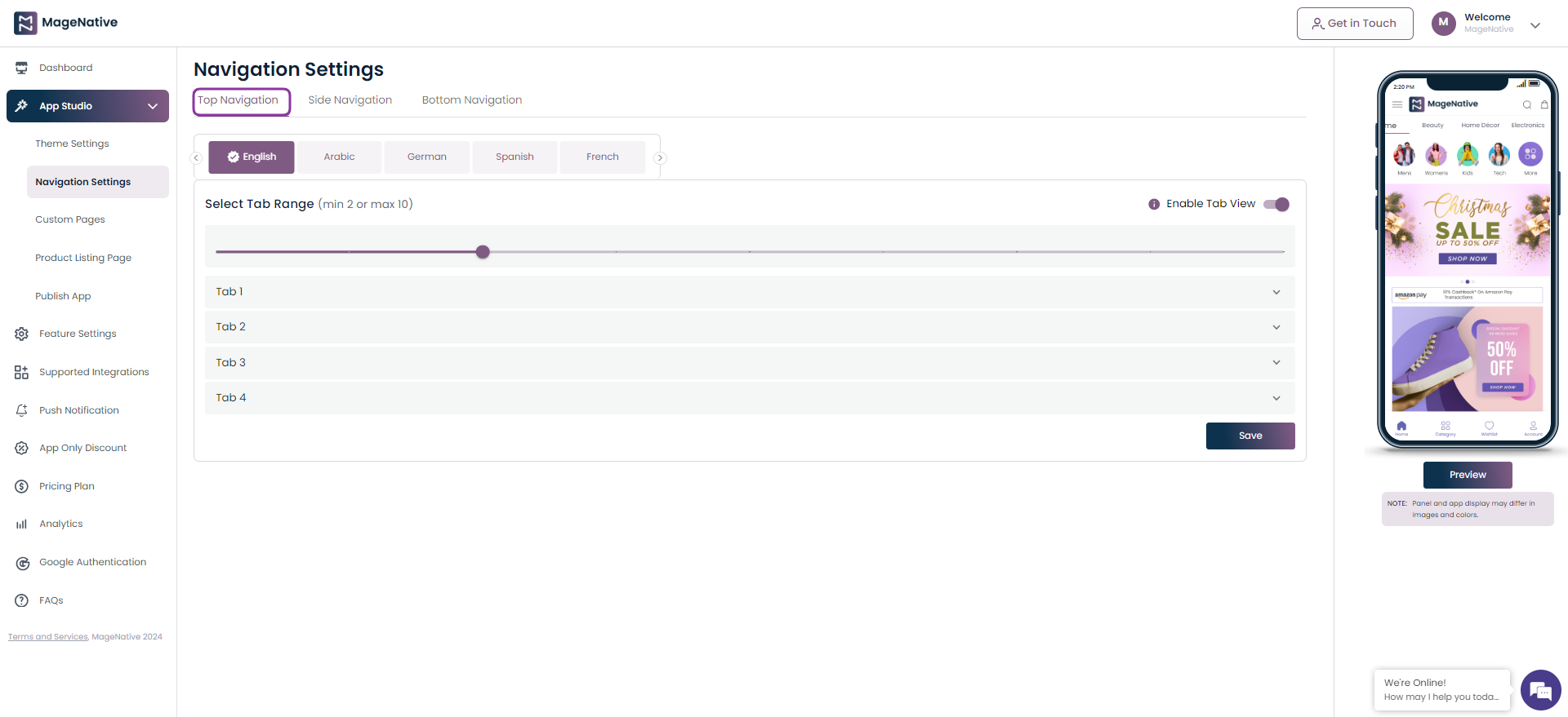
2. You will get 10 tabs to add in your app top navigation menu. Now, select below features for each tab.
- Tab Title – Add a name to display on your tab.
- Custom Pages – Choose the page to be linked with tab.
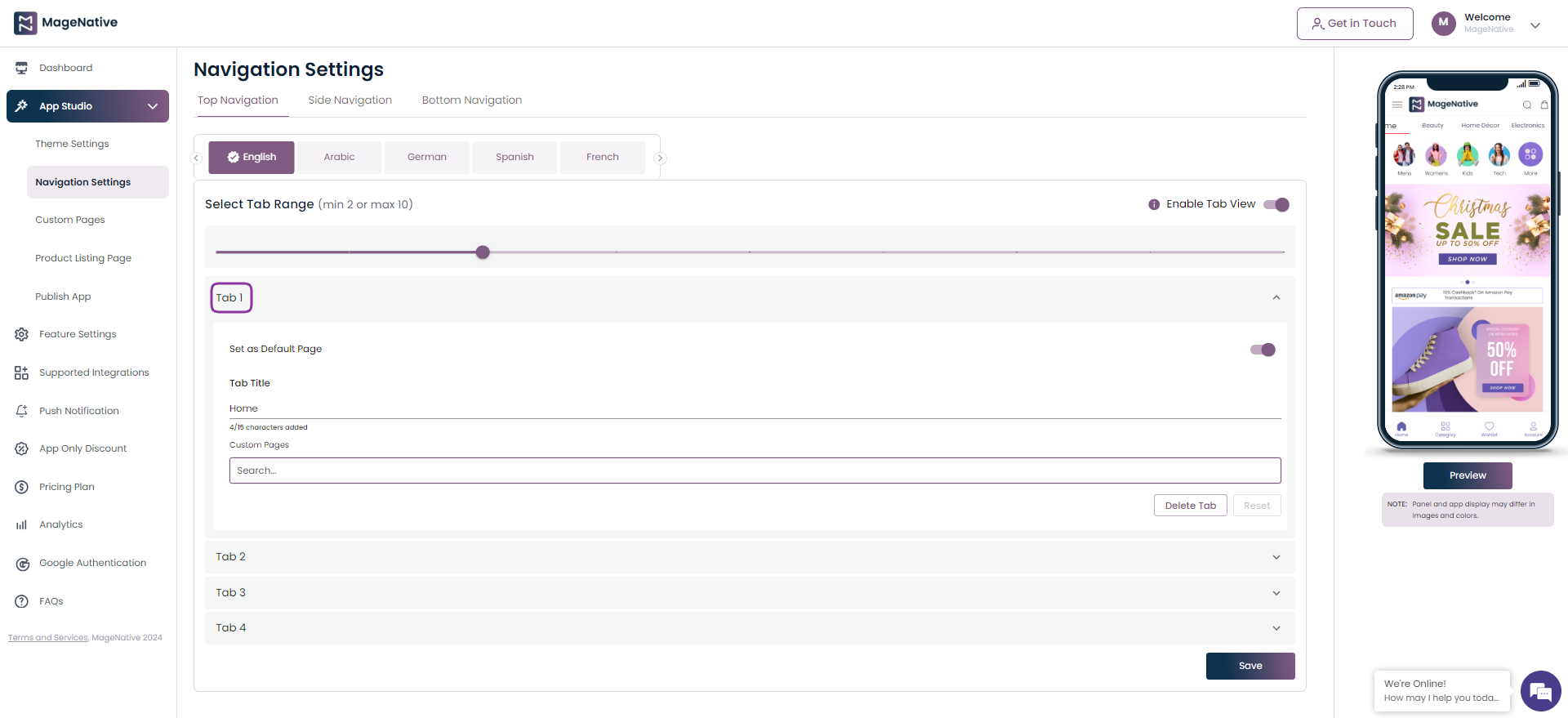
3. Click on the Save button to save the changes.
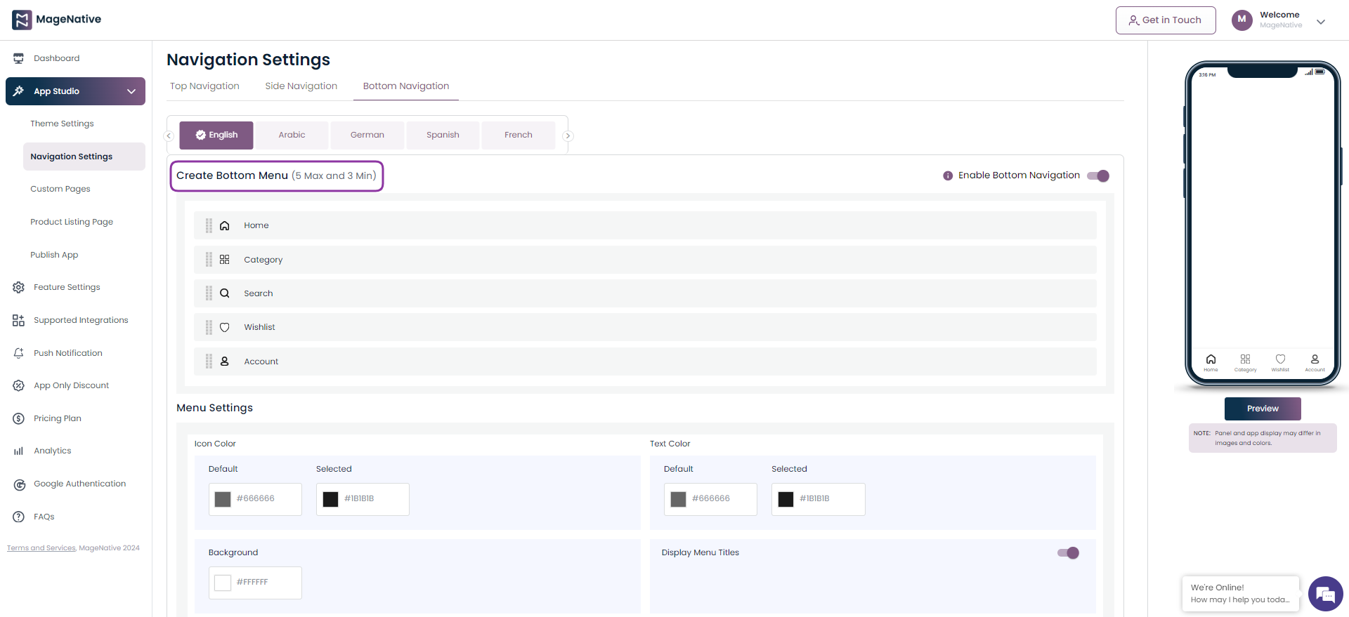
Bottom Navigation
1. Click on the Bottom Navigation section at the top under the Navigation Settings.
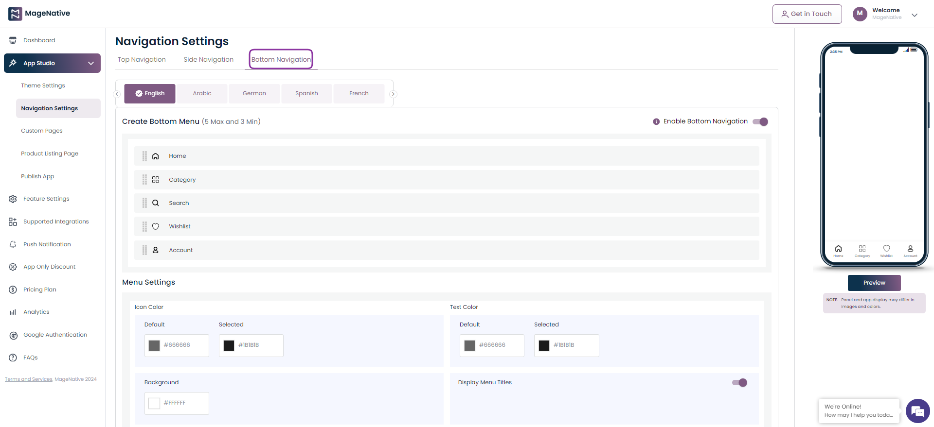
2. It will present to you options to create upto 5 bottom menus. One menu will auto redirect to the Home page.
3. Click on the edit icon to create bottom menus.
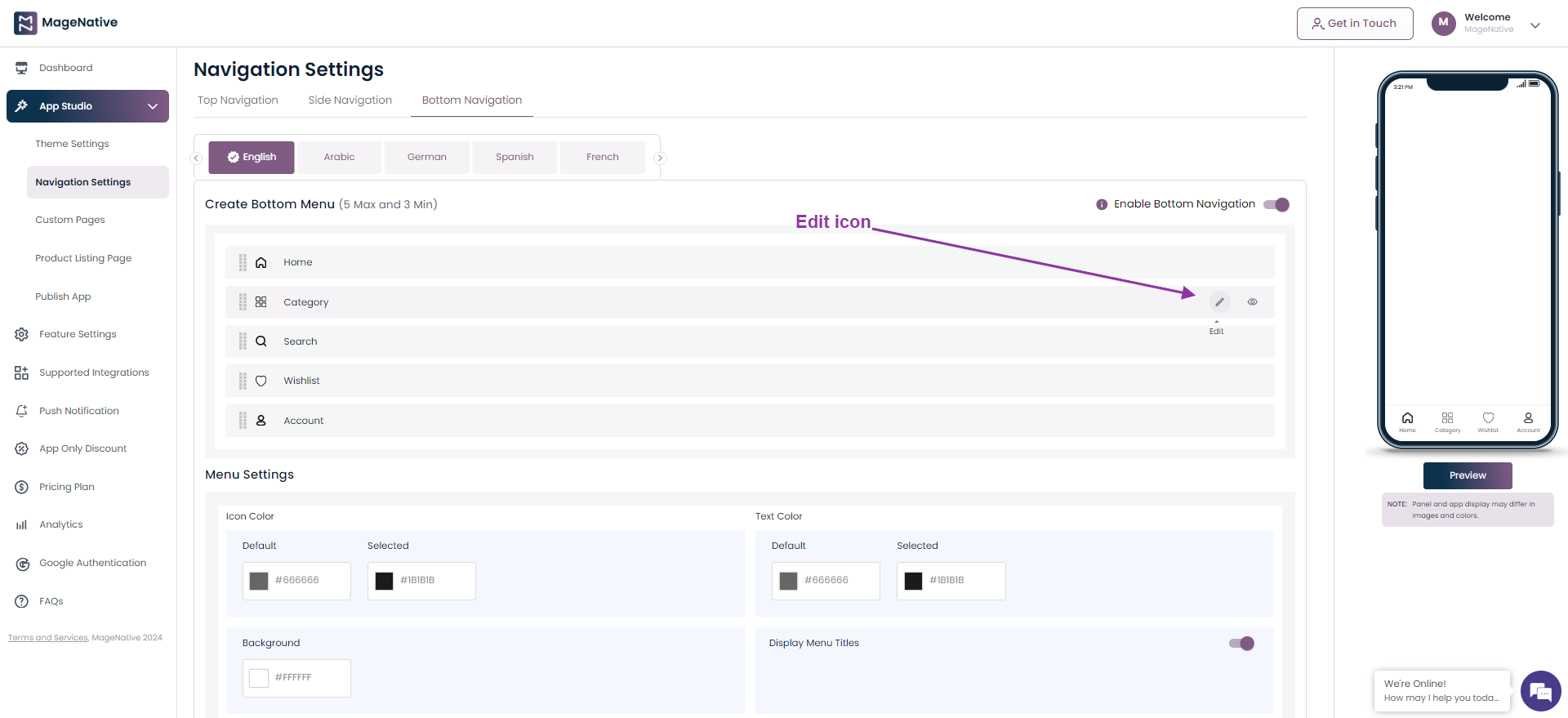
4. It will open up the Create Bottom Menu box. Here you can add below details to create menus to display on the bottom menu.
- Title – Add name of the menu.
- Link With – Choose the section that you want to link with the menu.
- Pages – Select the pages that you would like to link with the menu.
- Select icon – Choose a custom icon or upload menu from the icon library.
You also get to update the menu settings using below
- Icon Color – Choose a color for the icon.
- Text Color – Select the text color for icon name .
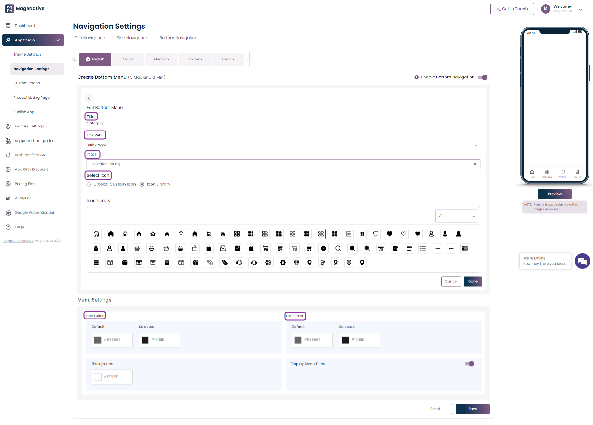
Click on the Save button to save the changes done.
A quick overview of navigation settings.
Thank you for choosing MageNative. We wish you success in creating your side, top, and bottom navigation.
12.Custom Landing Pages
Welcome to the MageNative Admin Panel! This document will guide you through the process of creating custom landing pages for your mobile app. Lets have an overview of how to configure custom landing pages.
Please follow the steps below to get started:
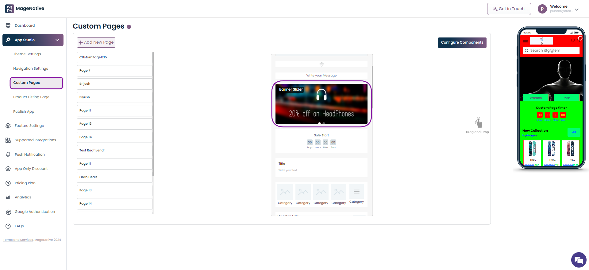
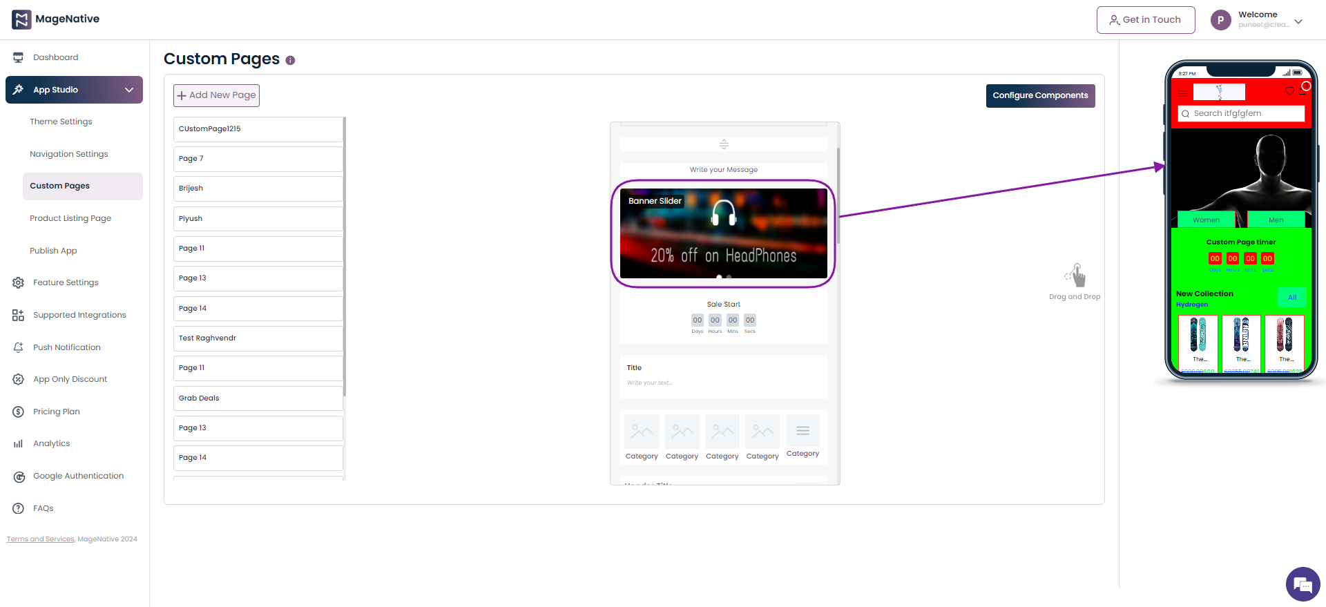
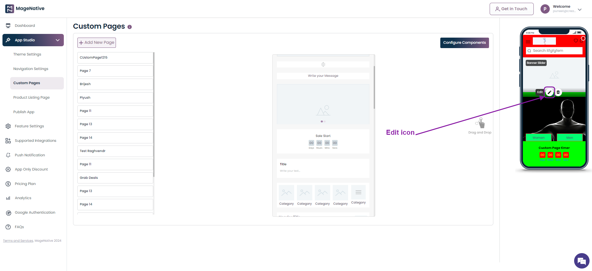
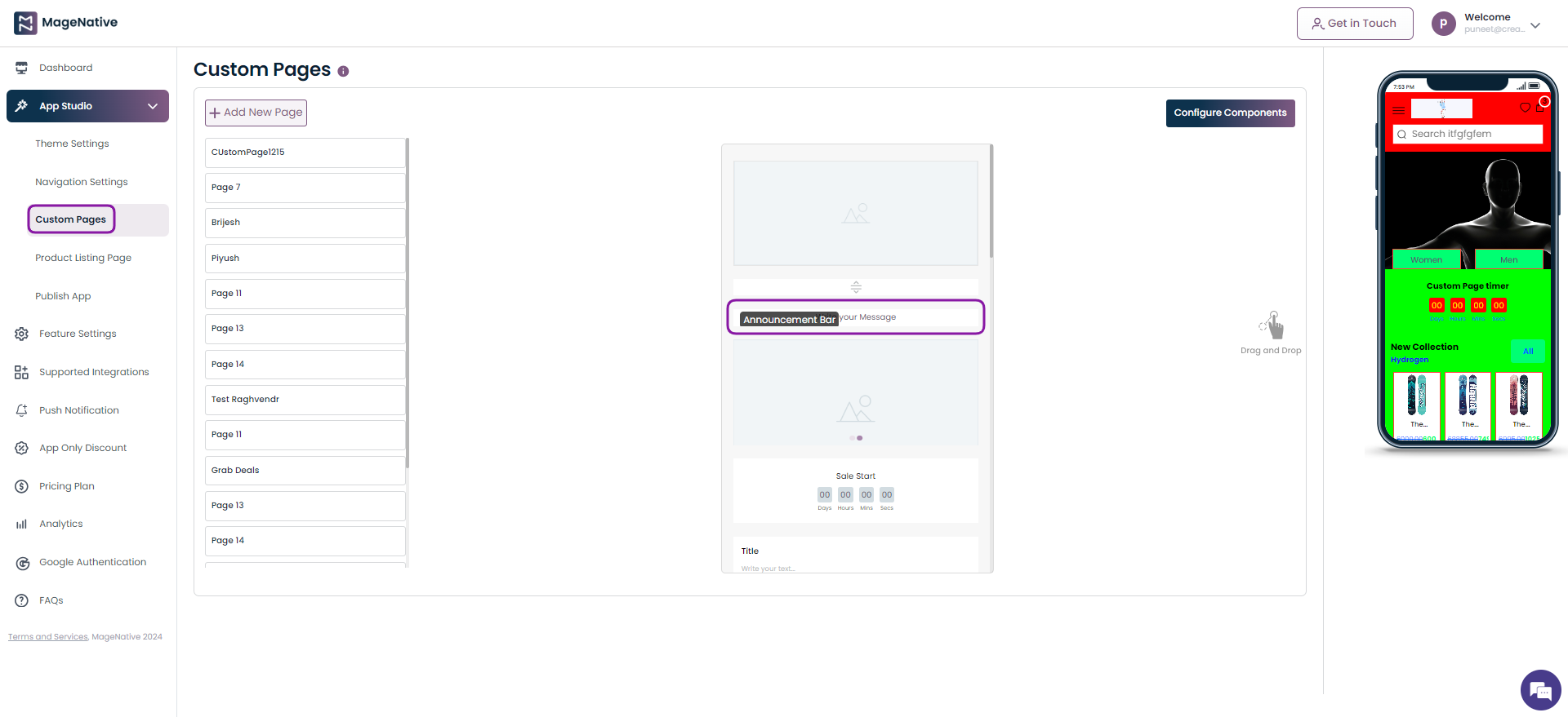
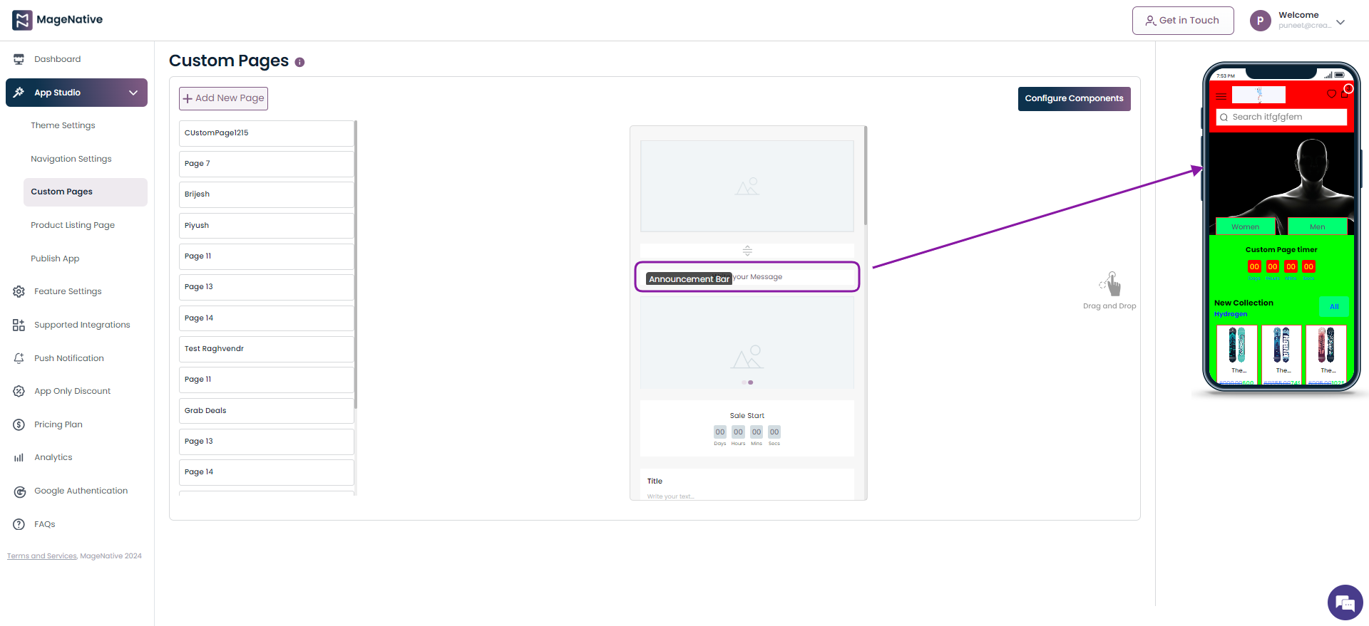
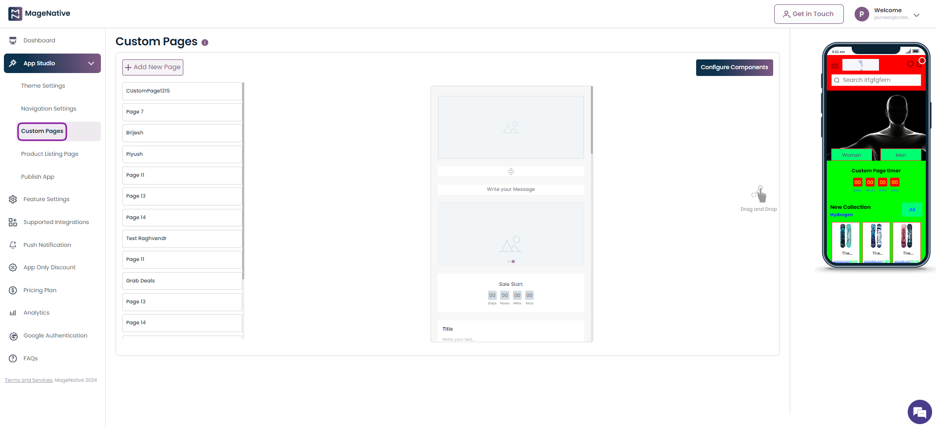
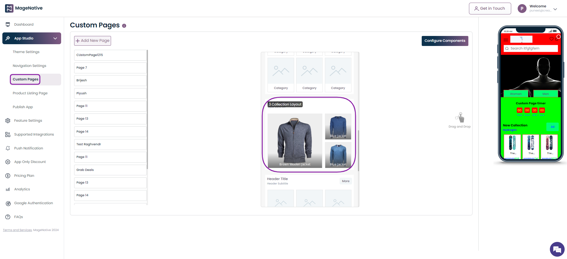
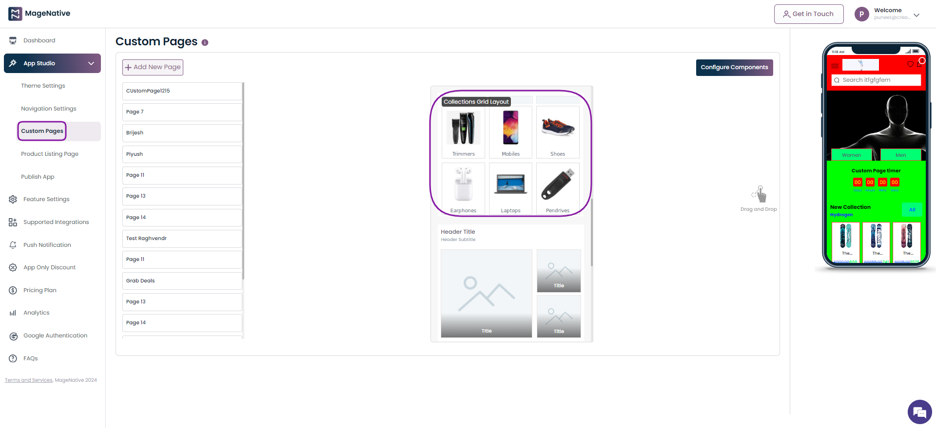
Step 1: Navigate to the MageNative Admin Panel. On the left-hand side, you will find the App Studio option. Click on it, and then select Custom Pages.
Step 2: Within the Custom Pages section, you can easily create your custom pages. Simply drag and drop the desired blocks to the right side on the mobile app interface.
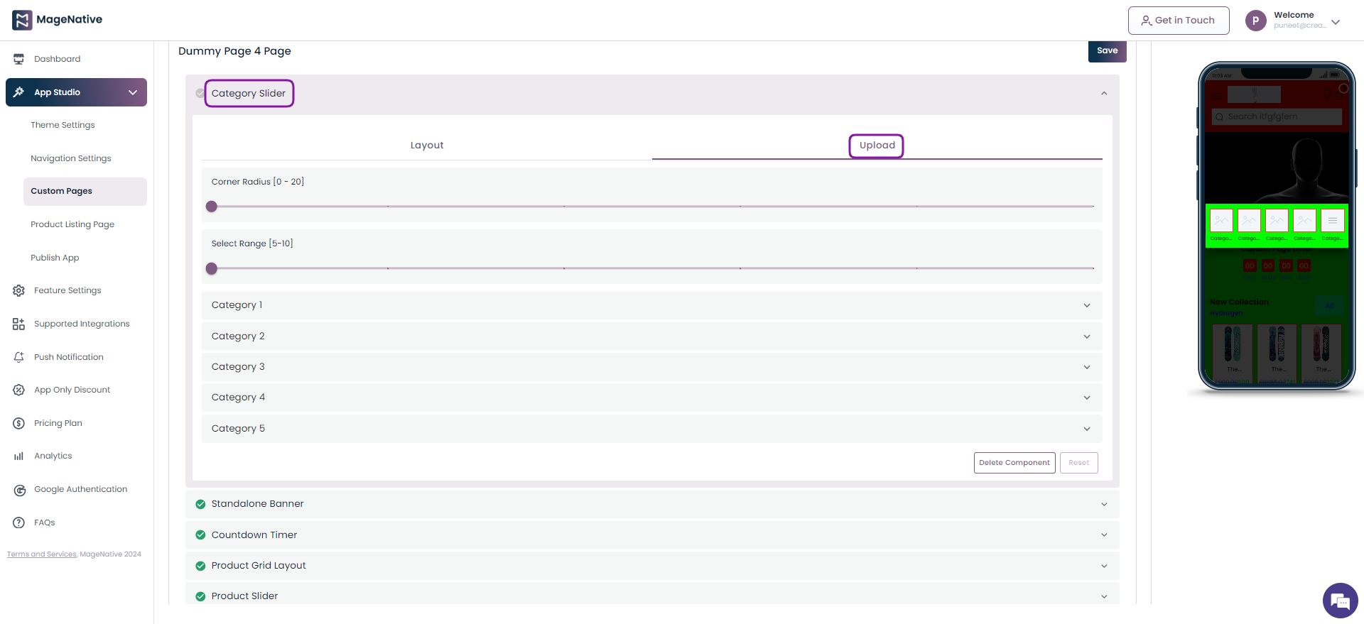
The Configure Components button allows you to csutomise each component of your custom landing page to meet your specific design requirements.
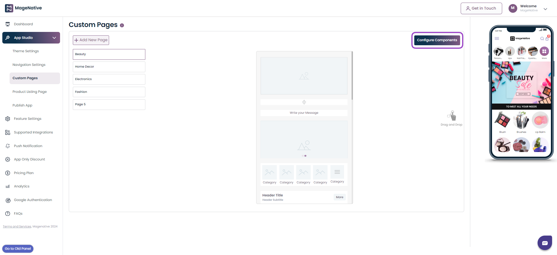
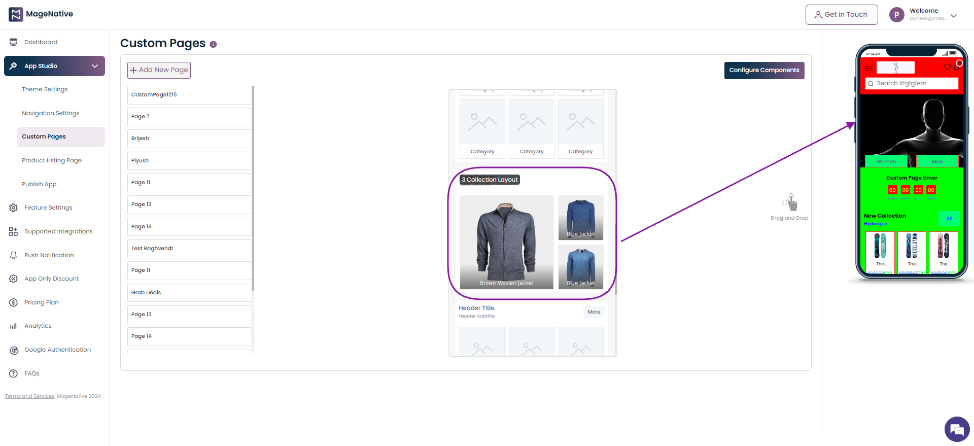
Step 3: Click on the Configure Components section to add differnt design elements to your custom landing page. Now, click on the Save button at top right.
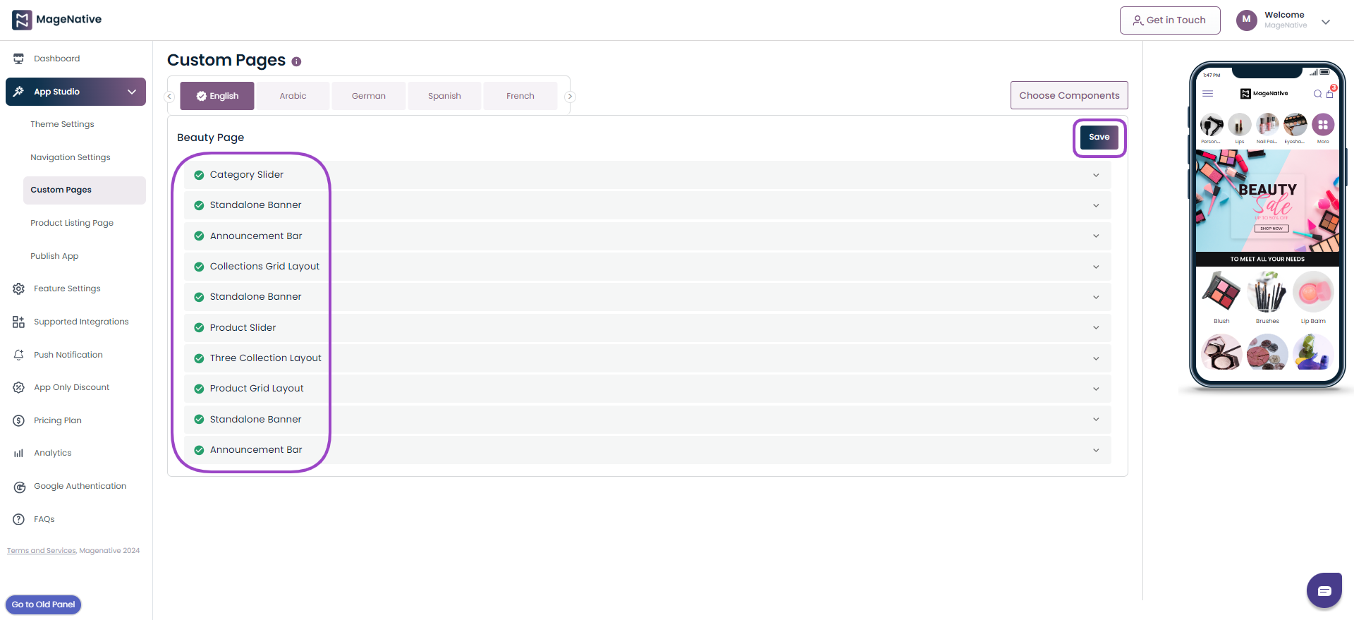
Step 4: These changes will get reflected on the mobile app interface present on the right side.
These steps will help you create and configure multiple landing pages tailored to your specific needs. Should you have any questions or need further assistance, please do not hesitate to contact our support team. We are here to assist you in enhancing your app’s user experience.
Thank you for choosing MageNative. We wish you success in creating your custom landing pages!
13.Advance Analytics
High retention rates indicate that users find value in the app and are satisfied with their experience. This positive sentiment can differentiate the app from competitors a
A higher number of active users indicates a strong user base and suggests that the app is meeting the needs and preferences of its users effectively.
Welcome To The Analytics Section
In this user guide, we’ll walk you through the Analytics section of the MageNative App. Here, you’ll find valuable insights into your mobile app’s performance and user engagement. We’ll explain key terms and how to navigate this section effectively.
Click on the Analytics section under the MageNative admin panel on the left side.
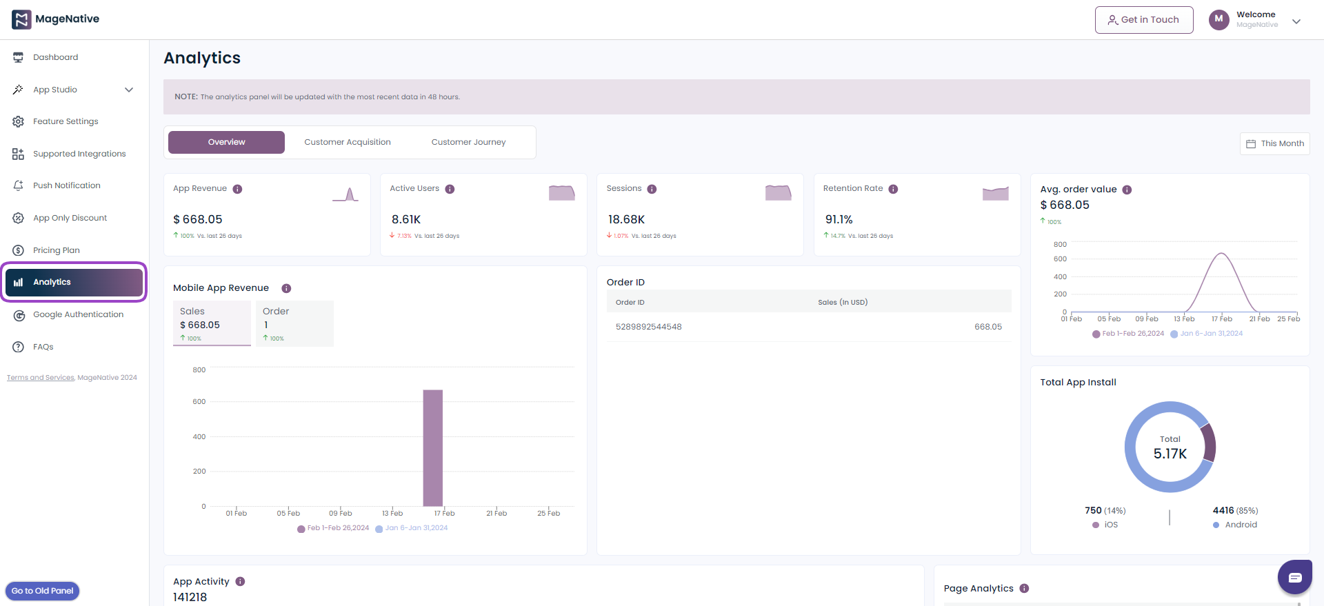
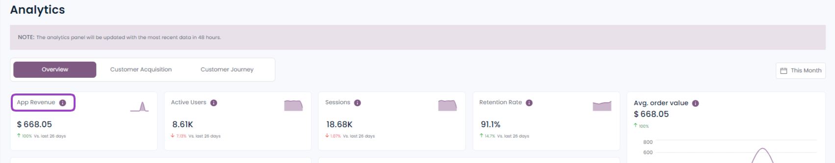
1. App Revenue
Mobile app revenue refers to the total income generated by your app over a specific time period. Analyzing app revenue is essential to understanding your app’s financial performance and can help you make informed decisions about monetization strategies.
By gathering insights on app revenue over time, merchants can spot trends in how users spend. This helps them seize opportunities during busy periods and tweak strategies when things slow down, ensuring a steady flow of income.
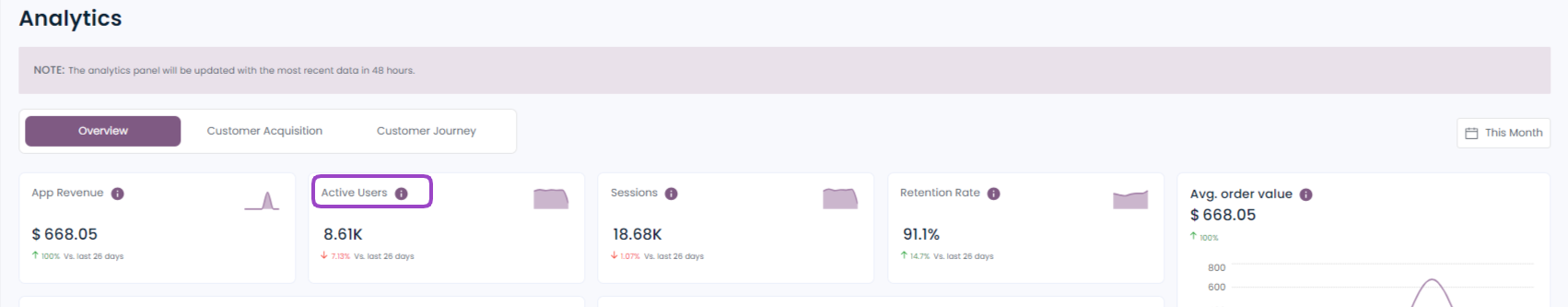
2. Active Users
The number of users who regularly engage with your app. It’s a key metric for assessing user engagement and app popularity. By understanding your active user base, you can tailor your app’s features and content to meet their needs and preferences.
A higher number of active users indicates a strong user base and suggests that the app is meeting the needs and preferences of its users effectively.
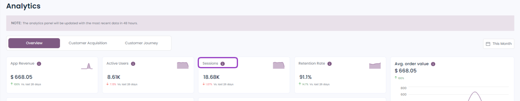
3. Sessions
A session in mobile app analytics refers to a single user interaction with your app, starting when the app is launched and ending when the user exits. Monitoring sessions help you gauge user engagement and app usage.
It provides insights into user behavior and preferences. This can be leveraged to tailor marketing campaigns and promotions to target specific user segments or promote relevant app features, driving user engagement and boosting customer retention.
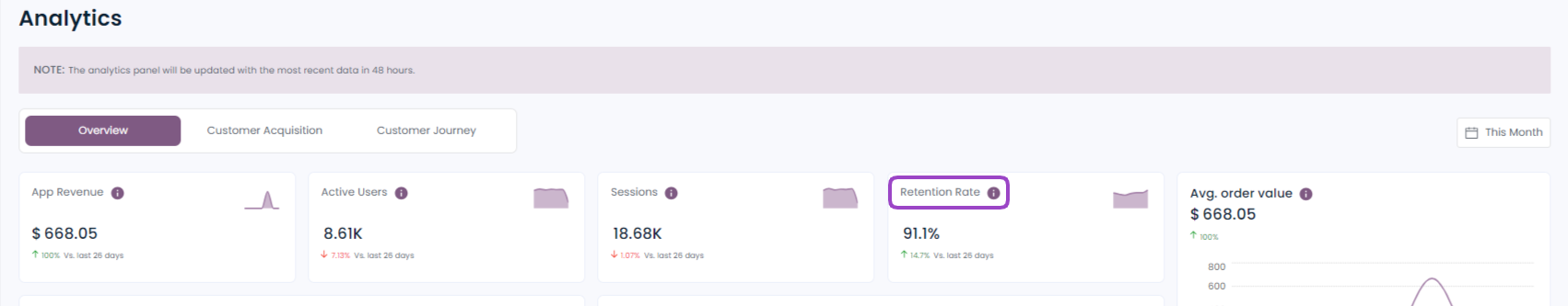
4. Retention Rate
Retention rate measures the percentage of users who continue to use your app over a specified period. It’s a key indicator of user satisfaction and app stickiness. High retention rates indicate that users find value in your app and are likely to return.
High retention rates indicate that users find value in the app and are satisfied with their experience. This positive sentiment can differentiate the app from competitors.
5. Choose Range
It allows you to select a specific time period for which you want to view the analytics data. You can choose from various pre-defined ranges:
- Today
- Yesterday
- This Week
- Last Week
- This Month
- Last Month
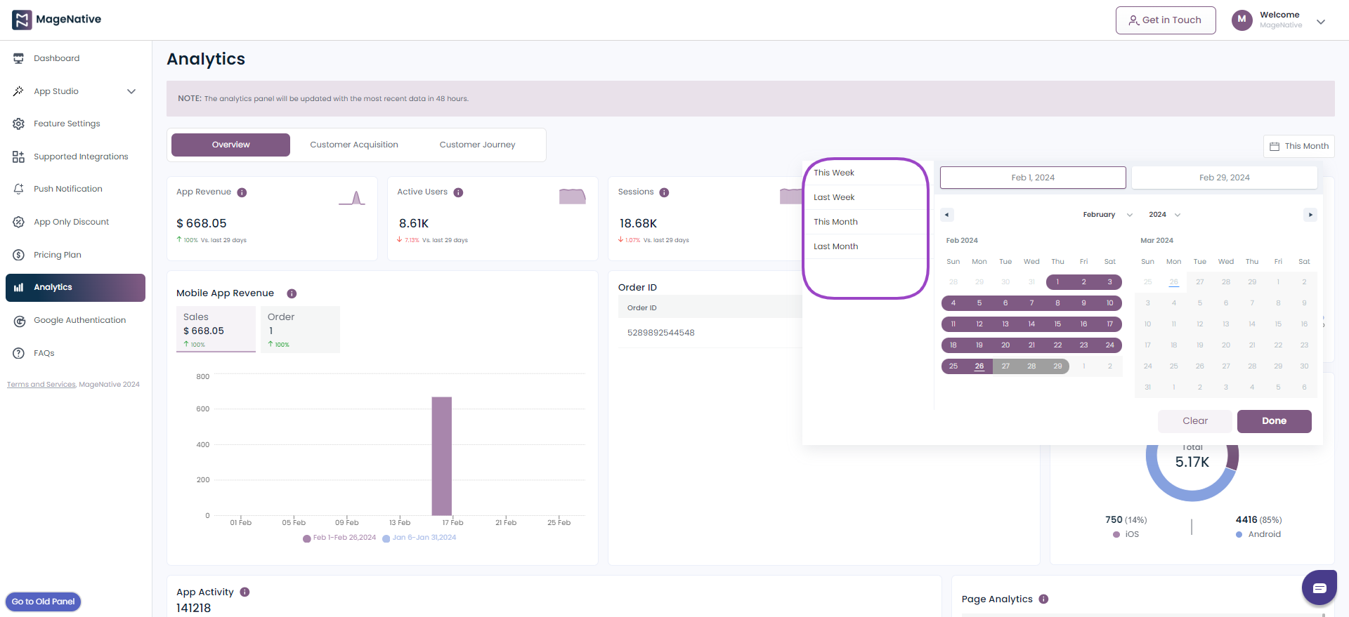
6. Mobile App Revenue
It’s a crucial metric that reflects the financial performance of your mobile application. It encompasses various components, with Sales and Order being two of the most vital aspects. Let’s dive into what each of these terms means:
- Sales: This represents the total sales generated through your mobile app over a specific period, typically measured in days, weeks, or months. It’s the sum of all transactions, including purchases, subscriptions, and more.
- Order: The number of orders placed by your mobile app users.
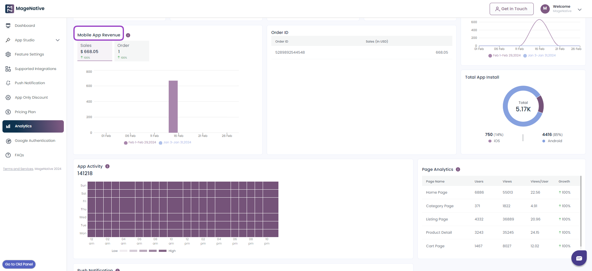
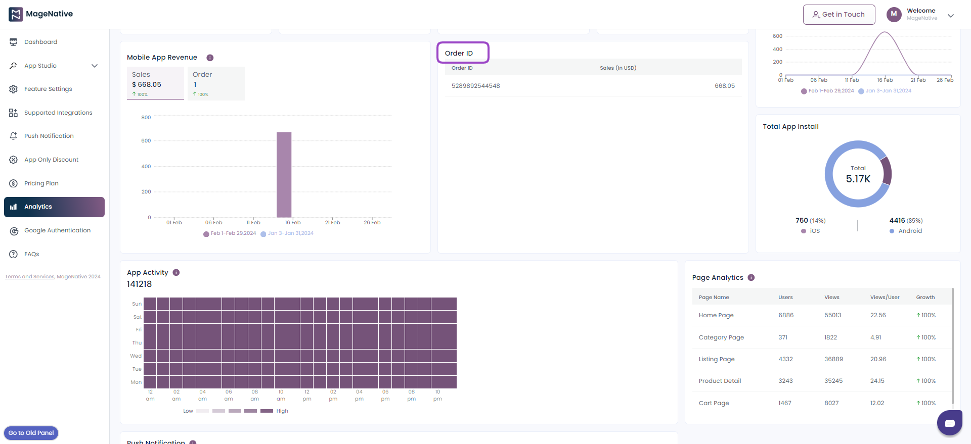
7. Order Id
Each order is assigned a unique identification number for easy reference. It facilitate easy organization and retrieval of order information. Merchants can quickly locate specific orders for processing, tracking and eventually streamline order management workflows.
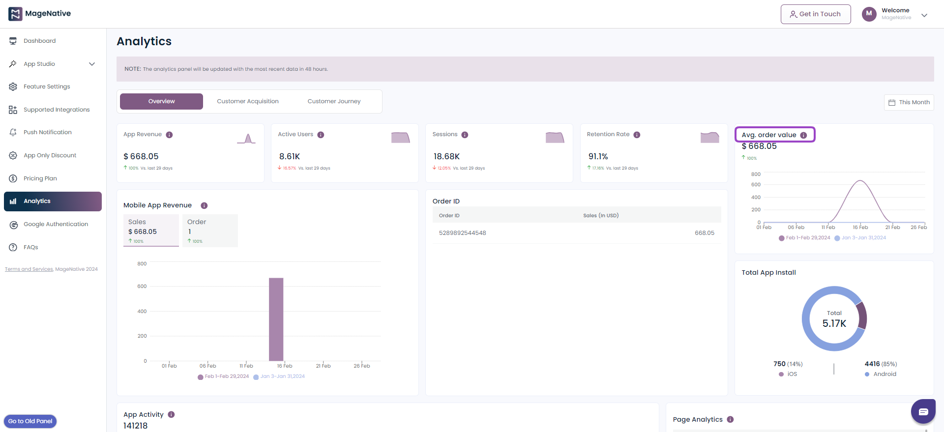
8. Avg. Order Value
The average value of each order, is calculated by dividing the total sales by the number of orders. It can be helpful in following ways
- Merchants can use the average order value as a benchmark to set thresholds for qualifying for free shipping or discounts.
- It becomes easy to create bundled product offers that complement the items typically purchased together.
- The average order value enables merchants to tailor personalized product recommendations based on customers’ purchasing behavior.
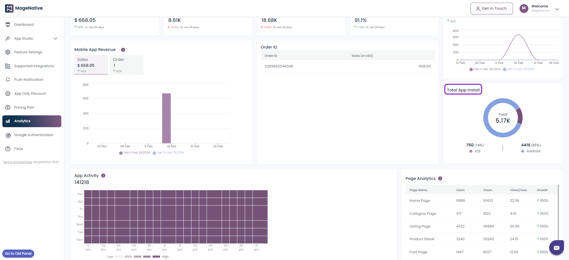
9. Total App Install
The total count of app installations. Tracking installation numbers over time allows merchants to assess the growth of app’s user base, providing valuable feedback on the effectiveness of their marketing and promotional efforts.
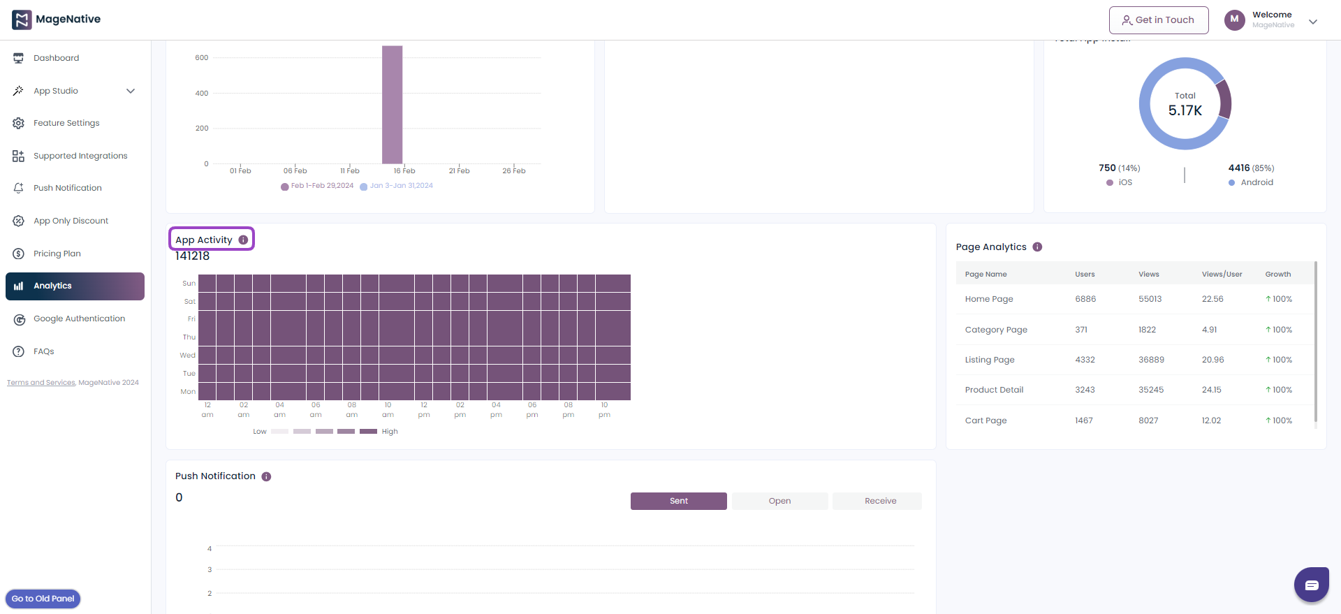
10. App Activity
The App Activity Card employs a heatmap to visually represent the total count of sessions, both by day and by hour, that occurred within your app during the selected time frame. This heatmap employs varying shades to convey information: darker colors indicate hours with a high number of sessions (high app activity), while lighter colors represent hours with fewer sessions (low app activity).
11. Page Analytics
This section provides insights into user interactions with different app pages. It includes the following:
- Home Page: Data related to the home page of your app.
- Category Page: Information about category-specific pages.
- Listing Page: Insights into product listing pages.
- Product Details Page: Information about individual product pages.
- Cart Page: Data related to the shopping cart, including items added and removed.

12. Push Notifications
This section covers data on the push notifications sent to app users. It includes:
- Sent: The number of push notifications sent.
- Open: How many users opened the notifications.
- Receive: The number of notifications received by users.
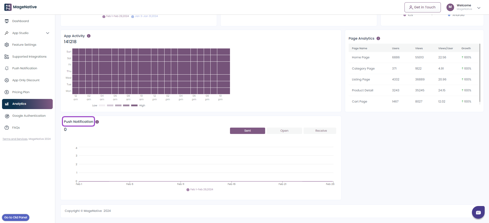
Let’s have a sneak peek into various insights offered by app analytics section
14.How To Seamlessly Link Custom Page To Your Mobile App Across Various Sections
With our latest update, we’ve introduced this amazing feature that allows you to effortlessly link the custom landing pages of your mobile app across a variety of sections as below.
- Banner Slider
- Announcement Bar
- Standalone Banner
- Collection Slider
- Three Collection Layout
- Category Slider
- Collection Grid Layout
Banner Slider
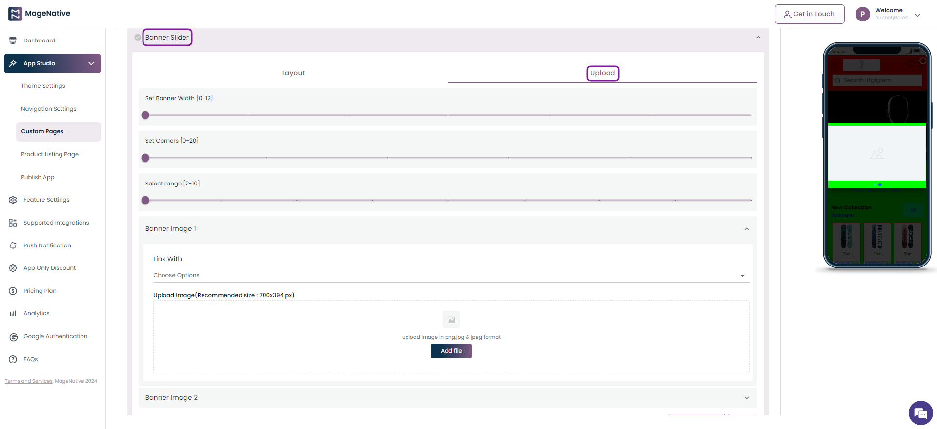
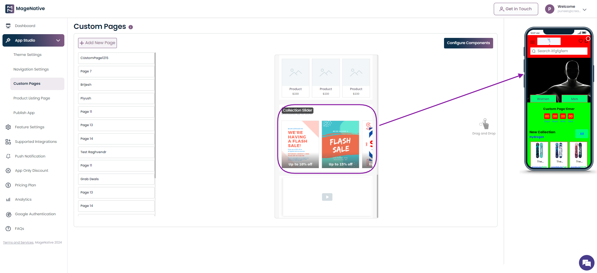
Step 1 – Navigate to MageNative app’s dashboard and click on the Custom Pages.
Step 2 – Locate the Banner Slider component. Now, drag and drop it on the mobile screen at the right side.
Step 3 – Click on the edit icon present on the Banner Slider section.
Step 4 – It will open up the different fields to be filled for adding banner slider in your mobile app.
Step 5 – Click the Link With field and choose the Web url option.
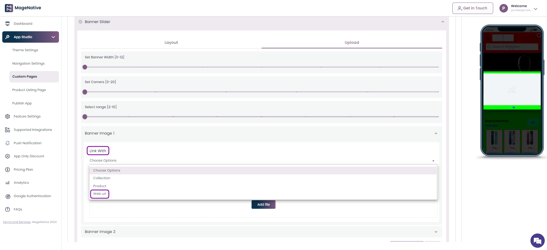
Step 6 – Now, under Web URL specify the link you’d like users to be redirected to when they click on the banner slider.
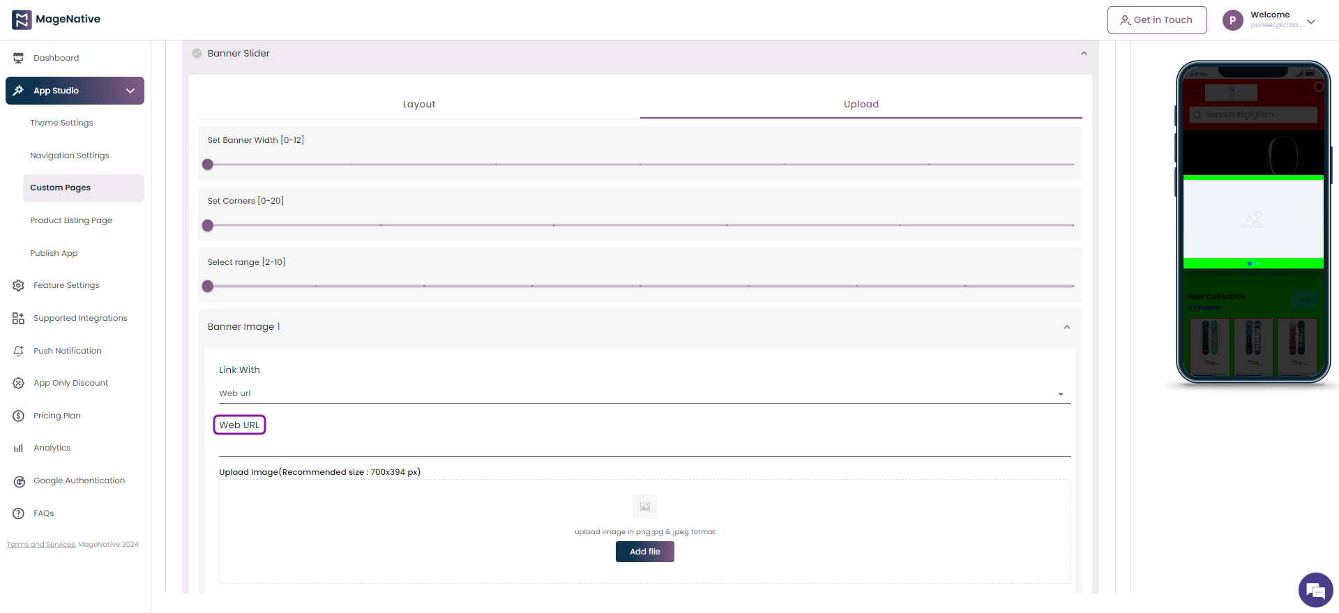
Step 7 – Finally, click on the Save button on the top right corner.
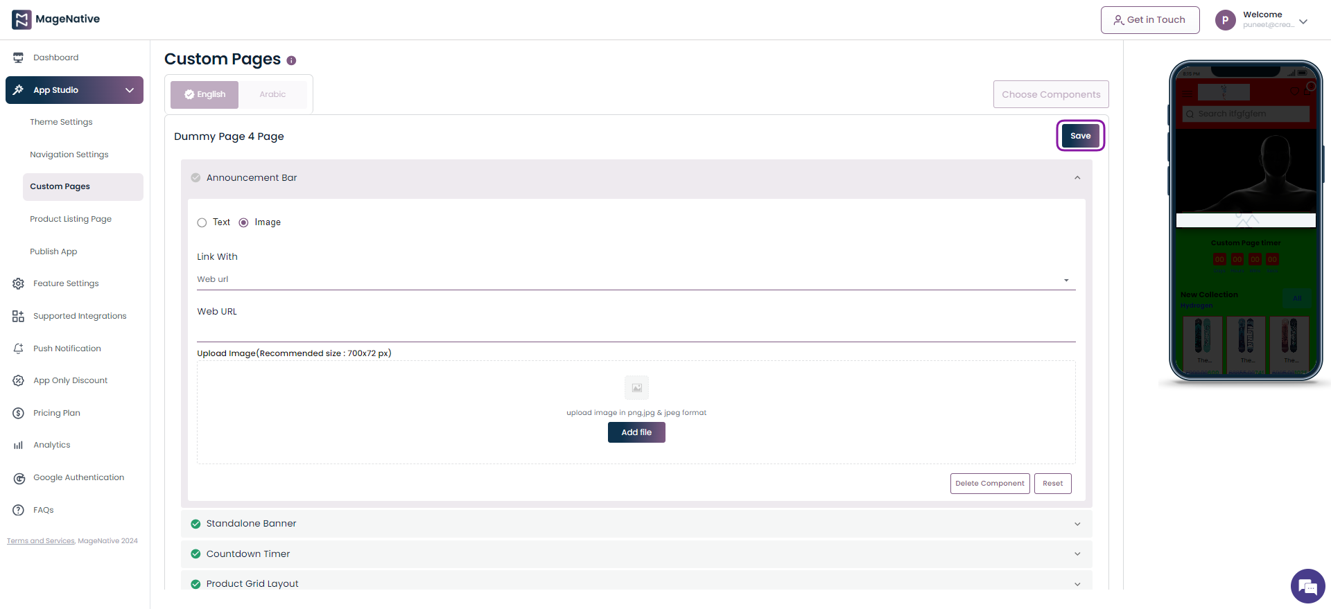
Announcement Bar
Step 1 – Navigate to MageNative app’s dashboard and click on the Custom Pages.
Step 2 – Locate the Announcement Bar component. Now, drag and drop it on the mobile screen at the right side.
Step 3 – Click on the edit icon present on the Announcement Bar section.
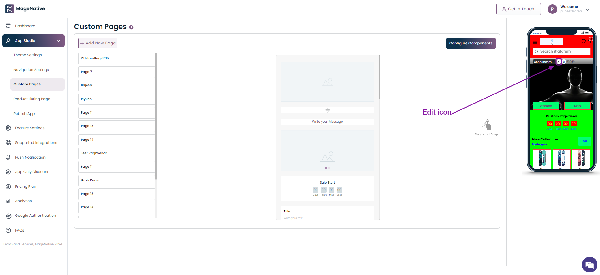
Step 4 – It will open up the different fields to be filled for adding an announcement bar in your mobile app. Choose the Image option.

Step 5 – Here under Link With field and choose the Web url option.
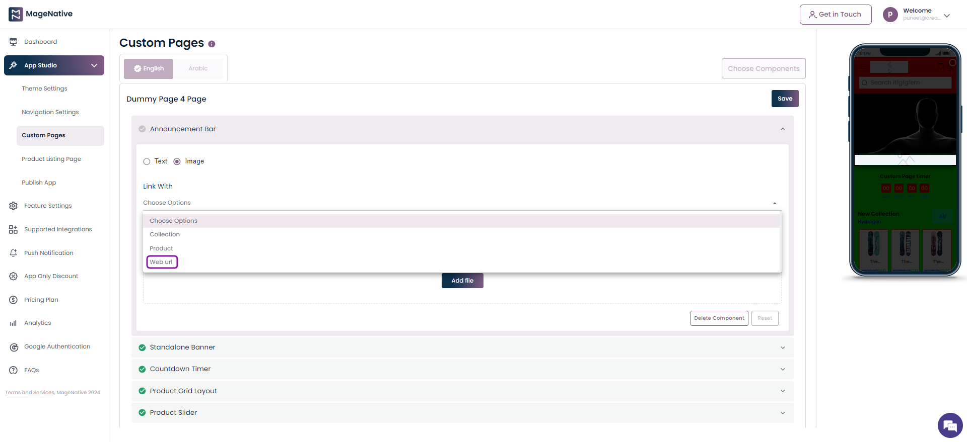
Step 6 –Now, specify the link you’d like users to be redirected to when they click on the announcement bar.

Step 7 – Similarly, when you choose the Text option. Click on the Text Link toggle slider and choose the Web url option.
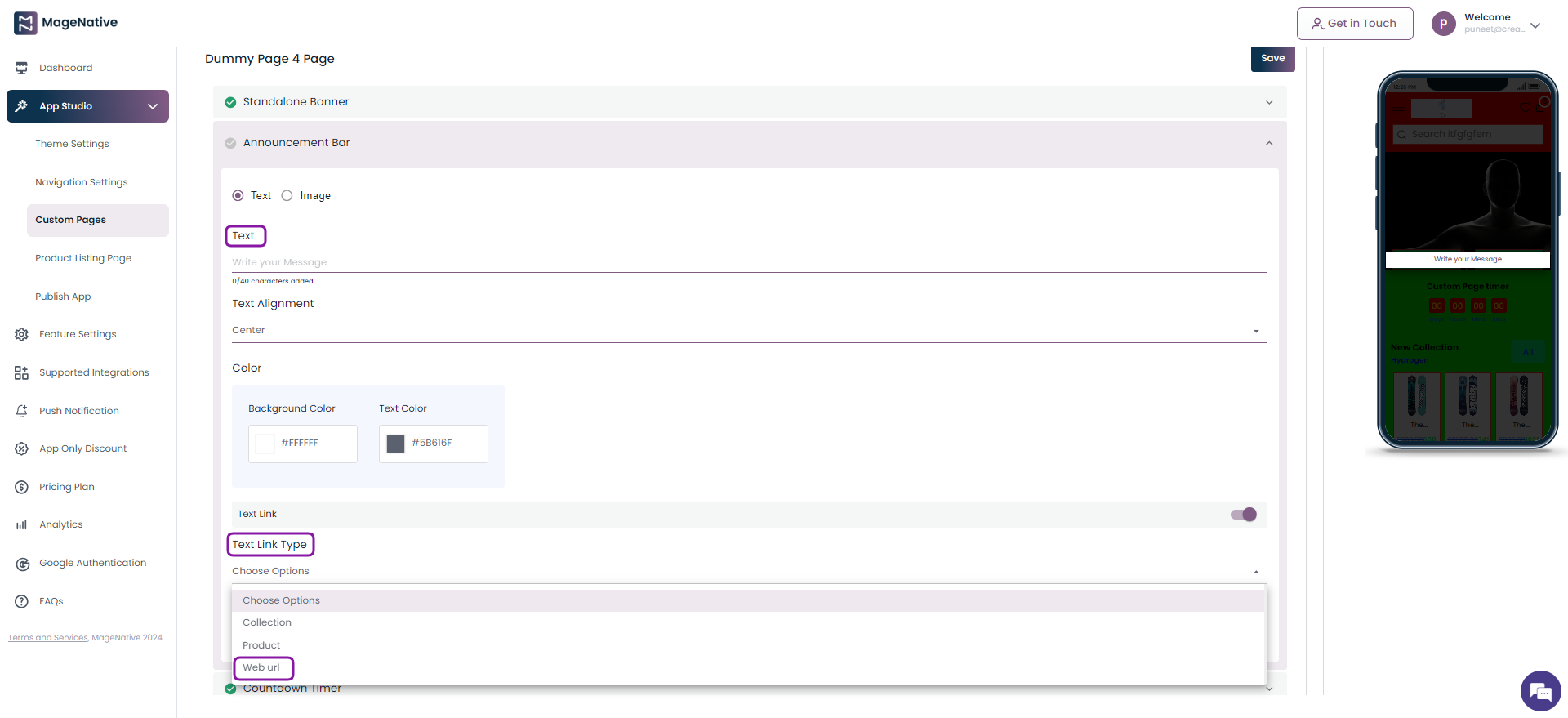
Step 8 – Input the Web URL which is the link you’d like users to be redirected to when they click on the announcement bar.
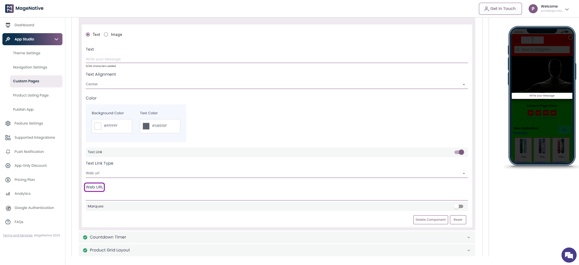
Step 9 – Finally, click on the Save button on the top right corner.
Standalone Banner
Step 1 – Navigate to MageNative app’s dashboard and click on the Custom Pages.
Step 2 – Locate the Standalone Banner component. Now, drag and drop it on the mobile screen at the right side.
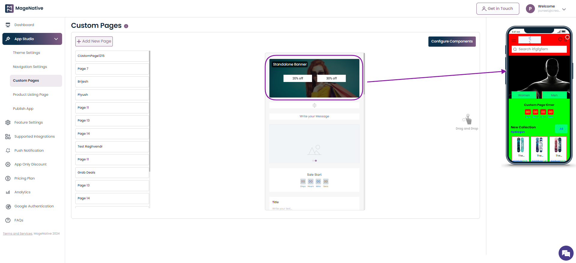
Step 3 – Click on the edit icon present on the Standalone Banner section.
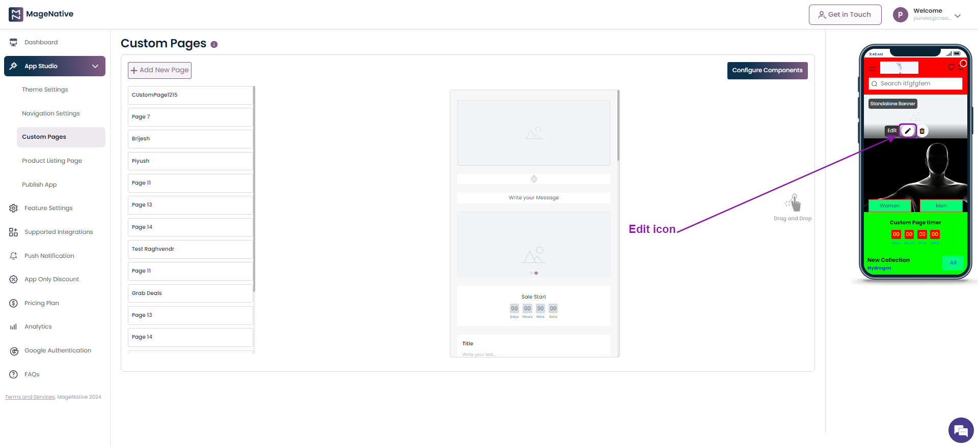
Step 4 – It will open up the different fields to be filled for adding a standalone banner in your mobile app. Now click the Upload section

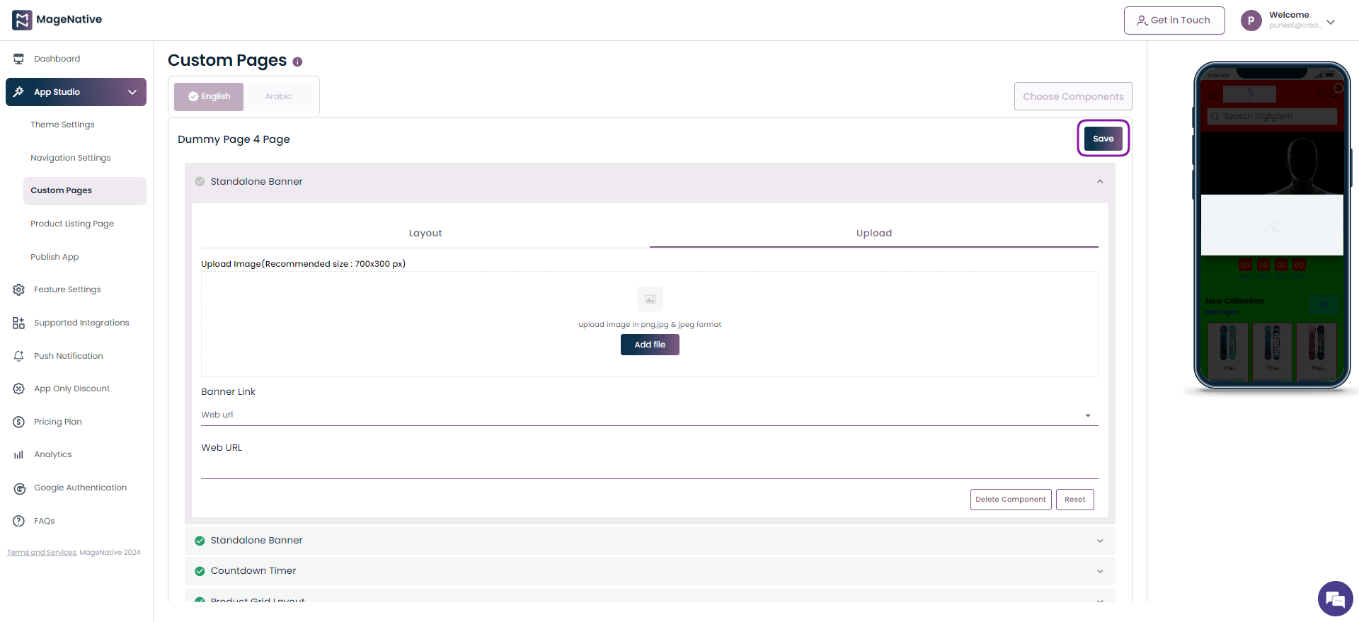
Step 5 – Here under Banner Link choose the Web url option.
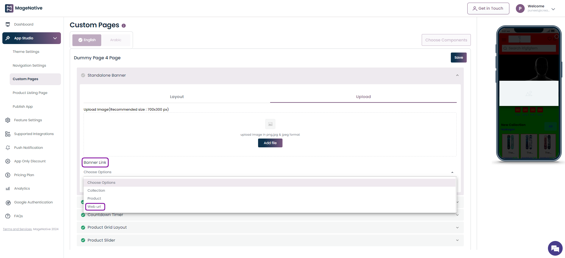
Step 6 –Now, specify the link you’d like users to be redirected to when they click on the Standalone Banner.

Step 7 – Finally, click on the Save button on the top right corner.
Collection Slider
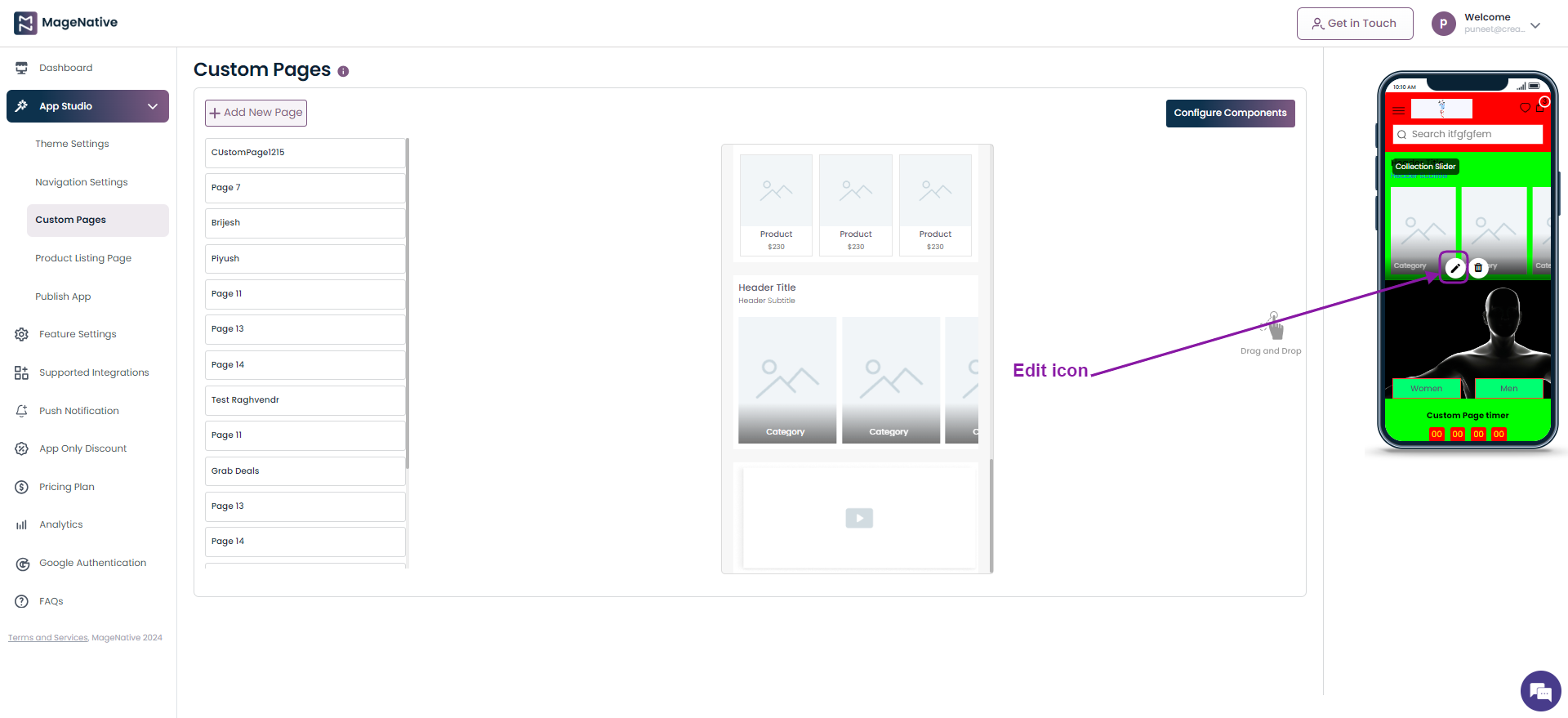
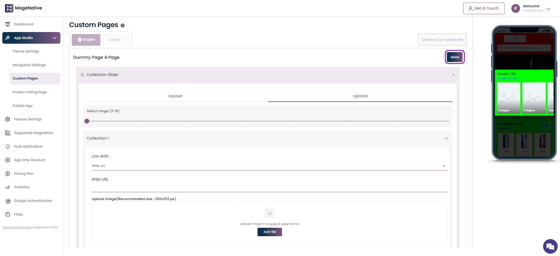
Step 1 – Navigate to MageNative app’s dashboard and click on the Custom Pages.

Step 2 – Locate the Collection Slider component. Now, drag and drop it on the mobile screen at the right side.
Step 3 – Click on the edit icon present on the Collection Slider section.
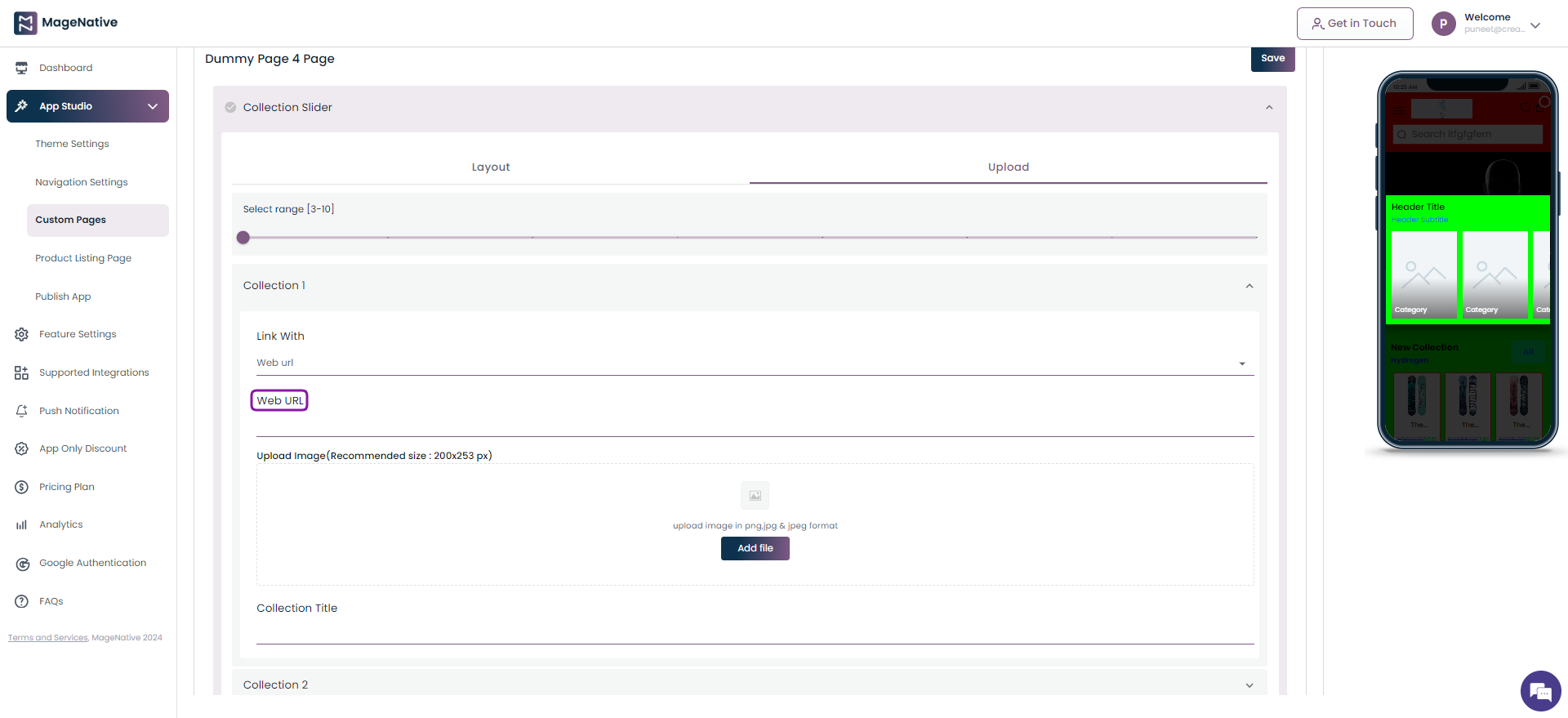
Step 4 – It will open up the different fields to be filled for adding a Collection Slider in your mobile app. Now select the Upload section.
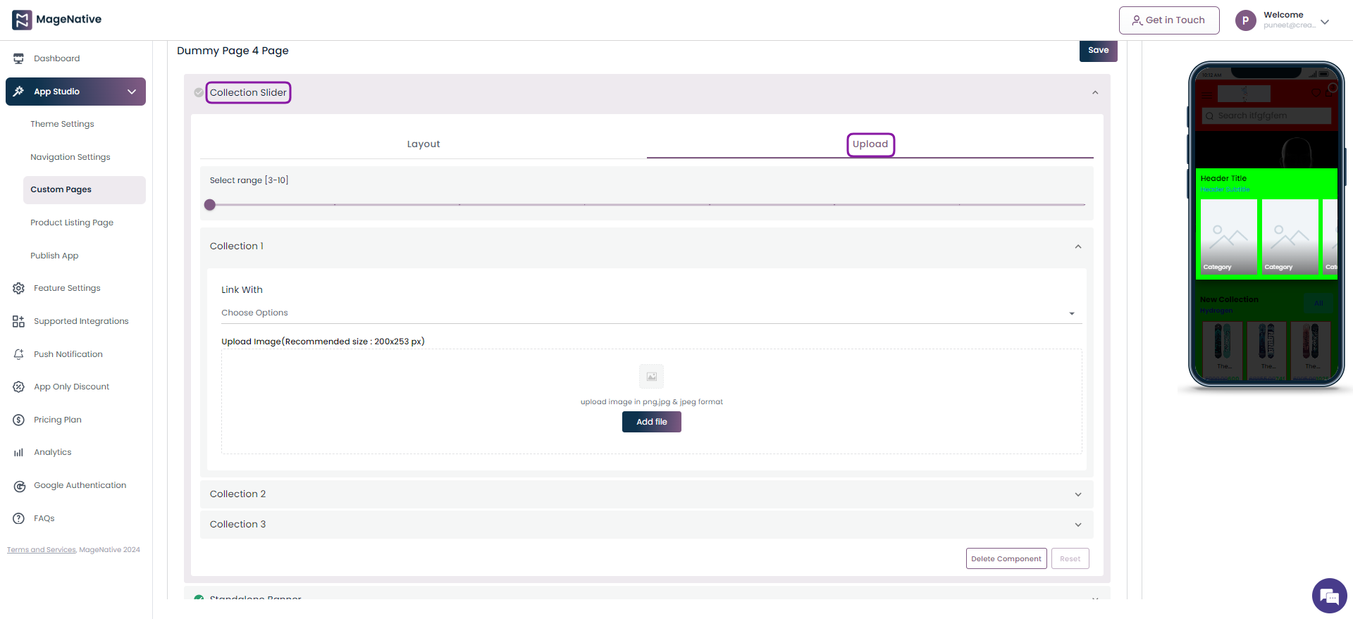
Step 5 – Here click the Link With field and choose the Web url option.

Step 6 –Now, specify the link you’d like users to be redirected to when they click on the Collection Slider.
Step 7 – Finally, click on the Save button on the top right corner.
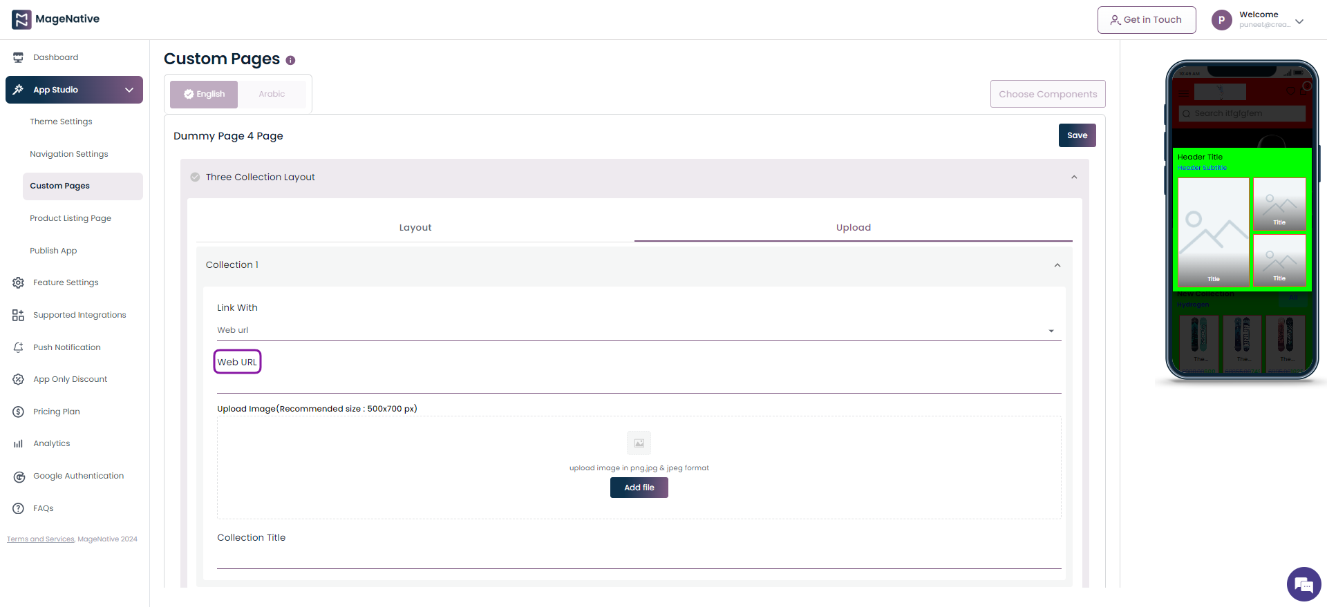
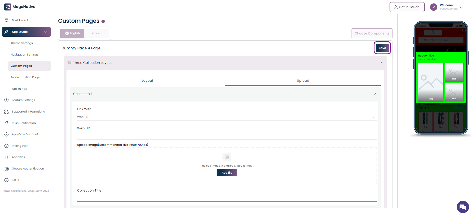
Three Collection Layout
Step 1 – Navigate to MageNative app’s dashboard and click on the Custom Pages.
Step 2 – Locate the Three Collection Layout component. Now, drag and drop it on the mobile screen at the right side.
Step 3 – Click on the edit icon present on the Three Collection Layout section.
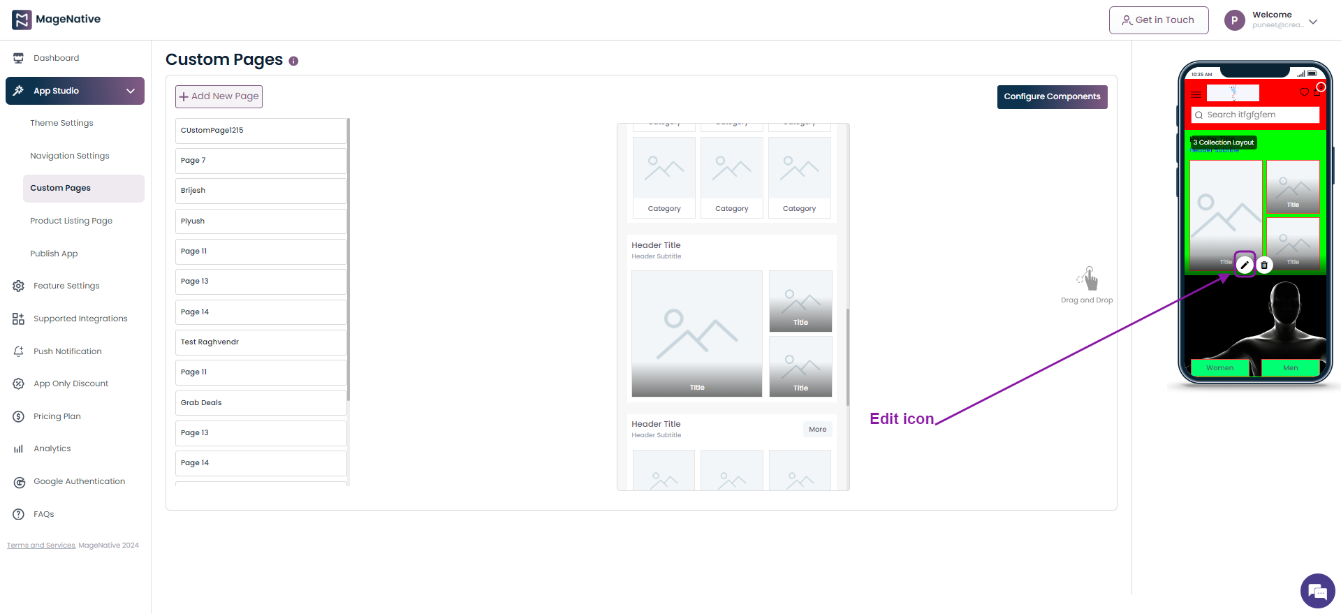
Step 4 – It will open up the different fields to be filled for adding a Three Collection Layout in your mobile app.
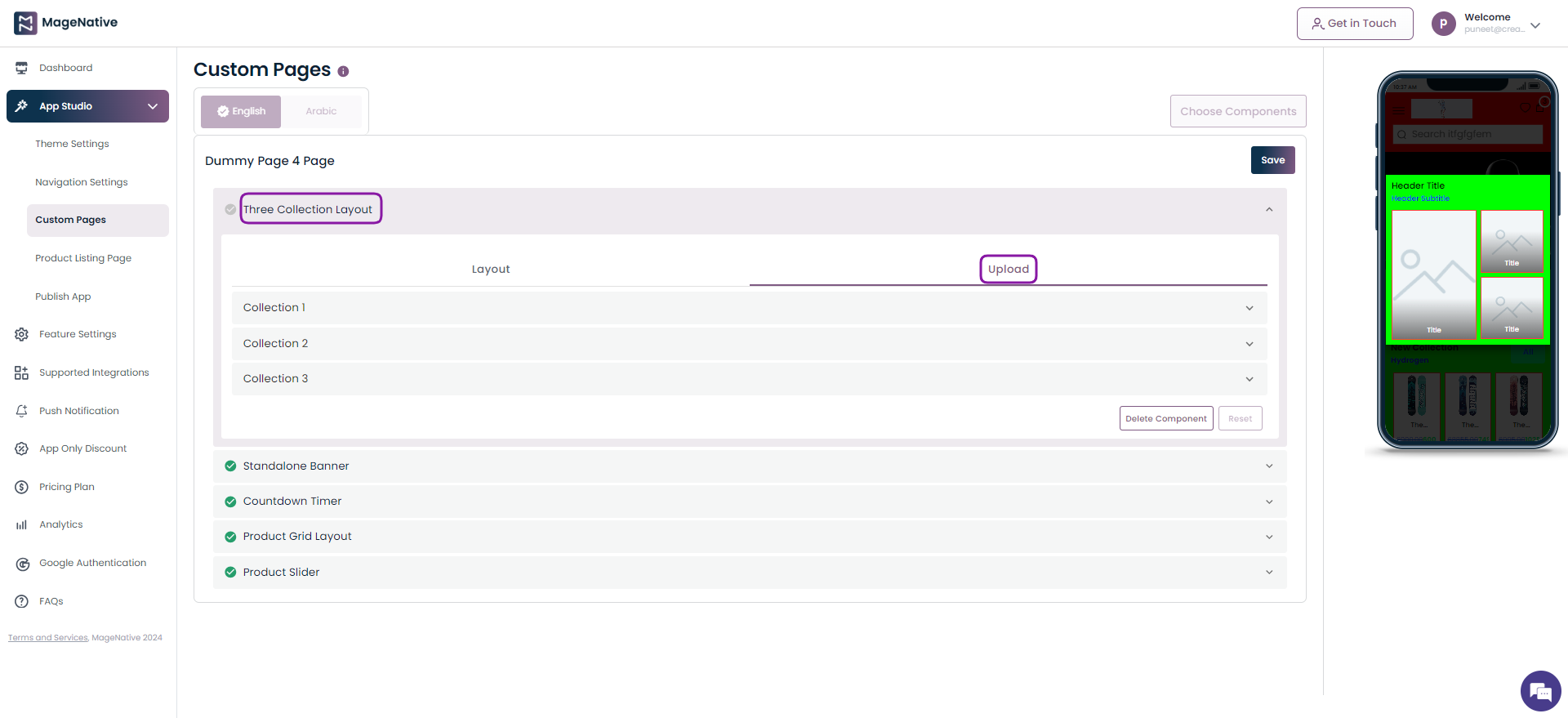
Step 5 – Here click on Link With field and choose the Web url option.
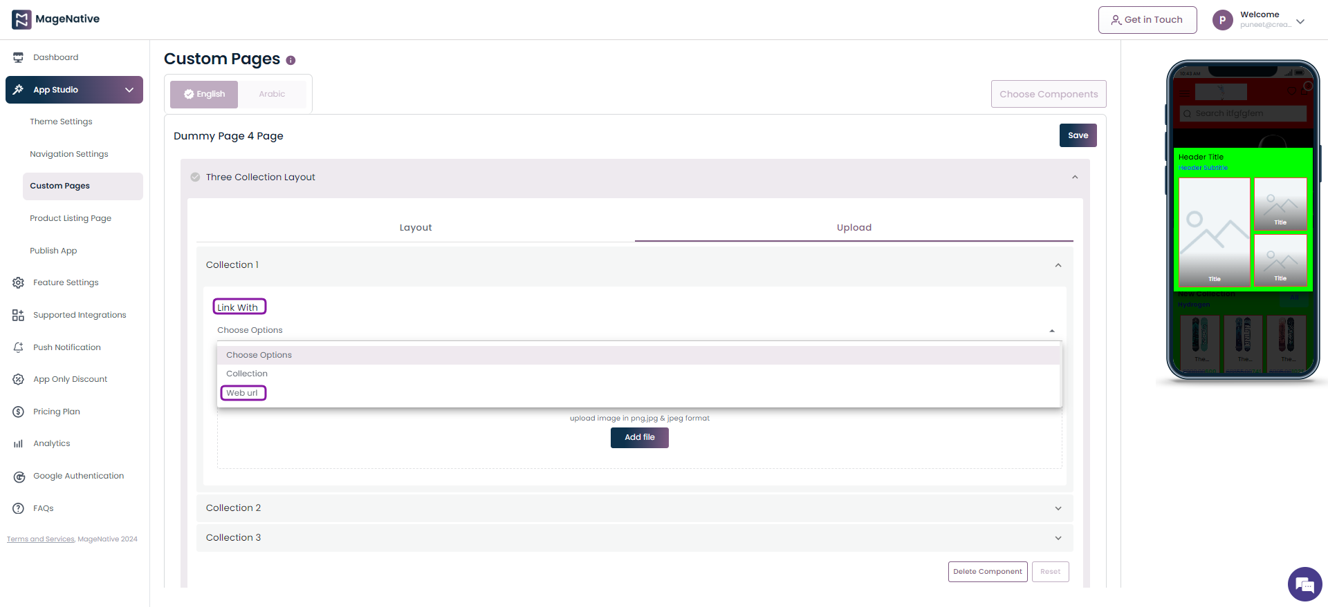
Step 6 –Now, specify the link you’d like users to be redirected to when they click on the Three Collection Layout.
Step 7 – Finally, click on the Save button on the top right corner.
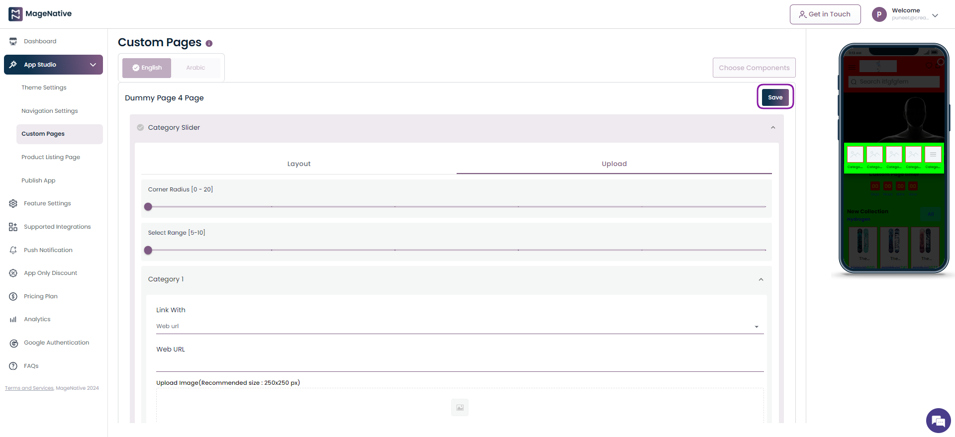
Category Slider
Step 1 – Navigate to MageNative app’s dashboard and click on the Custom Pages.
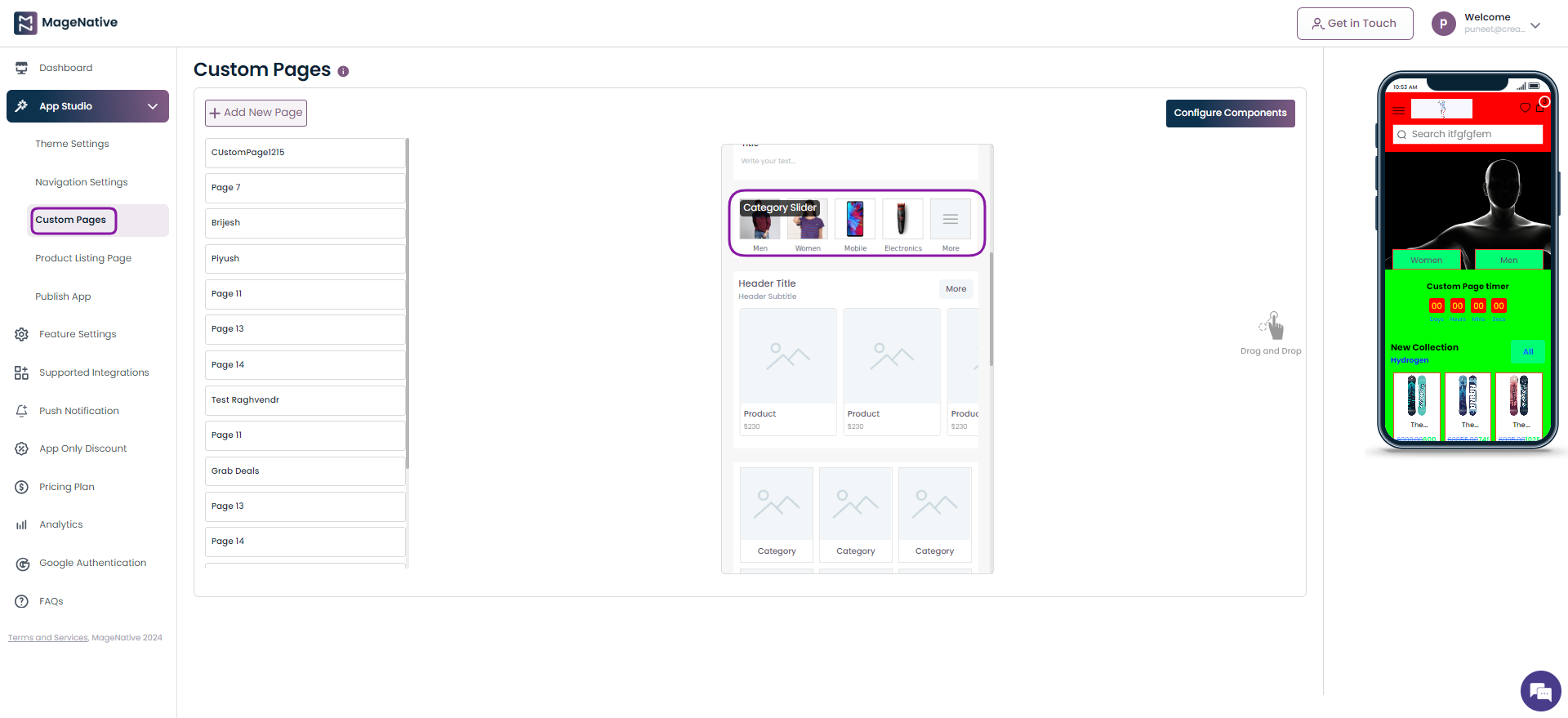
Step 2 – Locate the Category Slider component. Now, drag and drop it on the mobile screen at the right side.
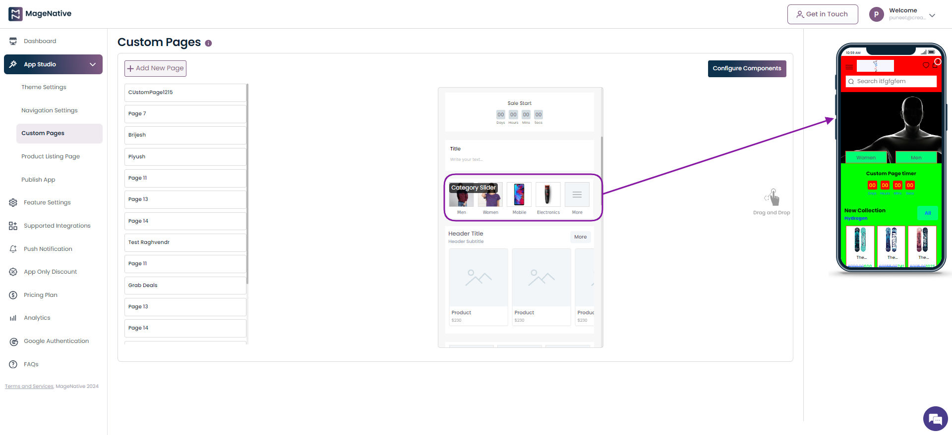
Step 3 – Click on the edit icon present on the Category Slider section.
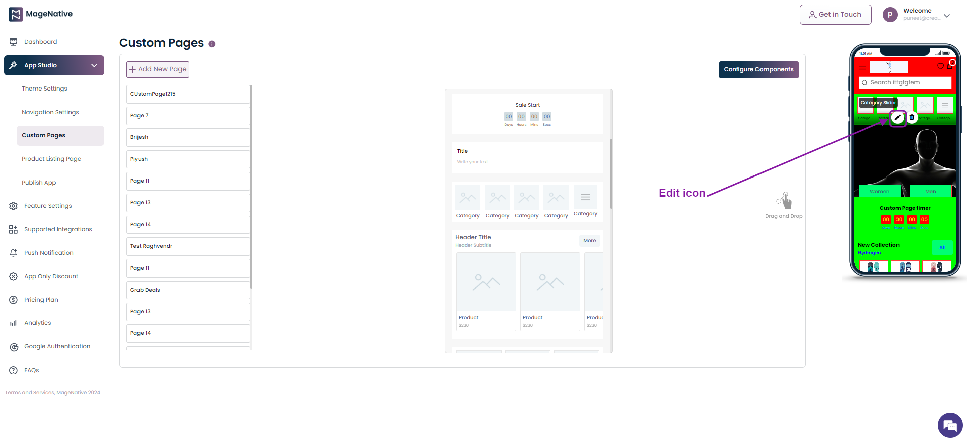
Step 4 – It will open up the different fields to be filled for adding a Category Slider in your mobile app. Choose the Upload section.
Step 5 – Here click on Link With field and choose the Web url option.
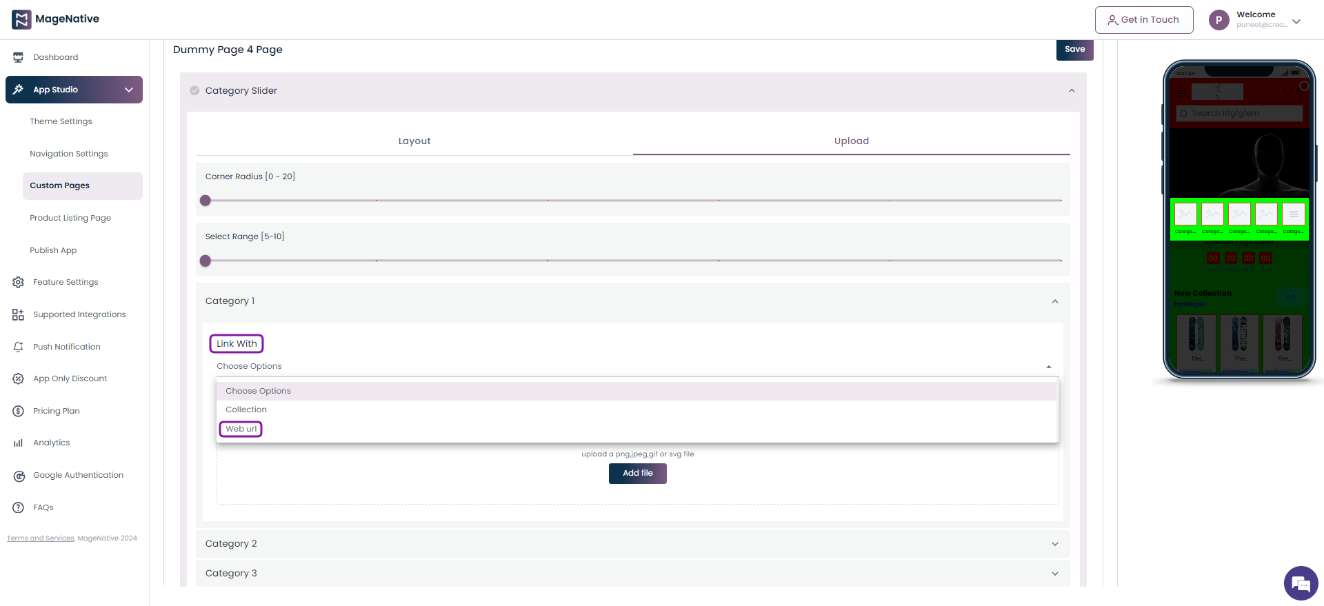
Step 6 –Now, specify the link you’d like users to be redirected to when they click on the Category Slider.
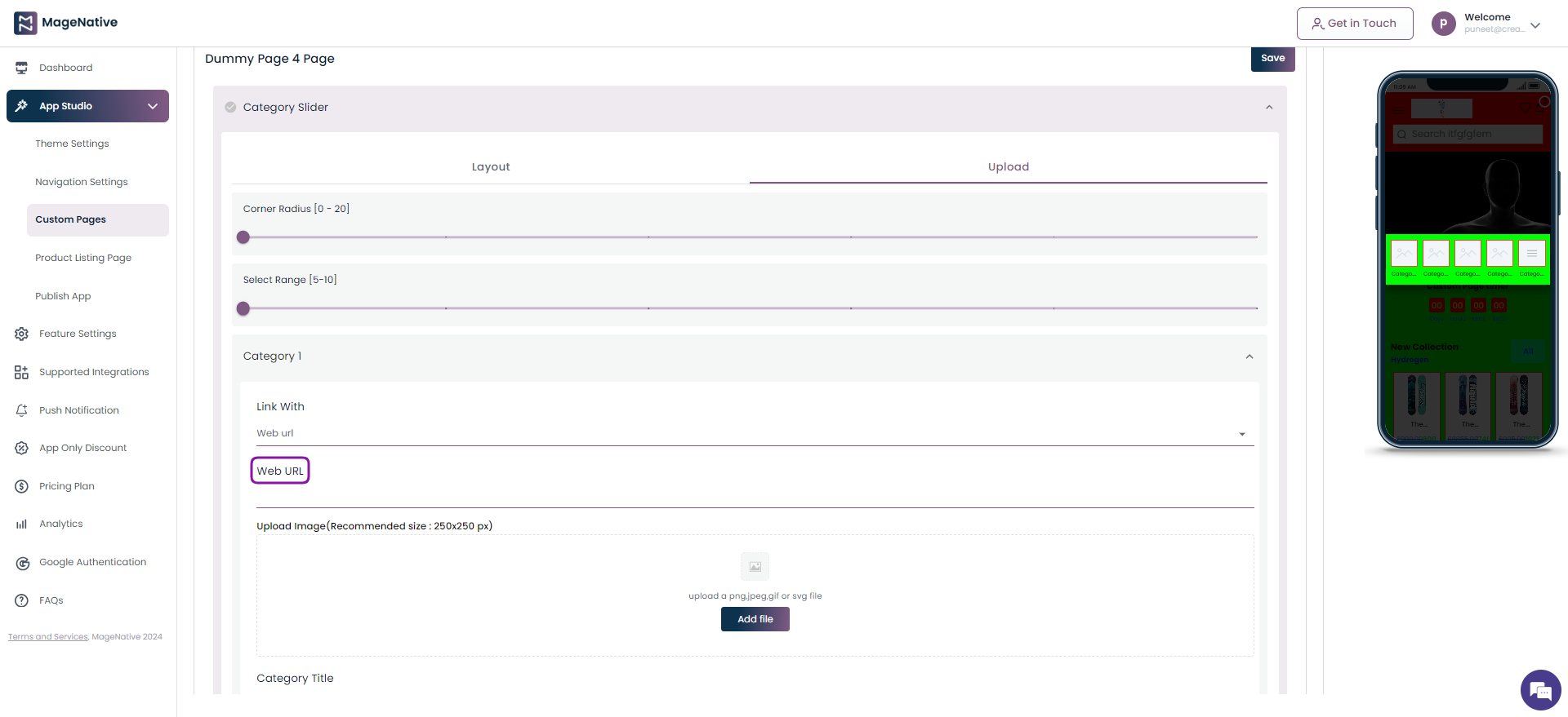
Step 7 – Finally, click on the Save button on the top right corner.
Collection Grid Layout
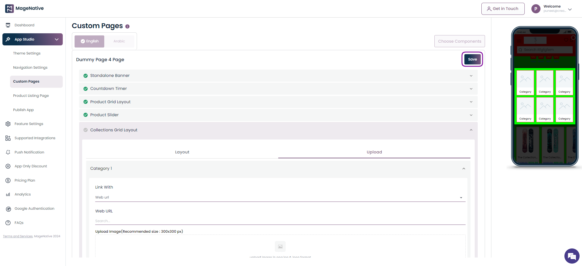
Step 1 – Navigate to MageNative app’s dashboard and click on the Custom Pages.
Step 2 – Locate the Collection Grid Layout component. Now, drag and drop it on the mobile screen at the right side.
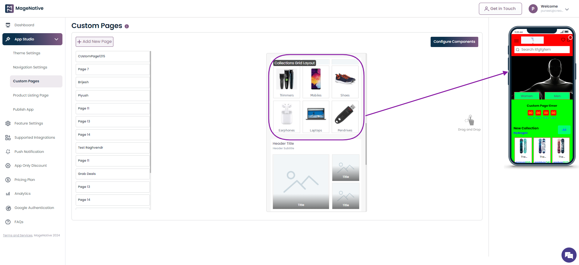
Step 3 – Click on the edit icon present on the Collection Grid Layout section.
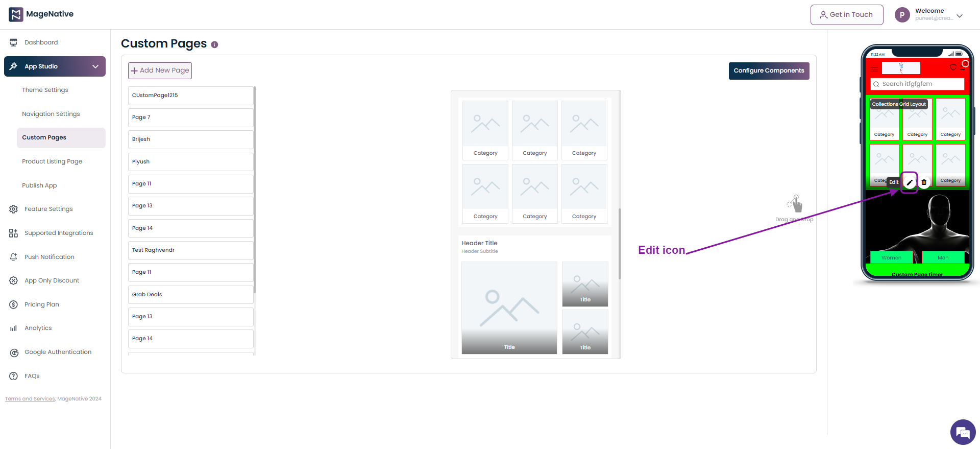
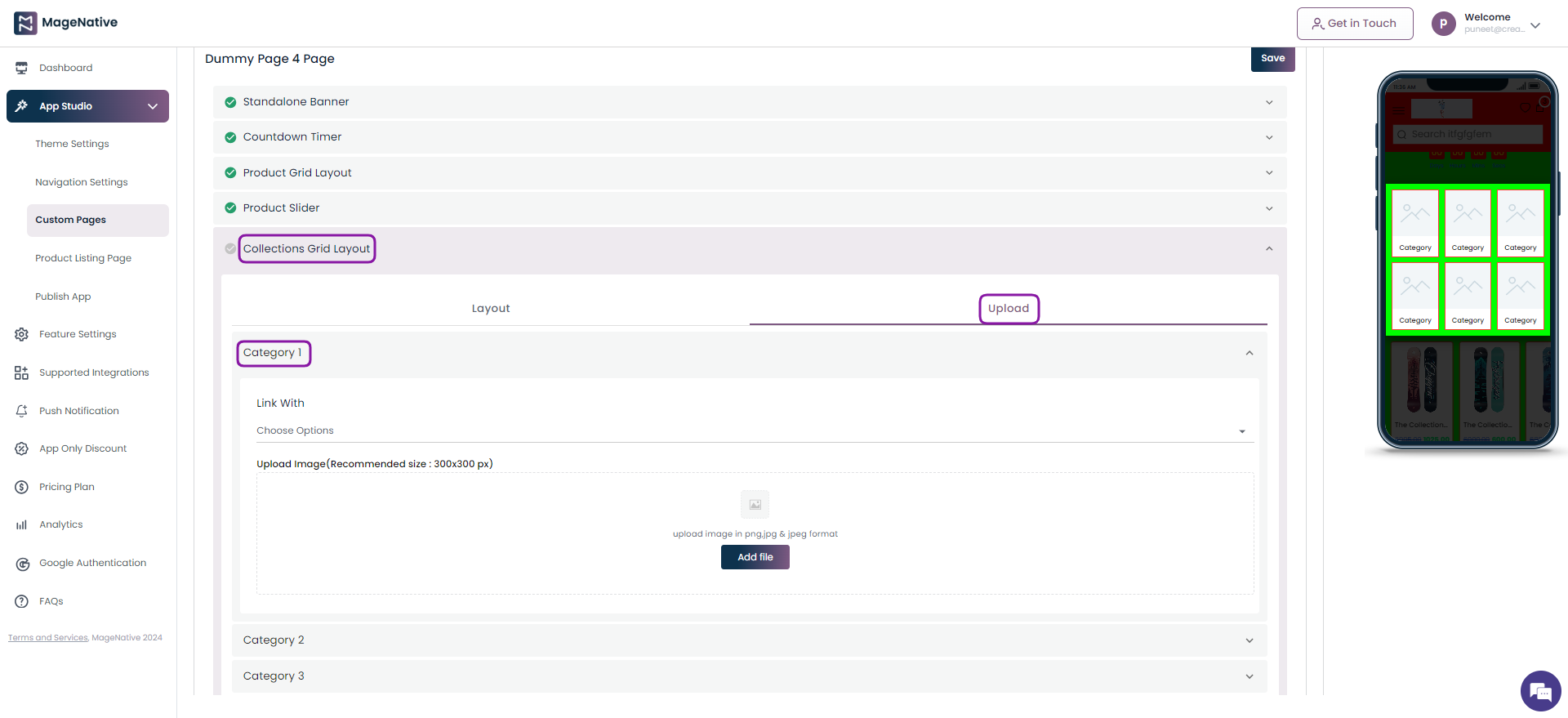
Step 4 – It will open up the different fields to be filled for adding a Collection Grid Layout in your mobile app. Choose the Upload section and click followed by a click on the Category 1.
Step 5 – Here click under Link With field and choose the Web url option.
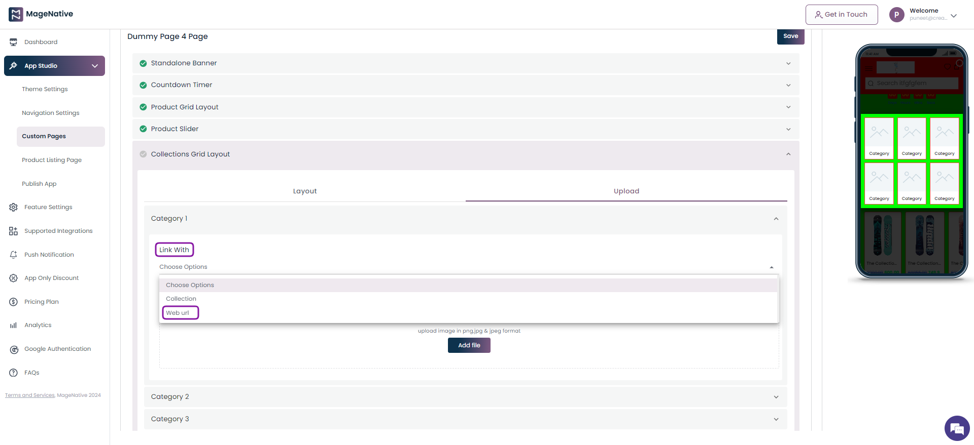
Step 6 –Now, specify the link you’d like users to be redirected to when they click on the Collection Grid layout.
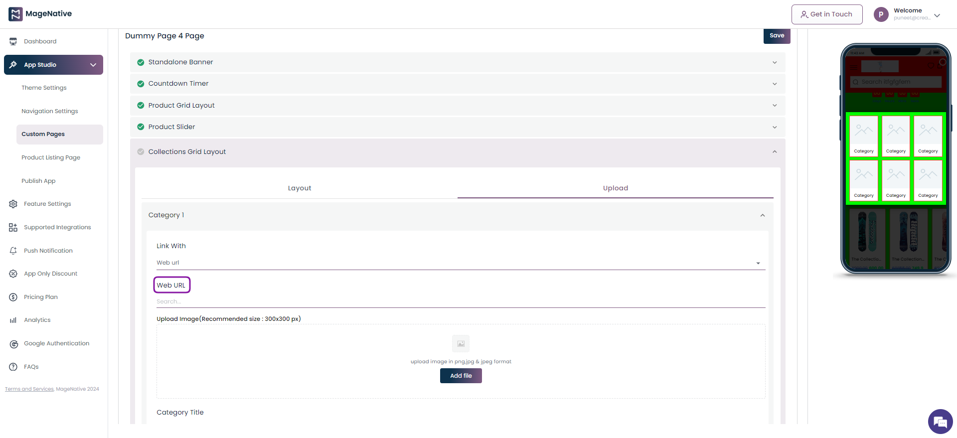
Step 7 – Finally, click on the Save button on the top right corner.
With the new feature allowing you to link web URLs to your mobile app in different sections, you will be able to offer a seamless blend of app and web experience.


