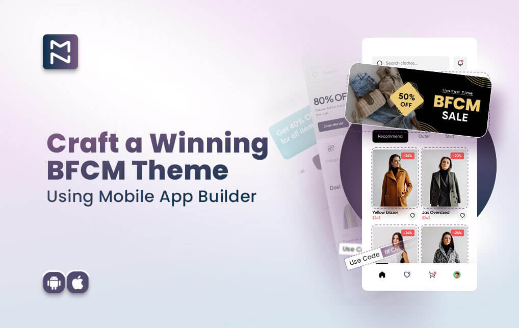
As Black Friday and Cyber Monday (BFCM) is round the corner, you need black friday cyber monday theme to maximize sales during the high-traffic shopping period.
The visual appeal of your mobile app is the first thing users notice. According to Adobe, 38% of users will stop engaging with a website if the content or layout is unattractive. Applying a holiday-themed design to your app will boost engagement and make your BFCM promotions stand out.
Table of Content
- Why You Need BFCM Ready Home Page for Mobile App
- How To Use Mobile App Builder Features To Design BFCM Ready Home Page
- Which Features Will Help You To Capture Upto 70% of BFCM Sales in 2024
- How To Use Mobile App Builder Features To Design BFCM Ready Deals and Promotions Page
- Why You Need BFCM Ready Product Page for Mobile App
- How To Use Mobile App Builder Features To Design BFCM Ready Product Page
- All Things Considered – Maximize Your BFCM Success with a Festive, Conversion-Boosting App Theme
We know you want to make a killer first impression and capture your buyer’s attention from the get-go. Let’s ensure your app’s black friday cyber monday theme is not only visually appealing but also strategically designed to drive conversions and maximize your BFCM success.
Why You Need BFCM Ready Home Page for Mobile App
How To Use Mobile App Builder Features To Design BFCM Ready Home Page
1. Standalone Banner
Why It Matters: Think of the standalone banner as the welcome mat for your sale. It’s the first thing your customers see, so make it count. When customers land on your homepage, this banner is the first thing that catches their eye, so it needs to grab their attention.
How to Use It:
- Design: Craft a banner that grabs attention with vibrant images and bold text. Go for festive colors and a design that screams “BFCM!”
- Content: Highlight your biggest deals or discounts. Keep it clear and enticing so visitors know exactly what’s in store.
- Placement: Stick it at the top of your homepage. You want it front and center so it’s the first thing visitors notice.
Impact: This banner puts your best deals right in front, grabbing attention and getting shoppers excited from the start.
2. Announcement Bar
Why It Matters: The announcement bar is like your personal shopping assistant, keeping customers updated with important info in a low-key way. Whether it’s a flash sale, a new product launch, or a special discount code, the announcement bar ensures your customers are always in the loop. It’s a subtle yet effective way to communicate what’s happening in your store, making sure your shoppers don’t miss out on any key offers or events while they browse.
How to Use It:
- Design: Use a contrasting color to make it stand out but keep it clean so it doesn’t overshadow the rest of the page.
- Content: Share quick updates about flash sales, additional discounts, or important BFCM info. Keep it short and snappy.
- Placement: Put it at the very top of your page, right below the navigation menu.
Impact:This keeps your customers informed about key promotions and deals, helping them take action quickly.
3. Banner Slider
Why It Matters: It’ gives your customers a new reason to stick around every time they visit—whether it’s today’s hottest promotion or an exclusive offer, the slider ensures your deals are always front and center, grabbing attention and encouraging more clicks.
How to Use It:
- Design: Create multiple eye-catching banners with different promotions. Use smooth transitions to keep things lively.
- Content: Rotate through different aspects of your BFCM sale, like product categories or special discounts.
- Placement: Place it below the standalone banner but above the rest of your content.
Impact: A banner slider ensures you highlight a range of deals and keeps the homepage engaging for visitors.
4. Countdown Timer
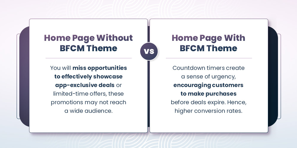
Why It Matters: The countdown timer is your secret weapon for creating a sense of urgency. It reminds customers how much time they have left to grab those deals.
How to Use It:
- Design: Make it stand out with a clear, bold design. Consider adding a visual element like a ticking clock.
- Content: Show the time remaining until your BFCM deals end or until specific promotions expire.
- Placement: Position it near the top of the page, or integrate it into the announcement bar or banner slider.
Impact: This timer helps drive urgency, encouraging customers to act fast and boosting your chances of converting visits into sales.
Transform Your App To Capture Maximum Sales During BFCM
Why You Need BFCM Ready Deals and Promotions Page for Mobile App
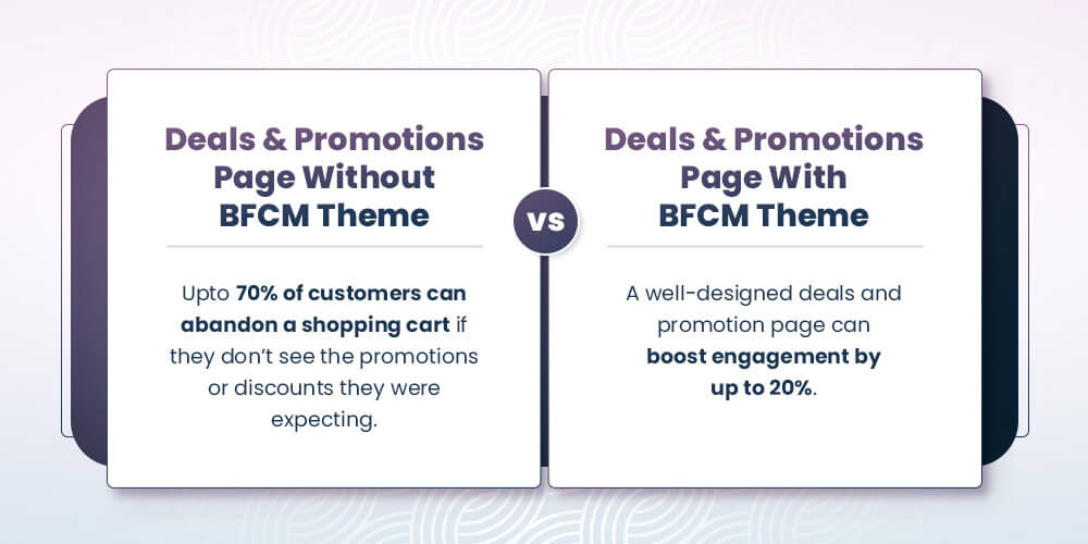
How To Use Mobile App Builder Features To Design BFCM Ready Deals and Promotions Page
1. Standalone Banner
Why It Matters: Think of the standalone banner as your store’s megaphone for the best deals. It’s the first thing your visitors will notice, so make it eye-catching!
How to Use It:
- Design: Go all out with festive colors and bold text to capture attention. Let your top deals and discounts take center stage.
- Content: Feature your biggest promotions and exclusive offers. Whether it’s a percentage off or a special bundle, make sure it’s front and center.
- Placement: Put it at the top of your page, right where everyone will see it when they first arrive.
Impact: A standout banner sets the scene for your page and immediately tells customers about the great deals they can expect.
2. Countdown Timer
Why It Matters: A countdown timer adds a sense of urgency that can make your customers act fast. When they see the clock ticking, they’re more likely to grab a deal before it’s gone.
How to Use It:
- Design: Use clear, bold numbers and a splash of festive design to make the timer pop. It should be easy to spot.
- Content: Show how much time is left for your BFCM sale or specific deals. You can even set up timers for flash sales to keep things exciting.
- Placement: Position the timer right below your banner. This way, the urgency is right there with your top deals.
Impact: The countdown timer creates a buzz and encourages customers to shop sooner rather than later.
Elevate Your App’s Look for BFCM
3. Product Slider
Why It Matters: A product slider makes your Deals and Promotions page interactive and engaging. It’s a fun way for customers to browse through different offers and find what they’re looking for.
How to Use It:
- Design: Choose high-quality images and smooth transitions. Highlight your top deals and best sellers to catch customers’ eyes.
- Content: Rotate through a variety of products, from your biggest discounts to exclusive BFCM items. Keep the selection fresh and appealing.
- Placement: Place the slider below the countdown timer so customers can explore deals right after feeling that urgency.
Impact: The product slider keeps your page lively and helps customers quickly find the best deals.
Why You Need BFCM Ready Product Page for Mobile App
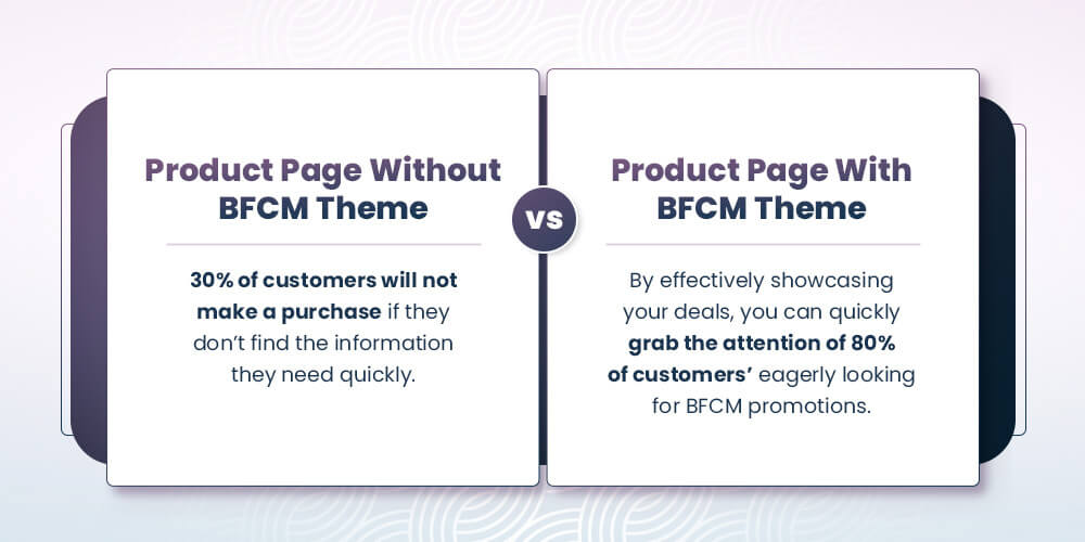
How To Use Mobile App Builder Features To Design BFCM Ready Product Page
To make your Product Detail Page truly stand out for BFCM, focus on using a Product Slider and Standalone Banner in a way that engages and excites your customers. Let’s learn how to do it.
1. Add a Product Slider
Show Off Your Best Deals:
- Highlight Top Picks: Use a product slider to display your best BFCM deals. Whether it’s items with huge discounts or exclusive BFCM offers, this slider should make those deals pop and draw attention.
- Feature Seasonal Favorites: Add a slider showcasing holiday-themed collections or gift sets. This helps create a festive mood and guides customers toward perfect BFCM gifts.
Encourage More Purchases:
- Show Related Items: Include a slider for related or complementary products. For instance, if someone is eyeing a particular item, suggest matching accessories or similar products they might also like.
Make It Visually Appealing:
- Use High-Quality Images: Ensure the images in your slider are clear and engaging. Great visuals can make a big difference in catching a shopper’s eye and encouraging them to explore more.
2. Use a Standalone Banner
Promote Key BFCM Offers:
- Highlight Main Deals: Place a standalone banner on your Product Detail Page to spotlight your major BFCM promotions. Make sure the banner clearly communicates your offer, like “Save Up to 50%” or “Exclusive BFCM Sale,” to grab attention right away.
Create a Sense of Urgency:
- Show Time-Sensitive Offers: Use the banner to emphasize that your deals are available for a limited time. Phrases like “Shop Now – Limited Time Only” or “While Supplies Last” encourage customers to act quickly.
Add Festive Flair:
- Design with the Season in Mind: Use festive graphics and colors on your banner to match the black friday cyber monday theme. This not only catches the eye but also adds to the holiday shopping excitement.
All Things Considered – Maximize Your BFCM Success with a Festive, Conversion-Boosting App Theme
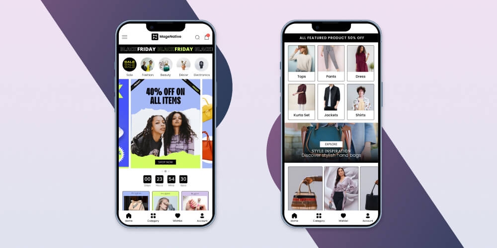
In the rush of BFCM, your mobile app’s theme can be the game-changer. A festive and well-designed black friday cyber monday theme can increase user engagement by 38% and boost conversion rates by 60%. Magenative mobile app builder empowers your app to strategically enhance your app’s homepage, deals page, and product pages with BFCM-ready features.
As a result, you can effectively capture attention, drive urgency, and maximize sales. Ready to make the most of this BFCM? Start by giving your app the upgrade it needs to turn visitors into loyal customers.
About The Author
I love navigating the world of SaaS with finesse. As an SEO enthusiast and seasoned Copy Writer, I'm here to transform tech-speak into compelling narratives that resonate with online merchants. With a penchant for alliteration and a touch of humor, I bring a unique flair to SaaS content.
Related Posts
10 Game-Changing Mobile App Marketing Strategies For Growth and Customer Retention
Launching a mobile app might feel like the hard part…
How to Grow Sales After Mobile App Launch: Proven Strategies for Long-Term Success
Mobile App growth goes beyond the initial launch. It’s about…
How MageNative Enabled $10.6 Million in BFCM Sales for Merchants in 2023
BFCM sales in 2023 surged for MageNative merchants, who experienced…
