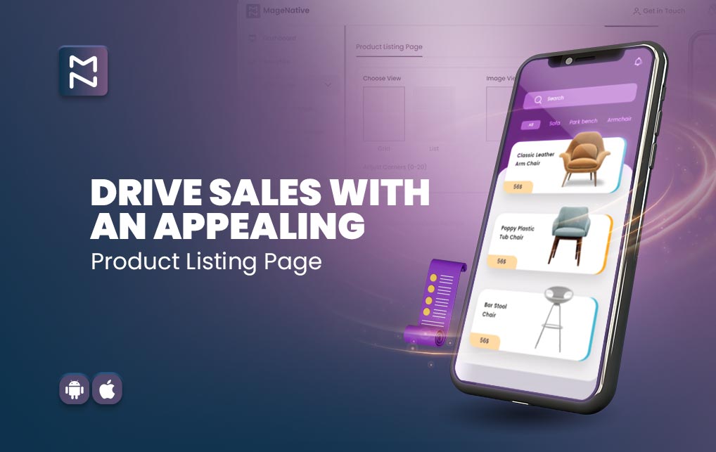
As the mobile e-commerce trend keeps growing, with a big 79% increase in online shopping via mobile phones in the last year alone, most Shopify stores want to get in on the action by creating their own mobile apps. One really important part of these apps is the page where you see all the products (let’s just call it the product listing pages or PLP). This is where customers first check out what’s for sale and decide if they want to buy something. And here’s the deal: a huge 92% of users say a well-designed mobile shopping experience is crucial. So, making sure your PLP looks good on mobile phone isn’t just important—it’s a must.
In this blog, we’ll take a closer look at some standout PLPs from the mobile apps of India’s top online shops. We’ll also talk about why this page is so important, what makes it good, and how to make sure people using the app have a great experience. Let’s dive in and make your mobile shopping experience top-notch!
Table of Content
The Significance Of An Effective Product Listing Pages
Within an e-commerce mobile app, the product listing pages stands out as a vital component. These are the pages where customers explore your products and make purchase decisions. Consequently, a well-crafted PLP can have a substantial impact on the success of your business. A thoughtfully designed PLP not only improves the user experience but also simplifies the process for customers to find what they need, ultimately boosting conversion rates.
Read Also: Data-Driven Decision Making: The Power of Mobile App Analytics
What Makes A Good Product Listing Pages
A good PLP should present customers with essential product information in a clear and concise manner. This includes details like product images, descriptions, pricing, and availability. It should also feature various filters and sorting options to facilitate quick and easy product discovery. Furthermore, a clear call-to-action (CTA) button should guide customers seamlessly to the checkout page.
Key Features To Prioritize When Crafting A Product Listing Pages (PLP)
When shaping a product listing page, it’s crucial to focus on the following essential features:
1- Detailed Product Images:
The images are the initial focal point for customers, so ensure they are clear, high-quality, and showcase the product from various angles. Keep image sizes minimal without compromising clarity for faster page loading.
2- Optimized for All Screen Sizes:
Ensure your product listing pages adapts well to different screen sizes and loads swiftly.
3- Comprehensive Product Descriptions:
A solid product description should encompass all necessary details about the product, covering features, specifications, and benefits.
4- Filter and Sorting Options:
Incorporate features that enable customers to refine their search, aiding them in quickly locating the desired product.
Product Reviews And Ratings:
Reviews wield significant influence on customer decisions, so include product ratings on the listing pages.
4- Clear Call-to-Action (CTA) Buttons:
Ensure that your CTA buttons are conspicuous and easy to locate, guiding customers seamlessly to the checkout page.
5- Personalized Recommendations:
Utilize data analytics to offer customers personalized product suggestions based on their browsing history and purchase behavior.
What Are The Best Practices While Designing A Good Product Listing Pages?
When crafting a PLP, it’s essential to adhere to certain best practices:
1- Make It Simple:
Keep the design simple and uncluttered. A crowded page can overwhelm and confuse customers. Ensure your PLP is clean and easy to navigate.
2- Use White Space:
Incorporate white space to break up the page, making it easier for customers to scan and locate what they’re searching for on the PLP.
3- Testing and Iteration:
Conduct tests with various designs and features to identify what resonates best with your customers. Continuously iterate and enhance your product listing pages based on valuable user feedback.
Now, let’s explore some standout examples of excellently crafted product listing pages (PLP) in e-commerce mobile apps for brands in India.
Numerous brands have adeptly designed their product listing pages to enhance the user experience and drive increased conversions. Let’s delve into specific instances of well-designed product listing pages within the e-commerce mobile apps of leading brands in India.
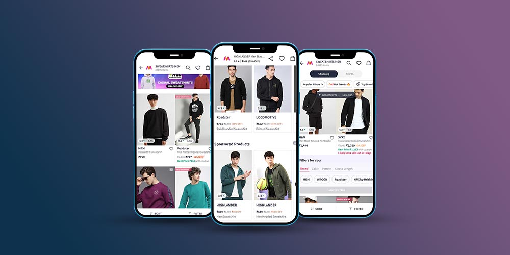
(I)- Myntra: Myntra’s product listing page showcases high-quality images, comprehensive product descriptions, and user-generated content (UGC) through customer reviews.
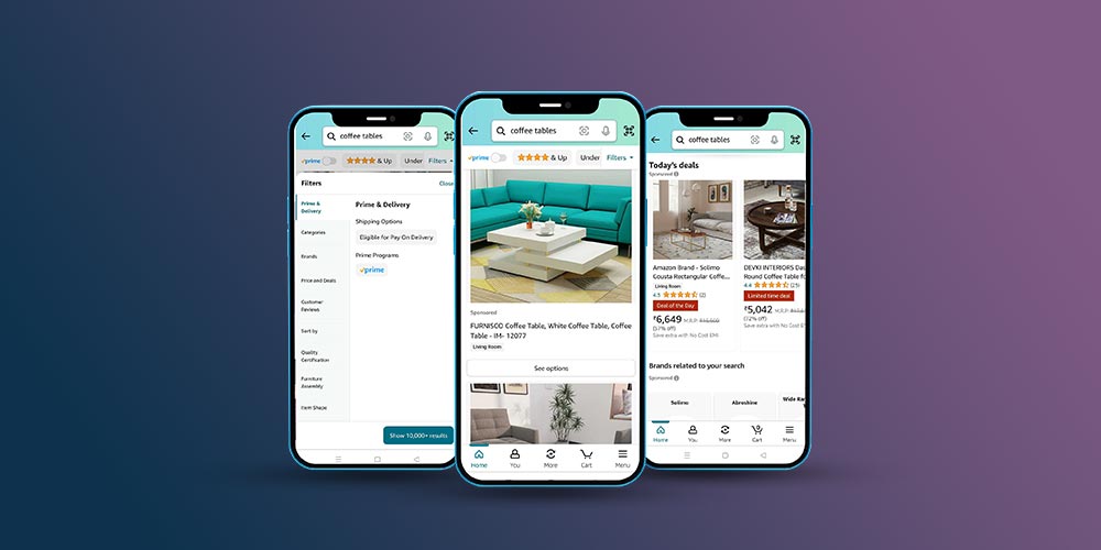
(II)- Amazon Shopping: Amazon’s product listing page provides diverse filter options, simplifying the process for customers to swiftly locate the product they desire.
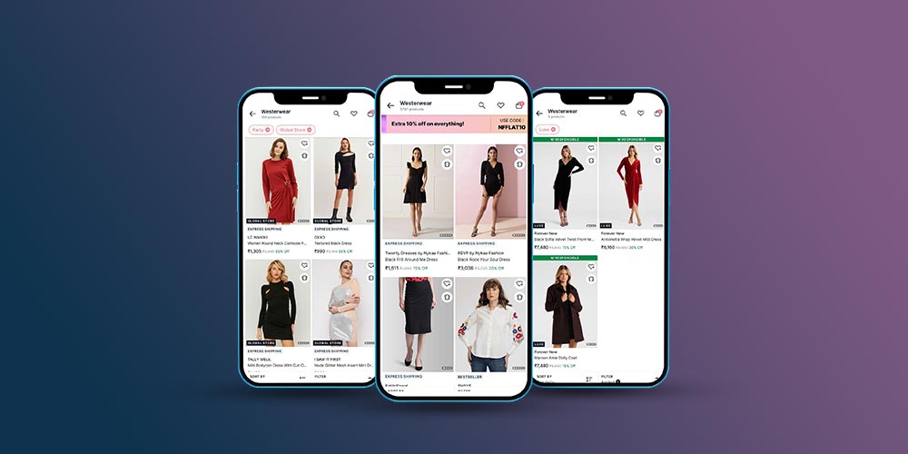
(III)- Nykaa Fashion: The product listing page on Nykaa Fashion showcases numerous product images, detailed product descriptions, and additional category and product filters, including the “editors’ pick” feature.
How MageNative No-code App Builder Helps You Craft An Astonishing Product Listing Pages
The Magenative PLP is designed to make your customers’ shopping experience effortless. It streamlines the process, allowing them to quickly browse and find the products they want to buy. The goal is to make product discovery and engagement easy, all while cutting down the time it takes to make a purchase. So, your customers can find what they’re looking for without any hassle and make a purchase in no time.
Here Is How You Can Optimize Your Product Listing Pages (PLP) On MageNative App:
1. Go to the admin panel and click on “App Studio” in the side menu.
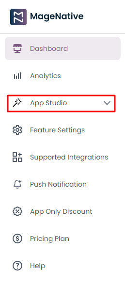
2. Select “Product Listing Page” from the dropdown menu in the side menu bar.
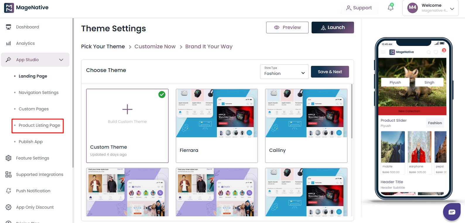
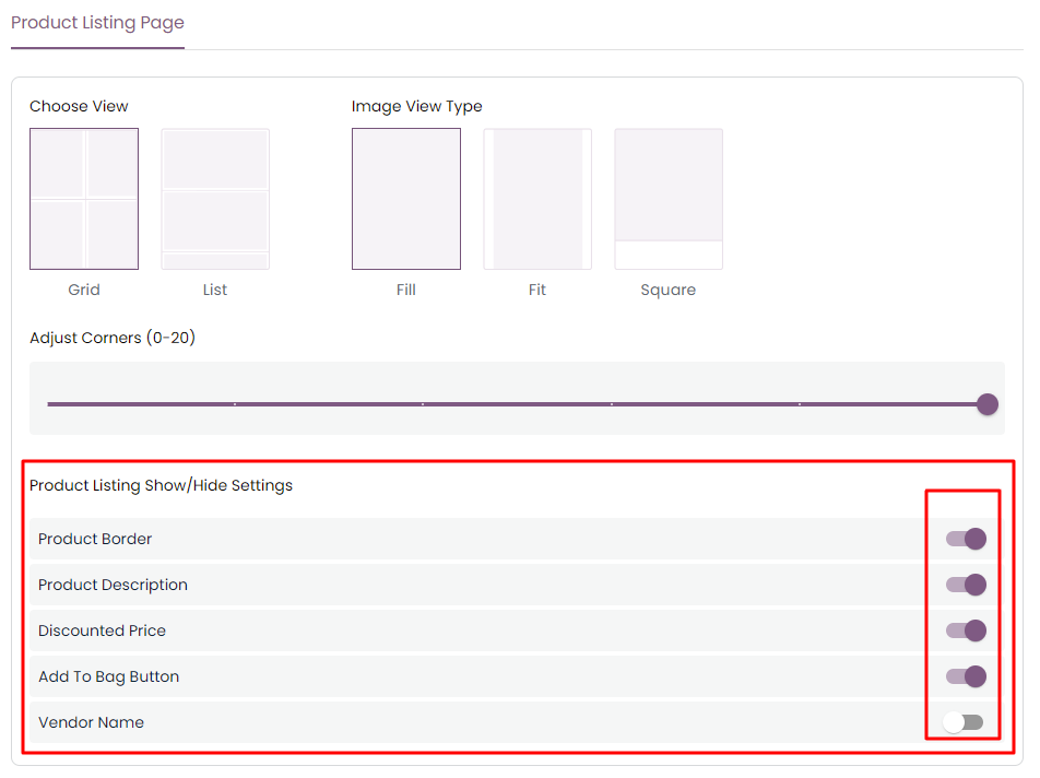
3. Now, you can choose how you want to view your page:
A. Grid: Elements are arranged in rows and columns, forming a grid that allows customers to easily browse and compare multiple products simultaneously.
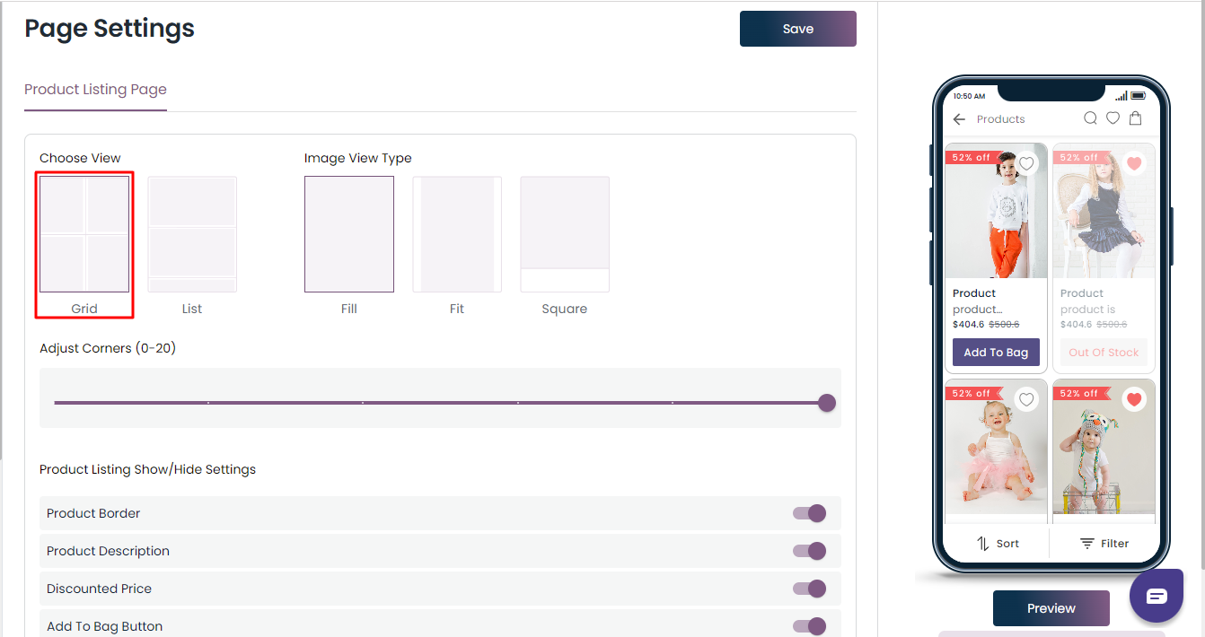
B. List: This layout is ideal for presenting products one by one, with users scrolling horizontally to explore more options.

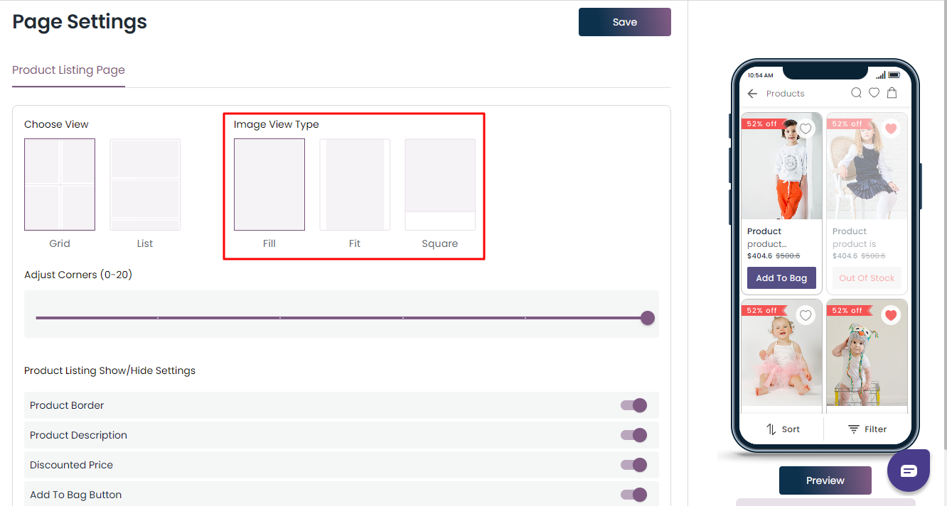
4. Now, choose how you want your image to in the grid view or line view should look like:
A. Fill: The image will crop to fill the frame.
B. Fit: The width of an image in relation to its height.
C. Square: The width and height are the same.
5. Now, you have the option to modify the corners of the uploaded image to give them a curved appearance.
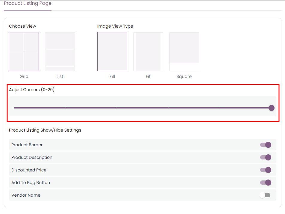
6. Product Listing Show/Hide Setting: You can hide or show, Enable/Disable the following categories on the PLP.
A. Product Border: This makes the product’s border give a visual distinction, provides alignment, and highlights the product border.
B. Product Description: This provides product information and gives a clarity about the full description about the product.
C. Discounted Price: Show the comparison between the actual price and selling price.
D. Add to Bag Button: You can either add the button to this or only a tag to it.
E. Vendor Name: You can hide or unhide the seller’s name.
Elevate Your PLP Effortlessly With MageNative’s No-code App Builder
In A Nutshell
A compelling Product Listing Page is crucial for a successful mobile e-commerce journey. Maximize the capabilities of your app with MageNative’s easy-to-use App Builder. Enhance user experience, increase conversions, and stand out in the competitive market.
Ready to improve your PLP? Explore the features of MageNative here. Your smooth mobile shopping experience begins now.
About The Author
I love navigating the world of SaaS with finesse. As an SEO enthusiast and seasoned Copy Writer, I'm here to transform tech-speak into compelling narratives that resonate with online merchants. With a penchant for alliteration and a touch of humor, I bring a unique flair to SaaS content.
Related Posts
10 Game-Changing Mobile App Marketing Strategies For Growth and Customer Retention
Launching a mobile app might feel like the hard part…
How to Grow Sales After Mobile App Launch: Proven Strategies for Long-Term Success
Mobile App growth goes beyond the initial launch. It’s about…
Why a Mobile App is Essential for Your Shopify Store’s Future Growth
By 2024, mobile commerce is set to hit a staggering…
