
To design a user-friendly and visually appealing mobile app, you can start by customizing various components within the Theme Settings section. The drag-and-drop functionality of MageNative mobile app builder makes it easy to add and modify these components while previewing changes in real-time on your mobile screen.
Various theme components are:
1. Top Bar
The Top Bar appears at the top of your mobile screen, featuring branding, search, wishlist, and navigation elements. It helps users access key functionalities and enhance their experience.
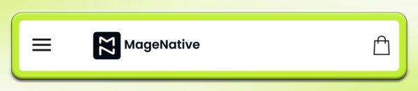
You can customize the Top Bar layout by choosing the search position: as an icon, in the middle, full width, or alongside the logo, and enable or disable the wishlist icon.
2. Banner Slider
The Banner Slider lets you display sliding banners to enhance your app’s visual appeal.
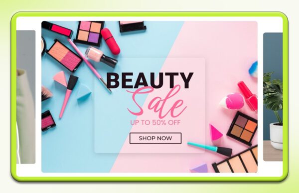
You can choose from various banner sizes, including 700×234 px, 700×394 px, 700×700 px, 700×500 px, and 700×900 px and enable or disable navigation dots as needed.
Furthermore, after uploading the banner image, you can customize the banner’s width, corners, and range as well.
3. Standalone Banner
The Standalone Banner is ideal for highlighting special offers or promotions in your app.
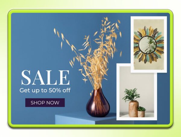
You can customize the Standalone Banner by choosing the button position (Middle, Bottom, or None), selecting a banner size (700×300 px, 700×120 px, 700×500 px, or 700×900 px), and adjusting text alignment.
Furthermore, you can upload images, add a link to the respective collection, custom page, or product, etc and save your changes. You can also reset or delete the banner as needed.
4. Product Slider
The Product Slider lets you showcase a product collection in a grid format. You can drag it to your screen to preview it.
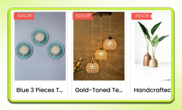
In the layout, you can adjust the product shape, text alignment, and number of rows. Moreover, you can further provide customization by enabling or disabling options like header, subtitle, action buttons, product borders, titles, prices, and special prices. You can also set up deals with specific start and end dates
You can manually add links or display products in the newest-first order. Make sure to save your changes, or use the reset or delete options if needed.
5. Spacer
The Spacer creates gaps between components for a more polished look. You can adjust its height using the scale and choose a color to match your design. Make sure to save the changes. Moreover, you can also reset or delete the Spacer if needed.
6. Announcement Bar
The Announcement Bar allows you to highlight special offers, new arrivals, or important events in your mobile app.
You can customize the text and link it with Collections, Custom Pages, Products, or a web URL. Moreover, you can also adjust the text color, background color, and marquee direction for a scrolling effect.
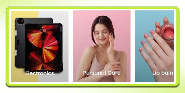
7. Category Slider
The Category Slider allows you to organize your products into different categories, making it easier for customers to find what they’re looking for.
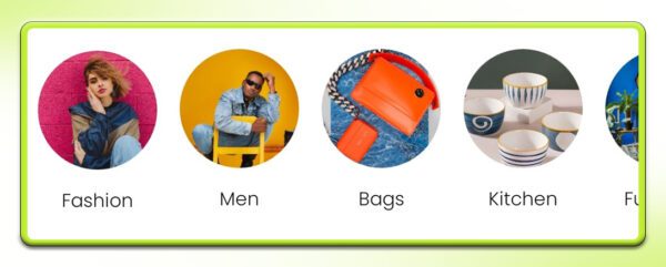
You can customize the slider by choosing the category shape – (square, circle, rectangle), adding a category title, and setting borders. Moreover, you can also upload images for each category and link them to specific pages, ensuring a seamless shopping experience.
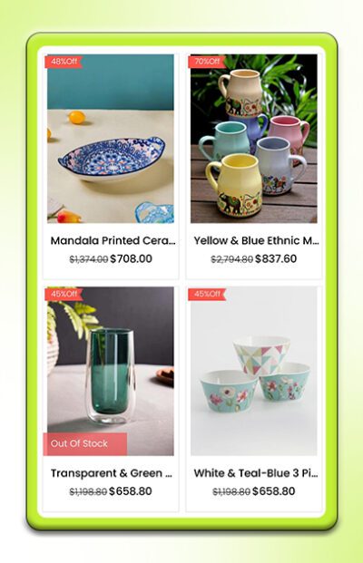
8. Collection Grid Layout
The Collection Grid Layout feature lets you display your products in a grid format, making it easy for customers to browse.
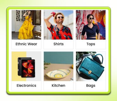
You can customize the grid by adjusting the number of rows, item shape, and text alignment. Choose to display or hide the header title, category grid title, and borders.
Additionally, you can upload images, add category titles, and link them to specific pages within your app to create an engaging shopping experience.
9. Three Collection Layout
The Three Collection Layout helps to display a main featured item along with related items, enhancing product visibility and organization in your app.
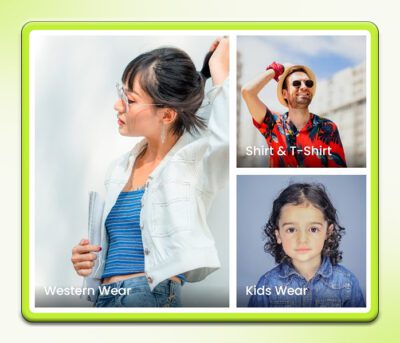
You can customize this layout by selecting the collection shape – (squared, rounded), adjusting text alignment, adding or removing headers, subtitles, borders and collection deals.
Moreover, In the upload section, you can add images, link collections to specific app sections, and set collection titles.
10. Collection Slider
The Collection Slider component showcases a collection of products in a sliding format, allowing users to navigate through items easily.
You can customize the slider by selecting the collection name, adjusting text alignment, and adding or removing headers, subtitles, and product borders.
You can also link products to specific pages within your app, upload images, and add collection titles.
11. Countdown Timer
The Countdown Timer feature allows you to add a countdown for promotions or deals on your mobile app.
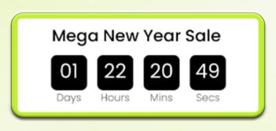
You can customize the style, deal message, time zone, start and end times, text color, text, and background color in this feature.
We’ve put together a detailed guide to help you through it – Read Here.
12. Product Grid Layout
The Product Grid Layout offers the option to display products in an organized grid layout format.
You can modify the display layout including button position, banner size, and alignment of text. Also, you can edit the button titles to align with your app’s theme.
The images can be uploaded in PNG, JPG, JPEG, or GIF formats. Furthermore, you can link each button to collection, custom pages, products or web URL.
13. Text Box
The Text Box feature lets you add and customize text for your app, such as testimonials or reviews.
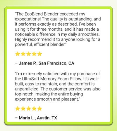
You can set a title, input and format the body text (including heading styles, color, alignment, and bullet points), and choose a background color for the text box.
For a more detailed explanation, visit this guide – Read.
14. Video Component
The Video Component lets you add engaging videos to your app to boost user interaction.
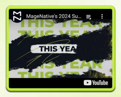
You can set a title, configure playback options (i.e – control bar, auto-play, and looping), and either upload a video file or add a YouTube video link.
Further you can customize by selecting display type(fill, fit, free size), uploading a thumbnail image, and adjusting padding.
For more detailed guidance, visit: #link of video component guide
The above is a short description of MageNative’s theme component. For more detail, visit each component’s help doc separately.
Feel free to reach out to our support team if you have questions or need support. We are here to help and address any issues you may have!
About The Author

I’m Anusha Ansari, a content writer and a tech enthusiast specializing in Shopify. I guide merchants to optimize their stores and grow their businesses. With skills in SEO and content writing, I ensure my articles are engaging and effective. I love exploring new apps and tech trends, sharing my insights to help others succeed.