In today’s times, you cannot deny that mobile apps have become an integral part of our lives. The reason is an exponential rise in the use of smartphones. The demand for mobile apps is growing exponentially. In this sea of mobile apps, its success depends primarily on user interface design. The mobile app design is the first thing users see and interact with, and it can make or break the user experience.
This blog outlines steps for designing a grocery mobile app UI UX, including identifying the target audience and key features and creating user personas. It emphasizes the importance of creating high-fidelity mockups and testing the interface for a great user experience.
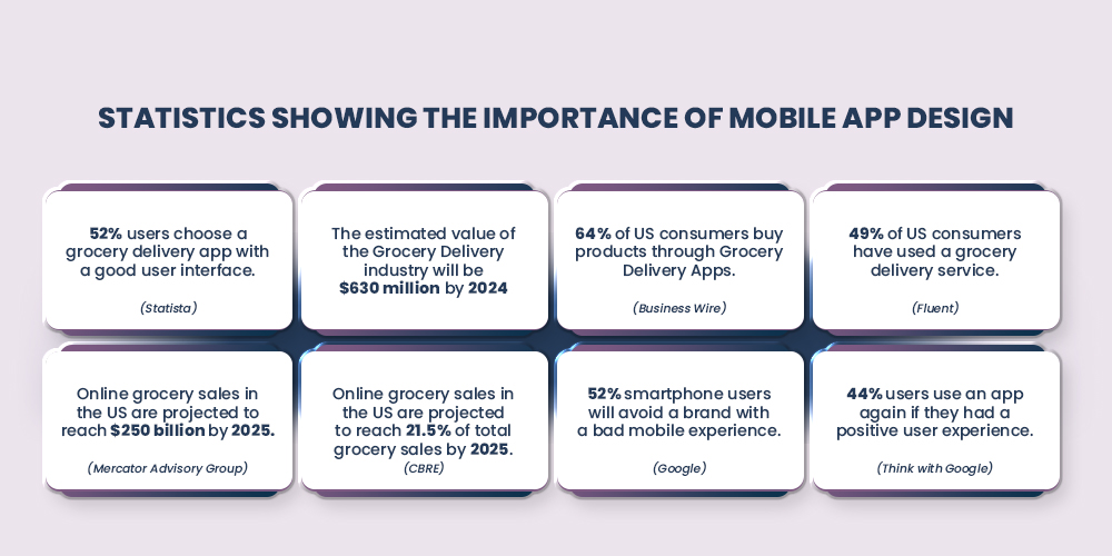
If we talk about the overall global online grocery market, it was valued at USD 285.70 billion in 2021. It is expected to grow at a compound annual growth rate (CAGR) of 25.3% from 2022 to 2030. So there is huge potential in the industry that makes grocery app design even more crucial.
Table of Contents
1. Understanding the Target Audience
2. Identifying Key Features
3. Creating User Personas
4. Sketching the Interface
5. Designing the User Interface
6. Creating High-Fidelity Mockups
7. Testing the Interface
8. Trending Grocery Apps
Conclusion
Let’s discuss the most important aspects of a grocery app design one by one:
1. Understanding the Target Audience
If you want your grocery app design to stand out in a crowded market, it’s vital to understand your users’ wants and needs. By conducting thorough user research and defining your target audience, you can create a truly unique and tailored experience that keeps users returning for more.
Imagine delivering an app that feels like it was designed specifically for each user, with a seamless interface that makes grocery shopping a breeze.
I. Defining the target audience
Before starting the design process, defining the target audience for your grocery mobile app UI UX is important. Who are the people that will be using your app? What are their preferences, behaviors, and pain points? Defining the target audience will help you create a user interface that meets their needs and expectations.
II. Conducting user research
To understand your target audience, you can conduct user research. This can include surveys, interviews, and focus groups to gather insights about their shopping habits, preferences, and pain points related to grocery delivery. You can also analyze data from similar apps in the market to understand user behavior and preferences.
By conducting user research, you can identify the specific features and functionalities your target audience would find helpful and valuable. You can also gain insights into their user interface preferences, such as color schemes, typography, and layout. The information gathered from user research can help you design an interface that meets the needs of your target audience and provides a great user experience.
2. Identifying Key Features
I. Analyzing competitor apps
Awareness of the competition is one of the most crucial aspects of designing a successful grocery mobile app UI UX. Analyzing competitor apps helps you identify the features and functionalities already offered and determine how to differentiate your app. You can also gain insights into user behavior and preferences by analyzing competitor apps.
II. Identifying unique selling points
Based on your analysis of competitor apps, you can identify the unique selling points of your grocery delivery mobile app.
- What features and functionalities can you offer that are not currently available?
- What sets your app apart from the competition?
By identifying your unique selling points, you can create a user interface that highlights these features and makes them easily accessible.
Some potential unique selling points for a grocery app design include
- Personalized recommendations
- An easy-to-use interface for ordering groceries
- A wide selection of products
- Fast and reliable delivery
By emphasizing these unique selling points in your user interface design, you can create a user-friendly and compelling app that stands out.
Build Your Grocery App With MageNative Mobile App Builder
3. Creating User Personas
I. Defining user personas
User personas are fictional representations of your target audience that help you understand their needs, behaviors, and preferences. They can help you design a user interface that meets the needs and expectations of your target audience.
II. Creating user personas for the target audience
You can use the insights gathered from your user research to create user personas for your grocery app design. You can create different user personas based on demographic factors like
- Age
- Gender
- Location
For example, you may have a user persona for busy working parents who need to order groceries quickly and efficiently and another for elderly users who may need a simpler interface.
When creating user personas, it’s essential to include their
- Personalized recommendations
- An easy-to-use interface for ordering groceries
- A wide selection of products
- Fast and reliable delivery
This can help you design an interface that meets each user persona’s needs and expectations. By preparing for particular user personas, you can create a user-friendly, personalized interface that resonates with your target audience.
4. Sketching The Interface
You can iterate and refine your ideas by sketching the interface and creating low-fidelity wireframes before creating high-fidelity mockups. This can help you save time and resources in the long run and ensure that your grocery app design meets the needs and expectations of your target audience.
I. Sketching the interface on paper
Once you clearly understand your target audience and their needs and have created user personas, you can start sketching your grocery app UI design. One effective way to do this is to sketch the interface on paper, which can help you quickly iterate and refine your ideas.
II. Creating low-fidelity wireframes
After sketching the interface on paper, you can move on to creating low-fidelity wireframes. These simple, black-and-white representations of your app’s interface show the basic layout and functionality. Creating low-fidelity wireframes can help you focus on the overall structure of the app and ensure that the user interface is easy to use and navigate.
When creating low-fidelity wireframes, you should focus on the key features and functionalities identified in earlier stages.
This can include
- Shopping cart
- Product search
- Account management
- Checkout process
Creating a simple and intuitive user interface for these key features ensures that your grocery delivery mobile app is easy to use and provides a great user experience.
Also Read : Fuel Up Your Grocery eCommerce Business With Mobile Apps
5. Designing The User Interface
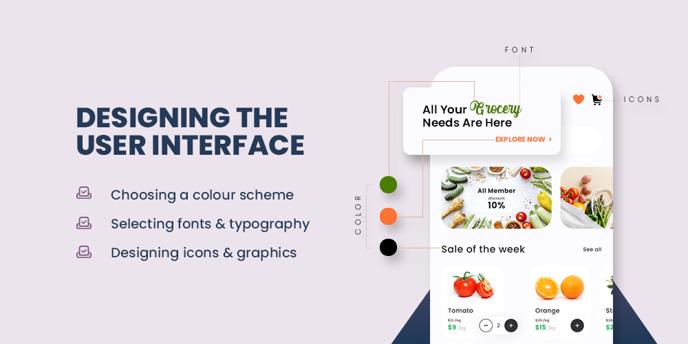
By paying attention to the below design elements, you can create a user interface that is visually appealing, easy to use, and consistent with your brand identity.
I. Choosing a color scheme
One of the most critical aspects of your grocery app design is choosing a color scheme that reflects your brand identity and resonates with your target audience. Color can influence user emotions and behaviors, so selecting a color scheme appropriate for your app and its features is very important. For example, green can evoke feelings of freshness and health, suitable for a grocery delivery app.
II. Selecting fonts and typography
Another critical aspect of user interface design is selecting fonts and typography that are easy to read and consistent with your brand identity. Mobile apps often prefer Sans-serif fonts as they are easily read on small screens. Typography can also convey hierarchy and emphasize important information, such as product names and prices.
III. Designing icons and graphics
Designing icons and graphics consistent with your app’s overall design can help improve user experience and make the interface more visually appealing. Icons can represent different features and functionalities, while graphics can be used to showcase products and promotions. It’s essential to use icons and graphics consistent with your brand identity and easy to understand for your target audience.
Build your own customized mobile app for your grocery business with zero coding knowledge and reach a wider audience with ease using our no-code mobile app builder.
6. Creating High-Fidelity Mockups
By incorporating feedback and making changes, you can create a user interface design that is user-friendly, visually appealing, and aligned with your brand identity and business goals.
I. Using prototyping tools
After sketching the interface, creating low-fidelity wireframes, and designing the user interface, the next step is to create high-fidelity mockups using prototyping tools. These tools allow you to create interactive prototypes that mimic the app’s functionality and give you a better idea of how the user interface will look and feel.
When creating high-fidelity mockups, it’s important to ensure the design is consistent with your brand identity and meets your target audience’s needs and expectations. You can use the user personas and feedback gathered from earlier stages to guide your design decisions.
II. Incorporating feedback and making changes
Once you have created high-fidelity mockups, gathering feedback from users and stakeholders and making any necessary changes is essential. This can help you identify any usability issues or flaws and refine your user interface design to improve the user experience.
You can conduct usability testing to gather user feedback and identify improvement areas. You can also collect feedback from stakeholders
- Developers
- Product managers
- Designers
to ensure that the design meets technical and business requirements.
Also Read : Top 8 Must Have Grocery Delivery App Features-With Cost Breakdown
7. Testing The Interface
By testing the interface and iterating on the design, you can create a user-friendly and intuitive interface that meets the needs and expectations of your target audience.
I. Conducting usability testing
After creating high-fidelity mockups and making any necessary changes based on feedback, the next step is to conduct usability testing to ensure the interface is user-friendly and intuitive. Usability testing involves observing users interacting with the app and gathering feedback on their experience.
During usability testing, you can identify any areas of the interface that are confusing or difficult to use and make any necessary changes to improve the user experience. You can also gather feedback on the overall design, including color schemes, typography, and graphics.
II. Iterating and refining the design
After conducting usability testing and gathering feedback, it’s important to iterate and refine the design to improve the user experience. This may involve changing the layout, typography, or color scheme to enhance usability and make the interface more visually appealing.
You can also use analytics tools to track user behavior and identify any areas of the interface that are not performing well. This can help you make data-driven decisions and refine the design better to meet the needs and expectations of your target audience.
Read More: How To Set Up App Only Discount In Your App?
8. Trending Grocery Apps
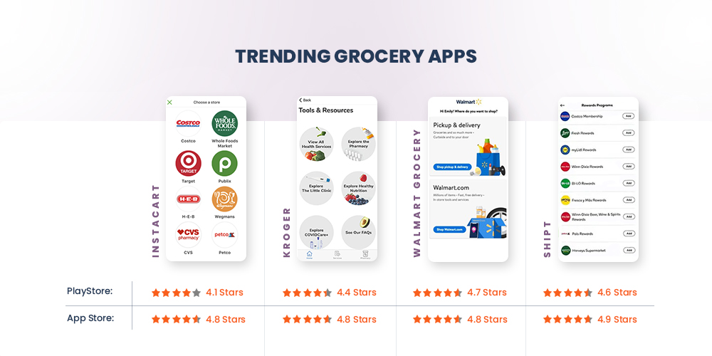
Look at the top-rated grocery mobile apps, ratings, and some notable features.
I. Instacart
PlayStore: 4.1 | App Store: 4.8
Founded in 2012, Instacart has rapidly expanded across North America and partnered with major grocery chains to provide customers with access to various products.
Here are some of its notable features:
- Easy Ordering
- Personalized Recommendations
- Multiple Stores
- Same-day Delivery
- Contactless Delivery
- In-app Chat
- Instacart Express
II. Kroger
PlayStore: 4.4 | App Store: 4.8
With a history dating back to 1883, Kroger has grown to over 2,700 stores in 35 states, providing customers access to fresh produce, meat, dairy, and household essentials.
Here are some of Kroger’s notable features:
- Digital Coupons
- Order Online
- Pharmacy Services
- Savings Tracker
- Personalized Recommendations
- Weekly Ads
- Loyalty Program
III. Walmart Grocery
PlayStore: 4.7 | App Store: 4.8
With Walmart Grocery, customers can order groceries online and have them delivered right to their doorstep or choose to pick them up at a nearby store.
Here are some of Walmart Grocery’s notable features:
- Easy Ordering
- Same-day Delivery
- Pickup Savings
- Rollbacks and Special Deals
- Savings Catcher
- In-app Chat
- Grocery List
IV. Shipt
PlayStore: 4.6 | App Store: 4.9
Founded in 2014, Shipt has rapidly expanded across the United States and partnered with major retailers to provide customers access to various products.
Here are some of Shipt’s notable features:
- Easy Ordering
- Personalized Recommendations
- Multiple Stores
- Same-day Delivery
- Contactless Delivery
- In-app Chat
- Shipt Pass
Read More: How To Set Up Push Notification In Your Mobile App?
Conclusion
Designing a user-friendly and visually appealing mobile app UI UX is essential for creating a successful grocery app design. In this blog post, we discussed the importance of understanding the target audience, identifying key features, creating user personas, sketching the interface, designing the user interface, creating high-fidelity mockups, testing the interface, and iterating and refining the design based on feedback.
By following the steps discussed in this blog post, you can create an excellent user interface for your grocery delivery mobile app that meets the needs and expectations of your target audience. A well-designed interface can improve the user experience, increase engagement, and drive business growth. So, take the time to design a user-friendly and visually appealing interface and create a great grocery app design that your users will love.
About The Author
I love navigating the world of SaaS with finesse. As an SEO enthusiast and seasoned Copy Writer, I'm here to transform tech-speak into compelling narratives that resonate with online merchants. With a penchant for alliteration and a touch of humor, I bring a unique flair to SaaS content.
Related Posts
10 Latest Trends in Mobile App Design for Online Merchants
Mobile app design is more than just making things look…
Why Your Mobile-Responsive Site Needs a Mobile App for Increased Conversions and Engagement
Why rely on a mobile-responsive site when mobile apps consistently…
10 Game-Changing Mobile App Marketing Strategies For Growth and Customer Retention
Launching a mobile app might feel like the hard part…
